Bonobono is more than a marketplace, it’s a destination for those who seek high-quality vegan food without compromise.
Inspired by Italian culinary traditions, Bonobono curates a selection of artisanal vegan products designed to elevate everyday meals into something extraordinary. By blending authenticity with innovation, the aim is to brings together taste, quality, and conscious living, making premium vegan food accessible across the UK.
THE CHALLENGE
The challenge was to craft a brand and digital experience that captured both vegan food lovers and vegan curious.
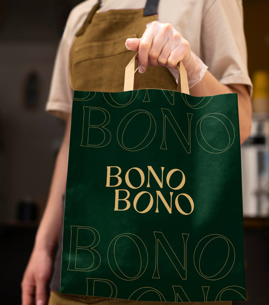
We started by shaping a strong visual identity, developing a logo, a fresh color palette, a distinctive typography system, to create a brand that felt both sophisticated and inviting.
The selected proposal balances premium culinary heritage with a modern and vibrant personality. Especially within digital tools the overall look and feel resonates with Bonobono’s vision, that of providing the highest quality artisanal plant-based produce available through an engaging user experience.
approach
To bring this vision to life, we designed and built a custom Shopify e-commerce platform tailored to brand’s audience. We conducted extensive benchmark research to gain insights into existing vegan marketplaces targeting the UK market. At the same time, we analyzed multiple Shopify themes to identify the best fit for BonoBono’s needs.
Beyond theme selection, we carefully assessed and integrated plugins that enhanced functionality while developing custom solutions where needed. This ensured a frictionless shopping journey, from intuitive navigation to seamless checkout.
RESULT
The result is a Shopify e-commerce platform that goes beyond transactions, creating a digital space where customers can fully immerse themselves in Bonobono’s world, to explore and discover a new dining philosophy.
We carefully balanced functionality and storytelling, ensuring that customers don’t just browse but experience brand’s commitment to high-quality vegan food.
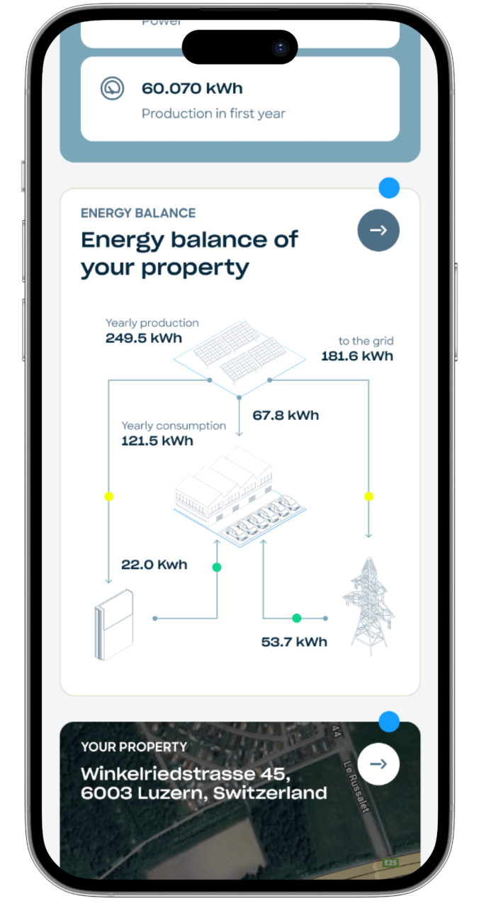
Y Tú is a company specialized in the installation of custom photovoltaic systems for businesses.
New to Spain but backed by decades of expertise, Y Tú creates solar systems tailored to fit seamlessly into any setting, from rooftops and wide-open fields to parking spaces. The company oversees every aspect of the process, including system design, installation, monitoring, and maintenance.
the challEnge
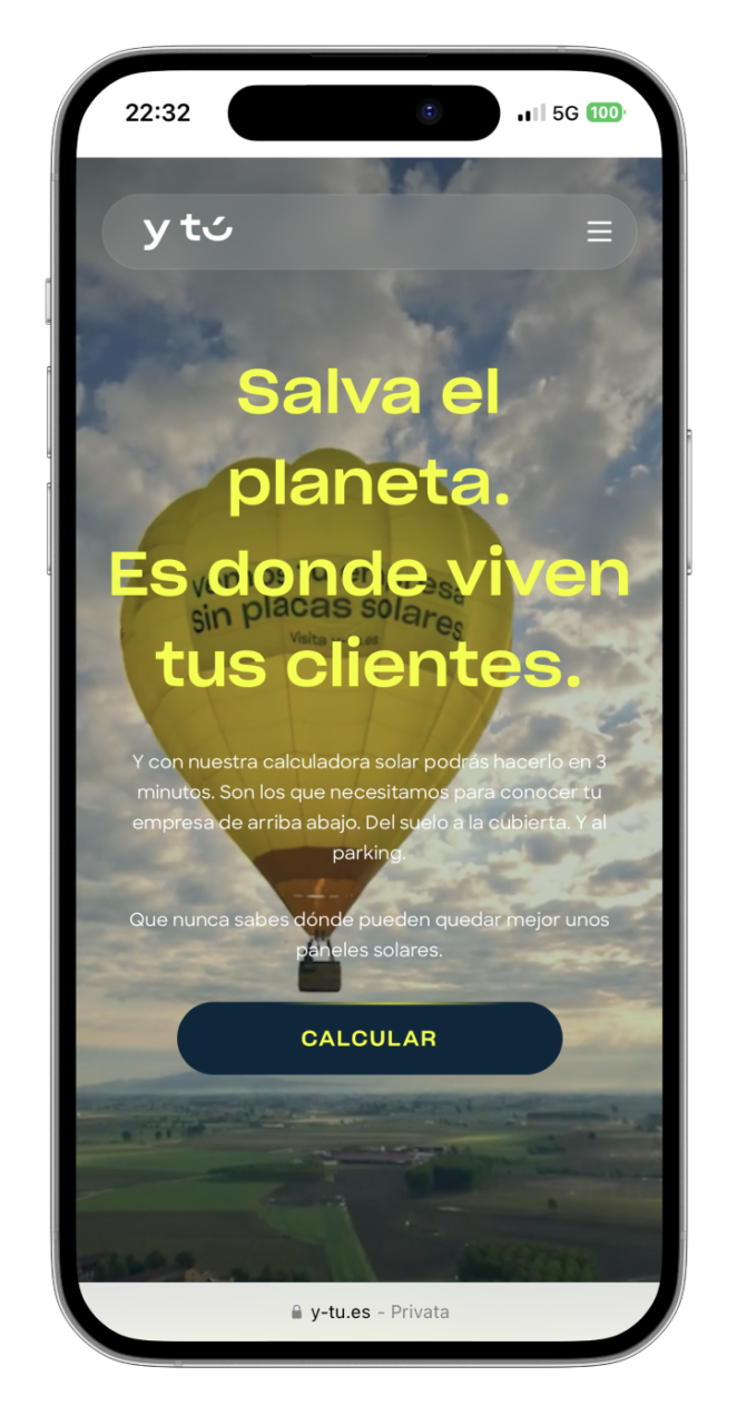
The client needed a website that could effectively showcase their solar panel installations and offerings while reflecting their unique brand identity and marketing objectives.
The goal was to create an interface and user experience that felt both editorial and aesthetically refined, striking a perfect balance between clarity, functionality, and their distinctive tone of voice.
the solution
We developed a website that combines visual storytelling with a seamless user experience, featuring real projects with real clients to build trust and credibility. Every page was carefully designed to highlight Y Tu’s solar solutions, providing users with an engaging and intuitive journey into the world of self-consumption energy. To ensure consistency and scalability, we created a robust design system that supports a wide range of content types, from videos and images to carousels and text.
This modular approach allows the client to easily build new pages while maintaining visual harmony across the platform. The website, has been celebrated within Best Corporate Website Designs, seamlessly represents the brand both editorially and aesthetically while inspiring users to explore Y Tu’s offerings in a unique and purposeful way.
RESULT
The new website successfully elevated Y Tu’s digital presence, offering a cohesive experience that aligns with their brand and business goals. By combining a strong design system with engaging content, we enabled the client to showcase their solar solutions with clarity and impact.
The platform now empowers users to explore projects, understand offerings, and connect with Y Tu effortlessly—driving both engagement and conversions.
Y Tú is a company specialized in the installation of custom photovoltaic systems for businesses.
New to Spain but backed by decades of expertise, Y Tú creates solar systems tailored to fit seamlessly into any setting, from rooftops and wide-open fields to parking spaces. The company oversees every aspect of the process, including system design, installation, monitoring, and maintenance.
the challEnge
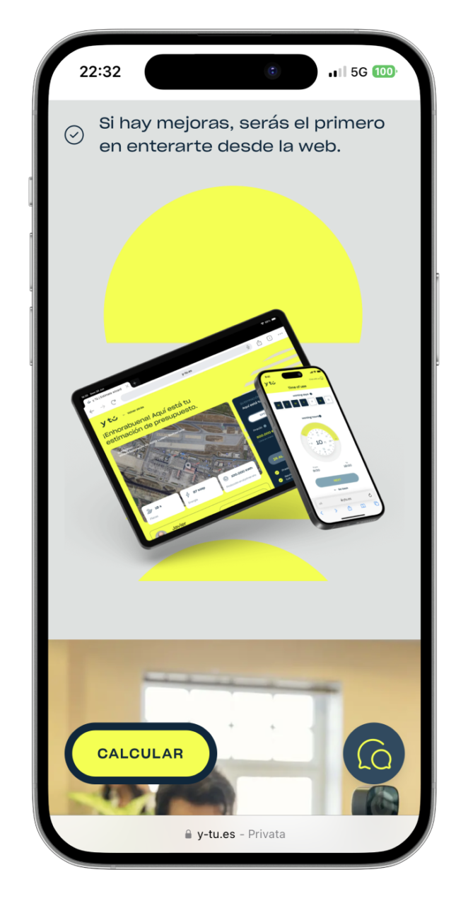
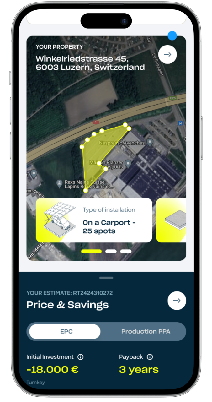
The client needed to develop a digital service that would guide users through the entire process of configuring and creating a solar energy system online. The platform had to simplify every step, making the project phases and proposal clear and easy to understand. This type of experience allows the brand to reduce commercial costs while providing greater transparency and clarity to customers, particularly in terms of offerings.
The client’s idea was to make users almost entirely autonomous after receiving an initial cost estimate on the public website. The goal was to enable them to configure and create the entire system independently, while also providing a way to monitor project steps. This was achieved through a single platform designed for the exchange of information and documents between the brand and users.
the solution
To approach a project of this scale, we conducted several design thinking exercises during an online workshop with all Y Tú team stakeholders. This allowed us to define the customer journey, identify users along with their needs and concerns, and create an experiential flow that would help the brand be more effective in sales while ensuring users could navigate the entire process without feeling lost, minimizing their cognitive load as much as possible.
We then developed wireframes guided by a clear timeline, featuring interactive areas for document uploads or parameter adjustments, and a constant recap section to keep project data visible and updated dynamically. The entire system adopts a modular, block-based approach, ensuring simplicity and ease of use despite a complex workflow.
RESULT
We successfully created a block-based, ergonomic experience that is clear and easy to use, even for inexperienced users. The platform enables the brand to seamlessly manage all project phases while serving as a single point of contact for documents and project updates. The project was also developed with an almost fully responsive design, allowing users to track progress even on the go. Additionally, we built a distinctive design system that is reliable, scalable, and ready to support future developments of the platform.
Thanks to this online configurator, Y Tú can streamline its sales process, reduce operational costs, and improve customer satisfaction. The platform empowers users to independently manage their projects while providing the brand with greater control, efficiency, and transparency throughout all phases.
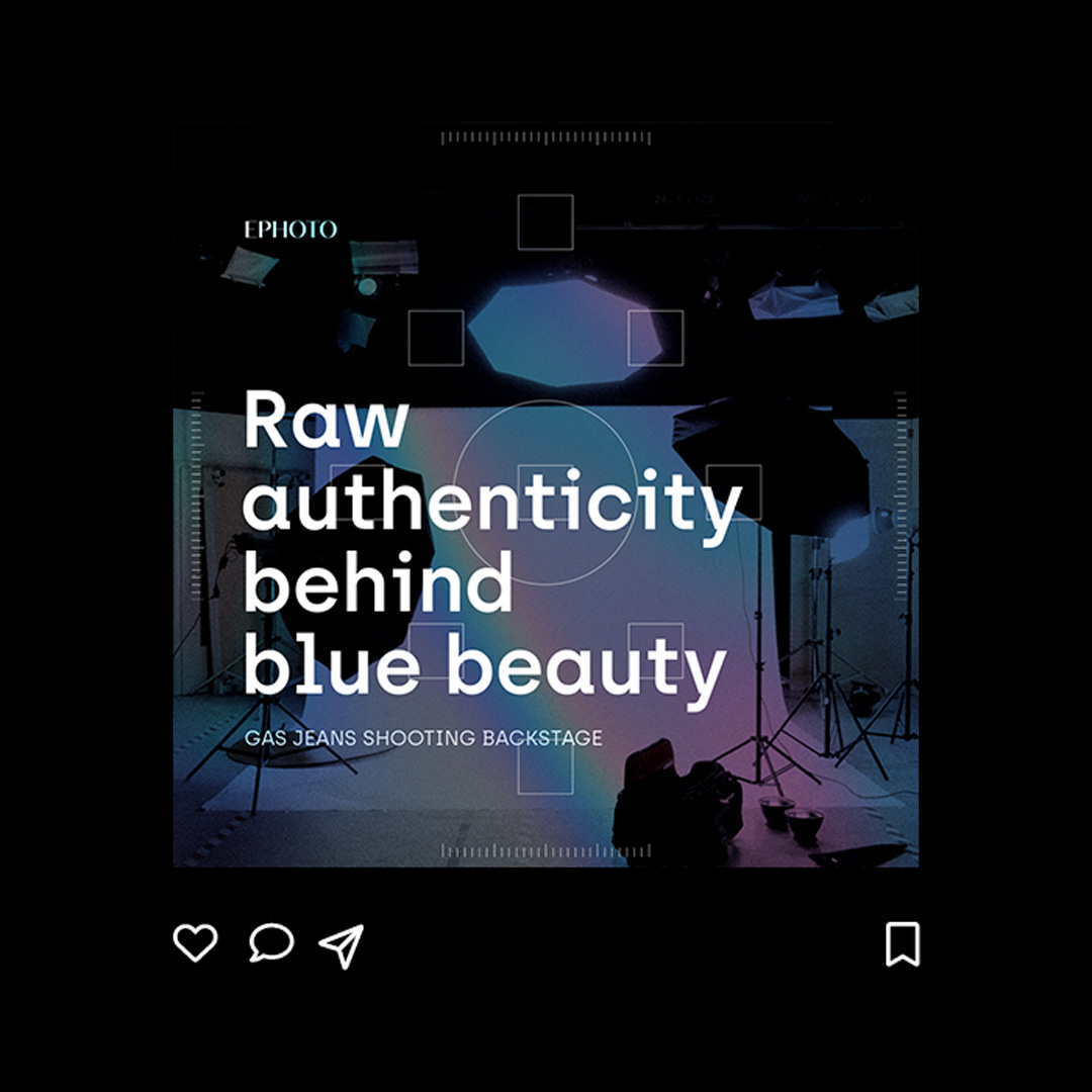
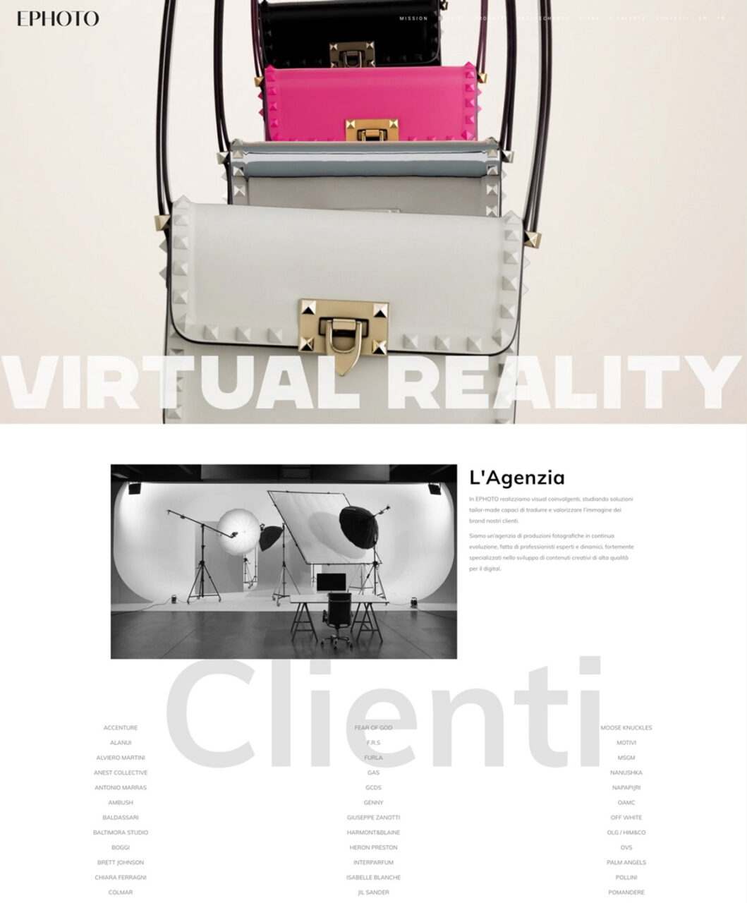
Ephoto specializes in creating high-quality visual content that drives engagement across e-commerce, B2B, and advertising channels.
With 13 years of expertise in photography, video, and 3D CGI, Ephoto offers hands-on production support, and crafts captivating visual identities that empower businesses to stand out.
THE CHALLENGE
Ephoto sought a complete transformation of its brand identity and digital presence to better align with its evolving vision and market positioning. The challenge was to reimagine the brand while keeping its recognizable logo at the forefront.
We introduced a refreshed identity with new colors, typography, and a detailed brand manual, complemented by an
enhanced company profile that truly reflected Ephoto’s expertise and innovative soul.
Alongside this, the website was fully redesigned, combining a refined UX and UI to deliver a seamless and visually engaging user experience. The result balanced familiarity for existing clients with a bold, modern look to attract new opportunities.
Creative direction
Our creative vision for Ephoto was inspired by the concept of iridescence, where the dynamic interplay of light and color symbolizes the brand’s innovative and fluid approach to digital content creation. This concept informed every aspect of the project, highlighting creativity, energy, and forward-thinking design while effectively communicating Ephoto’s unique blend of artistry and technological expertise.
We proposed a digital-first strategy, highlighting Ephoto’s ability to manage complex, large-scale productions using multiple technologies. This approach reinforced its identity as both a cutting-edge production house and a trusted creative consultant.
Old homepage
New homepage
result
Through multiple review phases, we designed and prototyped the entire website and design system, to finally develop full custom both front-end and WordPress backend. The result is a dynamic, user-friendly website that showcases Ephoto’s expertise and reinforces their leadership in digital content production.
Sailsquare is the website that simplifies your journey into the world of yacht and boat bookings.
Whether you're looking to sail in the Mediterranean or explore the Pacific, Sailsquare offers curated experiences across the globe, allowing you to search, book, and embark on your dream adventure with ease.
the challEnge
Sailsquare needed a comprehensive overhaul of its website’s design system to enhance its user interface and user experience. The goal was to improve the conversion rate while maintaining the site’s existing structure. We faced the challenge of balancing a redesign that felt both familiar to current users yet fresh and inviting to new ones.
The objective was to recreate the user’s boating experience right from the website, ensuring that users felt like they were already boarding their yacht from the moment they landed on the homepage.
Creative direction
Our creative approach centered around transporting users into the world of boating from their first interaction with the website. The design was crafted to reflect the excitement of sailing, with a user journey that flows as smoothly as a boat on calm waters.
We revamped the website’s interface, making the search and booking processes smoother and more engaging, offering users the ability to feel as if their nautical adventure had already begun.
RESULTS
The redesigned Sailsquare website saw a significant improvement in performance across the board, from enhanced user experience to a sharp increase in bookings. The site’s conversion rate increased, and the seamless user journey has led Sailsquare to become one of the top booking platforms for yacht and boating experiences worldwide.
This success highlights our dedication to delivering exceptional design and functionality in the digital travel industry.
MooneyGo is the app that streamline your journeys: parkings, buses, trains, taxis, ferries and mobility sharing options are there for you.
It's the app that empowers you to move, travel, and pay with complete freedom, offering a bunch of mobility services within and beyond the city: from parking to public transportation, all the way to highways, MooneyGo is your travel companion for every moment.
the challEnge
Mooney Go acquired MyCicero to integrate all the new payment systems into the new app. This challenge led us to find compatibility solutions between the two working environments. Our goal was to maintain a user-friendly structure that would allow existing MyCicero users to continue using and leveraging the skills they had already acquired from the app.
We collaborated with the MooneyGo Design and Product team and the MyCicero development team to achieve the goal of merging these two entities. We acted as a bridge, facilitating the discovery of the best connections between them, ultimately leading to the creation of MooneyGo’s new and innovative user experience.
Creative direction
We started working with the MooneyGo app’s design and teamed up with its project owner to create a design system that took the app to a whole new level. We didn’t just integrate features, we envision a new way to make people live the city on the go and deal with the frictions of daily travels.
Within this app, it’s even possible for registered users to discover, buy and then manage the recently launched E-tolling solution.
Now, booking parking, buying tickets, and getting around Italy is more seamless than ever before.
results
Mooney Go has been named the 2023 Consumer Product of the Year, recognizing it as an innovative mobility application.
This award fills us with immense pride and reflects our dedication to delivering exceptional work in this field.
Valentine’s Day, celebrated on February 14th, is a global festivity dedicated to love and romance.
During this special day, when couples and loved ones take this opportunity to celebrate their bonds, making it a day filled with joy, warmth, and the spirit of love, Valentino wants to celebrate client's affection by sending them a digital gift.
THE CHALLENGE
Client’s request was to design and develop a digital experience dedicated to top clients to make them explore a selection of products.
We started exploring few concepts and pitched them to Valentino Digital and Brand Teams.
The select concept celebrates the art of courtship. Valentino gifted customers with a box of chocolates accompanied by a love note. The chocolates were crafted in 3D, with each piece representing a specific product that the brand aims to promote.
APPROACH & RESULT
We took care of the User Interface and then of the Dev phase, managing two different domains to create a tailored experience for users belonging to a Chinese boutique and for those in the rest of the world, each showcasing diverse products.
The love letter welcomes the user, who selects their gender and then views the 3D gift. By tapping on a chocolate shaped to resemble Valentino’s iconic Stud, clients can savor a different mood of love and discover the corresponding product.
This web app successfully supported the sales department in stimulating top clients worldwide to make purchases.
Uniting stands as a corporate Collaborative Ecosystem, that holds together 5 Units specialized in Marketing and Communication
Established in 2019, Uniting offers a dynamic multi-collaboration model that supports brands facing complex challenges with creativity and innovation. Tailored to the unique needs of each client, units collaborate closely, fostering a synergy that not only ensures efficiency but also unparalleled expertise.
THE CHALLENGE
With a new, captivating brand identity aligned with the group’s positioning and strategy, it became essential to develop a website that effectively showcases Uniting’s offerings and its realtionship with the five specialized units: All, Kiwi, Flu, aBit, and Freshhh.
We have been engaged in the redesign project for the new website, working closely with Uniting’s marketing team, who handled content production. Our task was to advance the initial concept by designing components and modules that meet the requirements of each page and by building an interactive prototype to effectively gather feedback.
Approach & results
Together with Uniting’s team, we defined all customization logics and began the development phase.
Based on the client’s needs, we created a full custom WordPress template, providing extensive possibilities for modification and continuous updates, while maintaining a modern Ul and engaging animations.
We have been responsible also for the implementation and customization of several plugins, such as Hirehive to showcase open roles and manage job applications.
The result is a corporate website that seamlessly integrates formal and informal elements, embodying the vision and mission of the entire group and highlighting the strong connection with its five specialized units.
Renowned for its flawless craftsmanship and iconic style, Valentino embodies timeless elegance and luxury.
As happens every year, also in 2023 by the end of November, Valentino unveiled The Party Collection, enchanting fashion enthusiasts across the globe.
THE CHALLENGE
Valentino’s Digital Team asked us to develop a digital catalog for their 2023 Party Collection, showcasing handpicked items photographed at the prestigious Place Vendome Palace in Paris. The aim of this initiative was to captivate clients’ interest and guide them towards a personalized shopping experience with boutique advisors.
Thanks to our ongoing collaboration, we presented an immersive concept: a virtual exploration of the Place Vendome palace. Users could step inside the 3D Palace through its windows to access the party and discover the entire collection room by room.
APPROACH & RESULT
As we were responsible for both design and development phase, we collaborated with a 3D artist to craft the Place Vendome model and engaged a 3D front-end developer. Leveraging WebGL and Three.js technology, we handled 3D graphics, lighting, cameras, and interactions. Meanwhile, we focused on UX/UI design, emphasizing interactions and integrating key conversion points to ensure a memorable and seamless experience.
The Palace is immersed in an evening atmosphere, where users’ attention is captured by its illuminated windows.
It’s just by touching them, that users can unlock the Party Collection, and explore diverse galleries of videos, photos, and copylines. Users can bookmark their favorite pieces, download or share them, and access to the online shopping experience by selecting their preferred Valentino boutique.
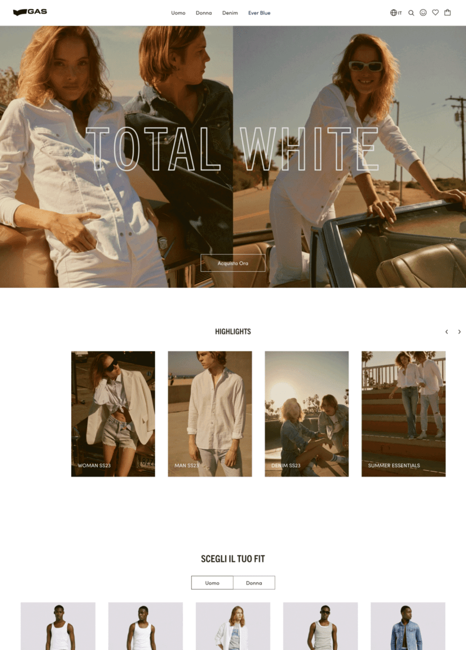
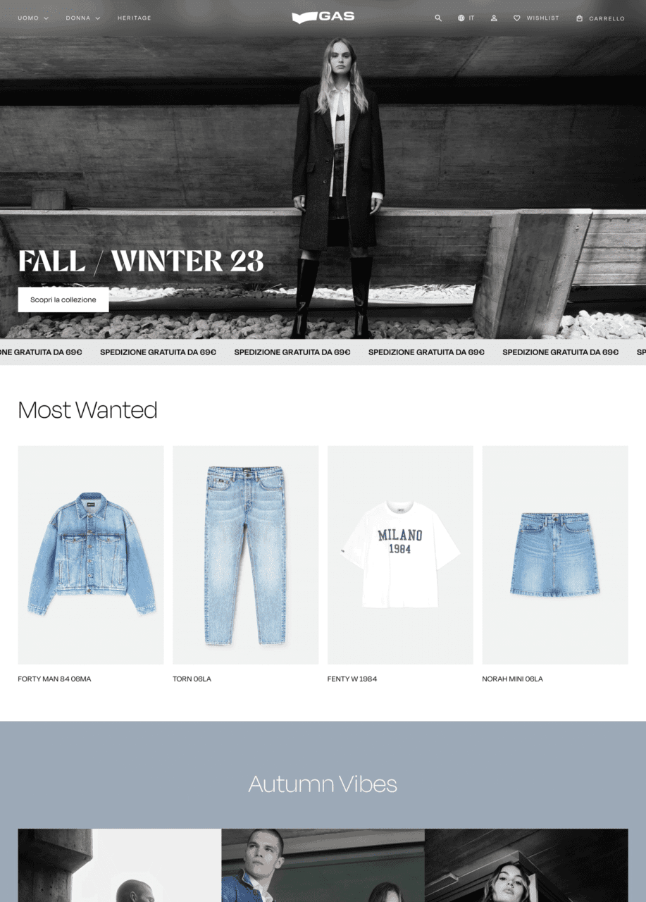
GAS is a historical brand in the Italian fashion scene, which has its roots in the denim world.
Founded in 1984 as a family-run business, GAS sells high-quality clothing, footwear and accessories for men, women and children. Its total looks are denim-centered.
THE CHALLENGE
GAS was undergoing a rebranding initiative, aimed at expanding brand’s appeal to reach out both new generations and long-time loyal customers. The goal was to go beyond their traditional denim focus, proposing GAS as a contemporary lifestyle brand with a comprehensive offering for all genders and also genderless.
They contacted us to redesign their e-commerce, working in partnership with an external content agency and a development company. Our task was to customize a Shopify premium template to highlight GAS new identity, its historical background and its balanced connection with both women and men’s universe.
Before
After
APPROACH & RESULT
We analyzed their current e-commerce and the proposed information architecture, to understand what were the critical points of the existing experience and the integrations that has to be implemented. Based on their goals, we selected 3 Shopify Premium templates, highlighting their distinctive features. Among them GAS team chose the Expanse – Modern style template, which was the starting point for our UI design proposal.
We crafted a creative direction focused on elegance and modernity, selecting a minimalist approach. The extensive use of black and white in various shades and sharp shapes for interactive elements serves to elevate the brand’s positioning. Abalos, chosen as the main font, adds a modern and playful touch, enhancing the new brand identity across product and category heroes, as well as cross-selling banners.