Forte Architetti is an internationally-acclaimed architectural firm, comprising architects, landscape designers, engineers, and interior designers.
The firm handles a wide range of projects, from urban planning to landscaping, residential to commercial buildings, and interior to furniture design. They employ strategic design thinking for both small and large-scale projects, offering feasibility studies, full architectural and planning services, site management, supervision, and various problem-solving techniques.
THE CHALLENGE
The client expressed a desire to conduct a comprehensive review of their website with the aim of enhancing communication regarding their projects and their presence in various countries. Specifically, the client tasked us with targeting South African and Nigerian high net worth individuals, given that these two countries are the most significant in terms of the client’s revenue and opportunities.
We developed a benchmark by studying U.S. luxury real estate communication methods as a model for our target countries. We incorporated Italian design aesthetics to engage our audience and compete with international design studios. Our research revealed a key insight: architectural firms often communicate internally, neglecting their intended audience, which hinders effective client engagement and issue resolution.
DESIGN direction
Based on the insights gained by our research, we adopted a customer-centric strategy, aiming to vividly narrate the stories behind the studio’s projects and how they meet clients’ needs and aspirations. We introduced a fresh creative concept called “Behind the House,” a creative concept spotlighting clients and all aspects of the projects – an approach that’s in stark contrast to the conventional communication style of architectural studios.
Our goal was to connect users with our projects. To achieve this, we adopted an editorial approach that bridges the gap between an interior magazine and an architectural studio, offering users an immersive narrative experience of Forte Architetti’s work.
website
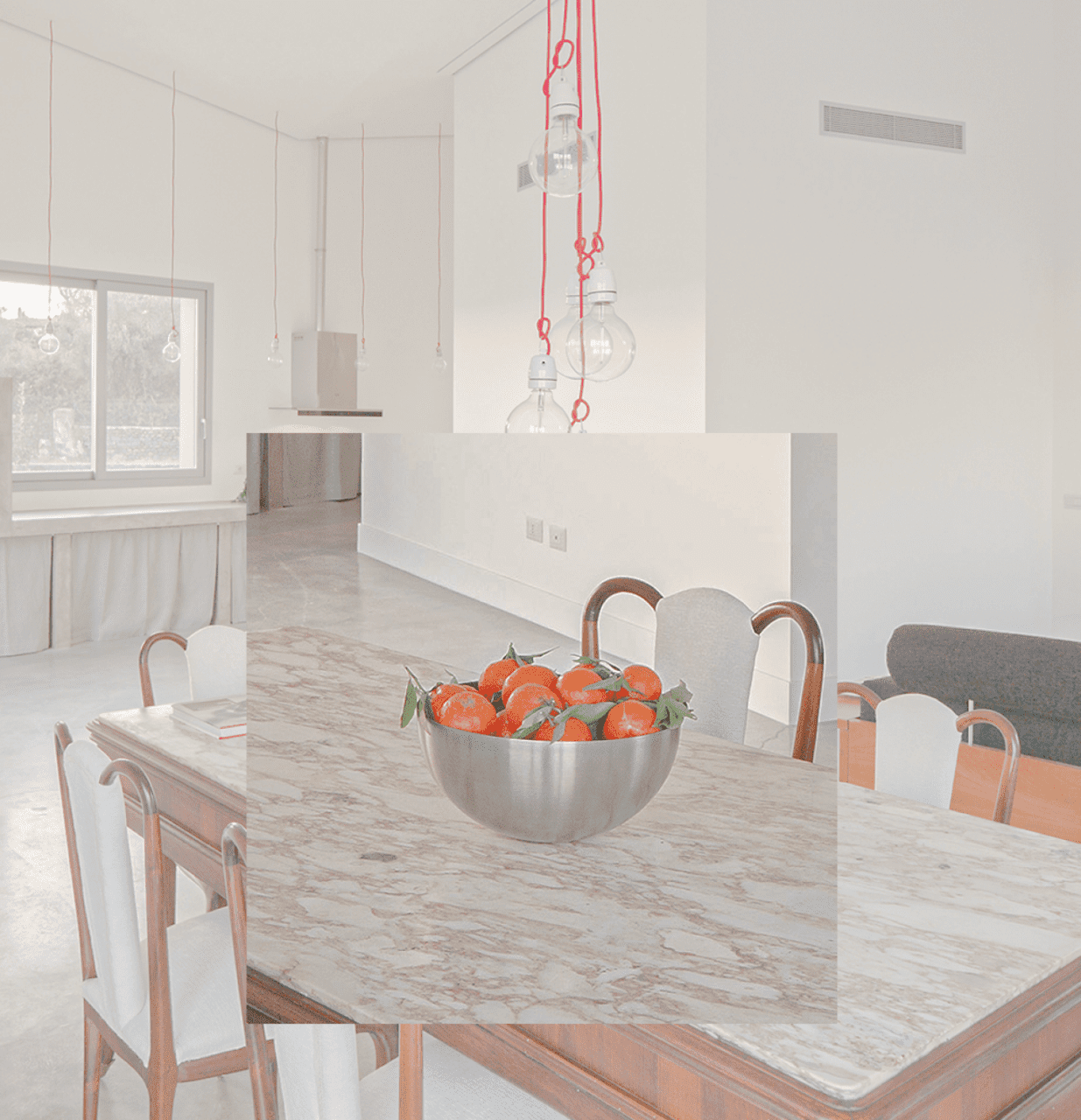
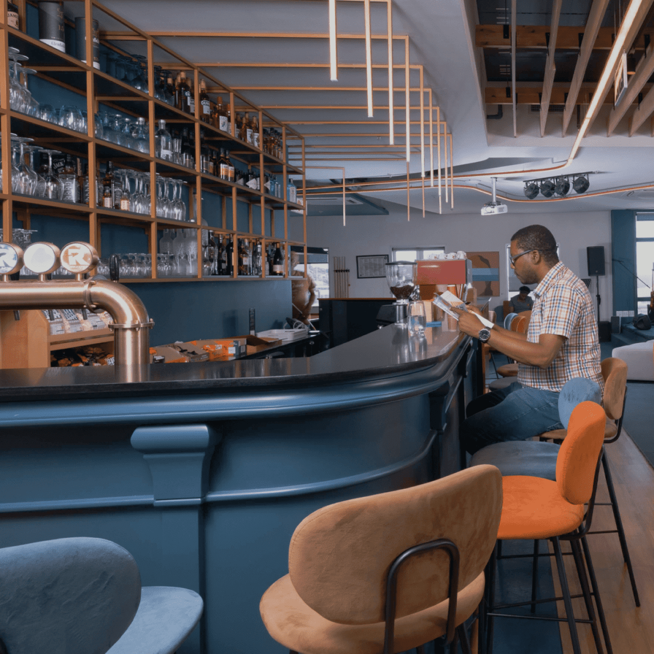
We designed a website that offers a dynamic, engaging user experience, using subtle animations to introduce primary photo-text content. This approach was chosen to create an editorial experience that aligns with the storytelling aspect of the studio’s projects.
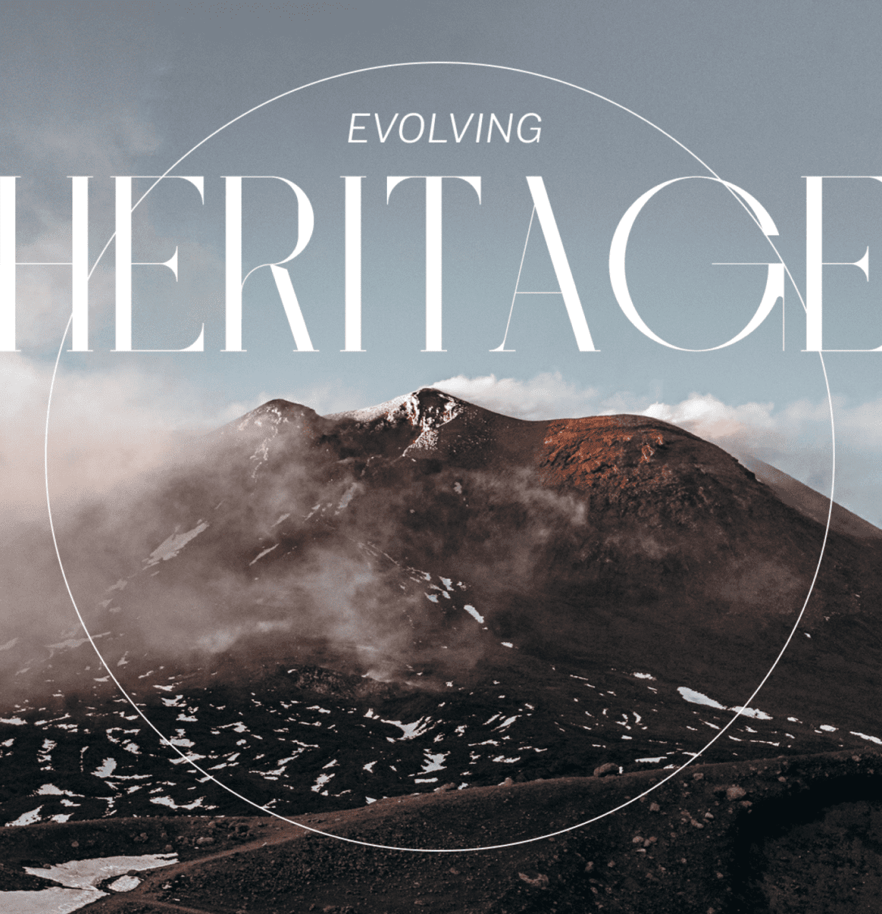
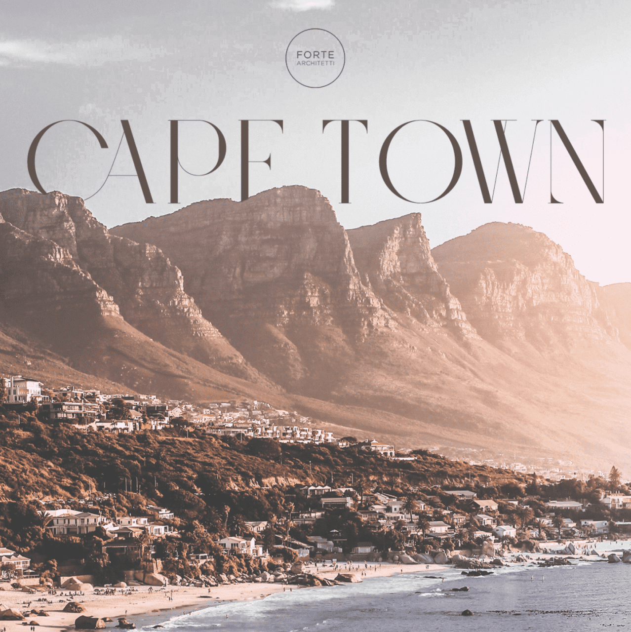
Our art direction used cool, dark colors against bright optical white, and a large serif font for headlines, mirroring the aesthetic of a luxury architecture magazine. The website showcases the studio’s projects, team, and operational methods, presenting them as a collection of narratives that challenge the traditional approach of a typical showcase website.