EssilorLuxottica is a global leader in eyewear, combining expertise in lenses and frames to create innovative vision solutions.
EssilorLuxottica, established in 2018, is a prominent global eyewear conglomerate formed by merger of Essilor, a lens manufacturing expert, and Luxottica, a leading frame designer and retailer.
THE CHALLENGE
Our task was to create a website for EssilorLuxottica that seamlessly integrated the brand’s values and aspirations. Our goal was to establish a visual identity that conveyed a sense of heritage while maintaining a clean and polished look.
We used sleek design elements, elegant typography, and an iridescent color palette to reach the whole spectrum and represent the essence of the brand. The result was a visually captivating website that radiated refinement and exclusivity, ensuring a user-friendly browsing experience.
Before
After
CREATIVE DIRECTION
We imagined a new way to define the loading icon with a modern approach. We started adding movement to the GRTSK Peta Grotesque, creating a completely new typography that starts from a single point and defines each letter with a smooth and round movement.
To give even more strength to the concept and a modern and digital treatment to the letters, we used a shade of vibrant pink degrading to electrical blue that illuminates the tip of the letter and resembles the typical loading spinners effect.
RESULTS
We managed to give EssilorLuxottica a distinctive digital branding identity, even though it’s a brand that has to accommodate many others.
We struck an ideal balance between design and identity, ensuring it doesn’t overshadow the other brands while also not getting lost among them. At the same time, the goal was to corporately represent the brand while offering an international scope.
Brandoh! redefines presentation engagement by converting static slides into dynamic, interactive experiences.
Its drag-and-drop editor allows users to create engaging stories, personalizing content for lasting impact. This tool goes beyond regular presentations, engaging audiences deeply and making storytelling in presentations more immersive.
Before
After
THE CHALLENGE
The challenge was reinventing Brandoh!’s identity to resonate with audiences seeking innovative presentation tools. We revamped its digital presence and offline representation, enhancing the dynamic appeal through gadgets and products.
This redesign aimed to create an eye-catching identity that piques the curiosity of people looking for a more visually appealing tool.
The video
We produced an intuitive video illustrating Brandoh!’s functionalities. This visual representation effectively differentiated it from traditional presentation methods, ensuring a clear and straightforward understanding of its unique capabilities.
The video positioned Brandoh! as an innovative, user-friendly solution for captivating and impactful presentations.
website
We designed an informative landing page detailing Brandoh!’s core features. This platform serves as an educational hub, showcasing how users can enhance presentations by seamlessly integrating enriched content elements.
The landing page blends brand content with tool functionalities, offering a comprehensive understanding of Brandoh!’s capabilities.
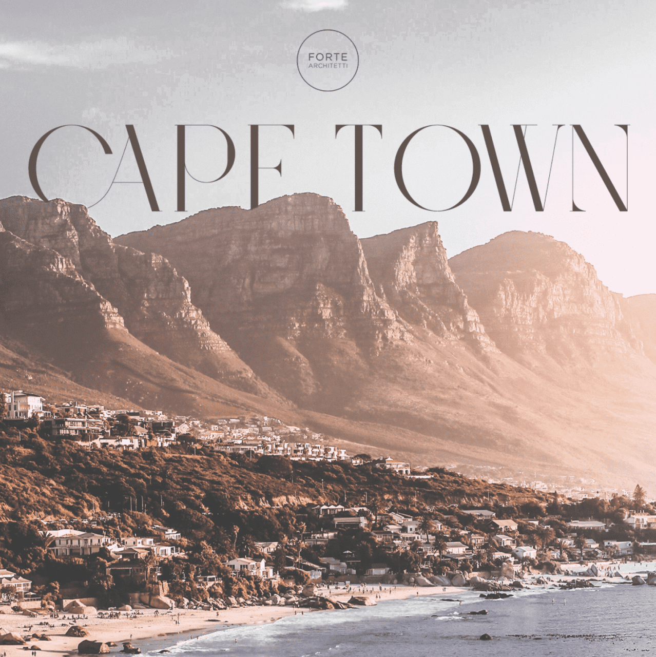
Forte Architetti is an internationally-acclaimed architectural firm, comprising architects, landscape designers, engineers, and interior designers.
The firm handles a wide range of projects, from urban planning to landscaping, residential to commercial buildings, and interior to furniture design. They employ strategic design thinking for both small and large-scale projects, offering feasibility studies, full architectural and planning services, site management, supervision, and various problem-solving techniques.
THE CHALLENGE
The client expressed a desire to conduct a comprehensive review of their website with the aim of enhancing communication regarding their projects and their presence in various countries. Specifically, the client tasked us with targeting South African and Nigerian high net worth individuals, given that these two countries are the most significant in terms of the client’s revenue and opportunities.
We developed a benchmark by studying U.S. luxury real estate communication methods as a model for our target countries. We incorporated Italian design aesthetics to engage our audience and compete with international design studios. Our research revealed a key insight: architectural firms often communicate internally, neglecting their intended audience, which hinders effective client engagement and issue resolution.
DESIGN direction
Based on the insights gained by our research, we adopted a customer-centric strategy, aiming to vividly narrate the stories behind the studio’s projects and how they meet clients’ needs and aspirations. We introduced a fresh creative concept called “Behind the House,” a creative concept spotlighting clients and all aspects of the projects – an approach that’s in stark contrast to the conventional communication style of architectural studios.
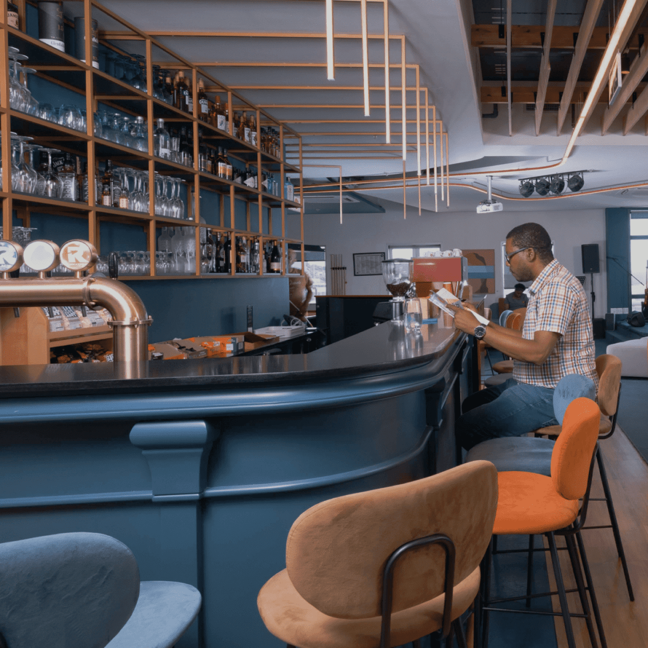
Our goal was to connect users with our projects. To achieve this, we adopted an editorial approach that bridges the gap between an interior magazine and an architectural studio, offering users an immersive narrative experience of Forte Architetti’s work.
website
We designed a website that offers a dynamic, engaging user experience, using subtle animations to introduce primary photo-text content. This approach was chosen to create an editorial experience that aligns with the storytelling aspect of the studio’s projects.
Our art direction used cool, dark colors against bright optical white, and a large serif font for headlines, mirroring the aesthetic of a luxury architecture magazine. The website showcases the studio’s projects, team, and operational methods, presenting them as a collection of narratives that challenge the traditional approach of a typical showcase website.
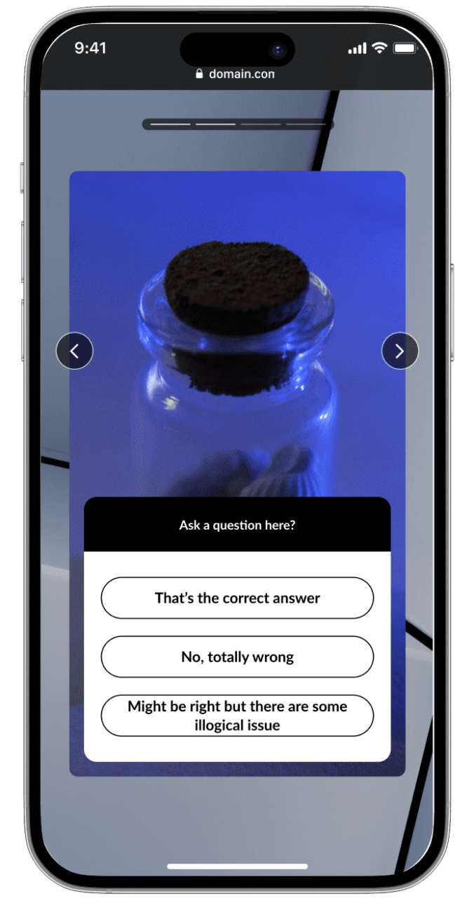
GS1 standards are the most widely used system of standards in the world, and they offer a broad portfolio of services and tools to make adoption of their standards easier and more impactful to businesses.
the challEnge
The challenge was to create an immersive experience in their showroom, Interno1, using large touchscreen monitors.
The aim was to present GS1 standards and information for retail products through an engaging, interactive experience, demonstrating how GS1 enhances supply chain efficiency and effectiveness through their software and services.
Our Approach
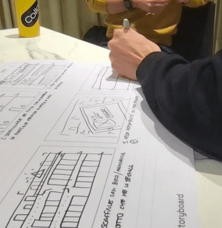
We began by analyzing the client’s content, then hand-illustrated individual storyboards to define the experience and storytelling.
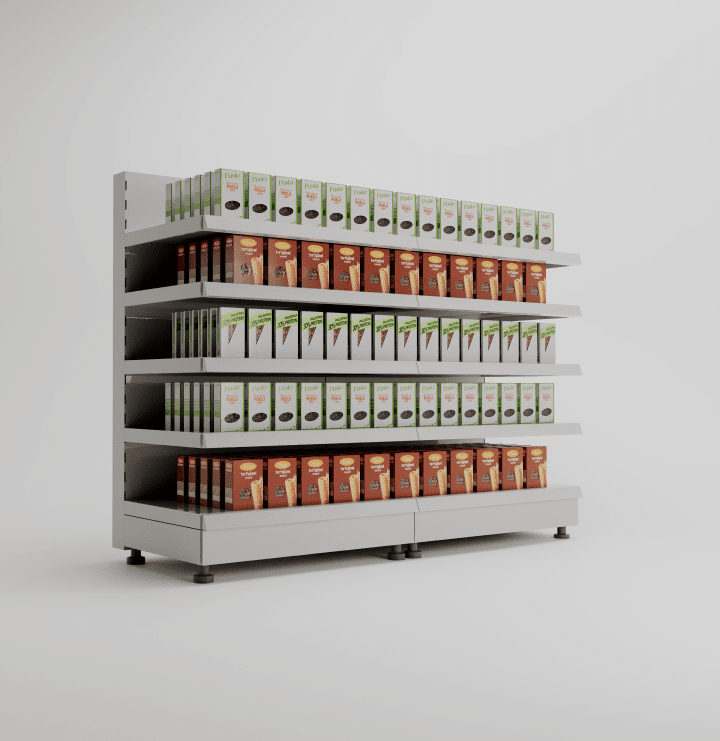
We identified a “starting point” from which we could tell all the necessary stories: a supermarket shelf.
We then created 3D models of the individual products and the shelf for storytelling reference, aligning the look and feel with GS1 Italy’s brand image.
results
We developed a web app using WebGL technology, capable of conveying information and best practices in large-scale distribution product supply chains, and how GS1 Italy’s services ensure accurate product information, satisfying all lifecycle requirements within the supply chain.
This allows the client to discuss highly technical topics like product pack information and management with their customers in an engaging and interactive way.
Reload S.r.l. is an Italian tech company that aims to transform the business challenges of their client into innovative solutions
They are a digital boutique that support businesses through the process of digital transformation. They operate to speed up the transformation of complex business processes with scalable and innovative digital services and products, giving users the best support to optimize their activities.
THE CHALLENGE
They contacted us to refresh and restyle their branding that was felt by the whole team as something static and not representative of the state-of-the-art tech developing and integration skills they have.
Our goal was to transform the perception of Reload S.r.l. into a 2020
technology company. The challenge was to create something fresh and corporate at the
same time and to have a pretty reliable identity to communicate but maintaining the
original loading icon concept.
Old logo
New logo
CREATIVE DIRECTION
We imagined a new way to define the loading icon with a modern approach. We started adding movement to the GRTSK Peta Grotesque, creating a completely new typography that starts from a single point and defines each letter with a smooth and round movement.
To give even more strength to the concept and a modern and digital treatment to the letters, we used a shade of vibrant pink degrading to electrical blue that illuminates the tip of the letter and resembles the typical loading spinners effect.
WEBSITE
For the website, one of the biggest issues was the lack of images by the brand that prefers not to expose works for the privacy of their clients. We implemented best website design rules
to imagined a way to communicate concepts through conceptual lines and shapes made by our pink/blue gradient in order to give movement and an abstract sensation to communicate visually.
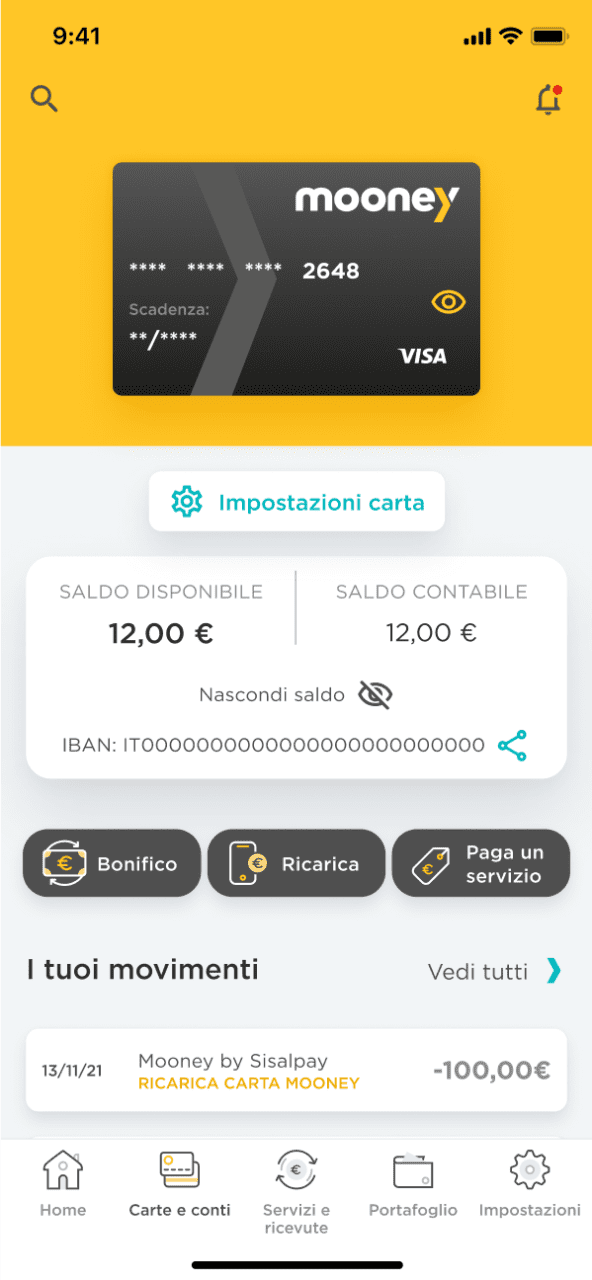
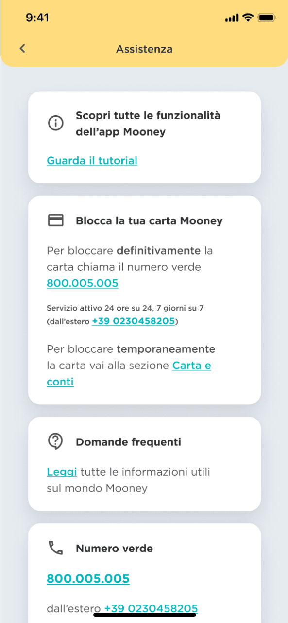
Mooney is the first Proximity Banking & Payments company in Italy which has inherited the
experience of SisalPay and Banca 5 (Intesa Sanpaolo Group).
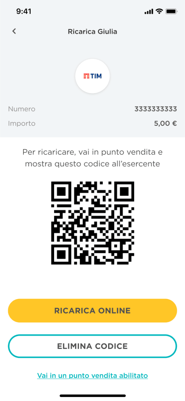
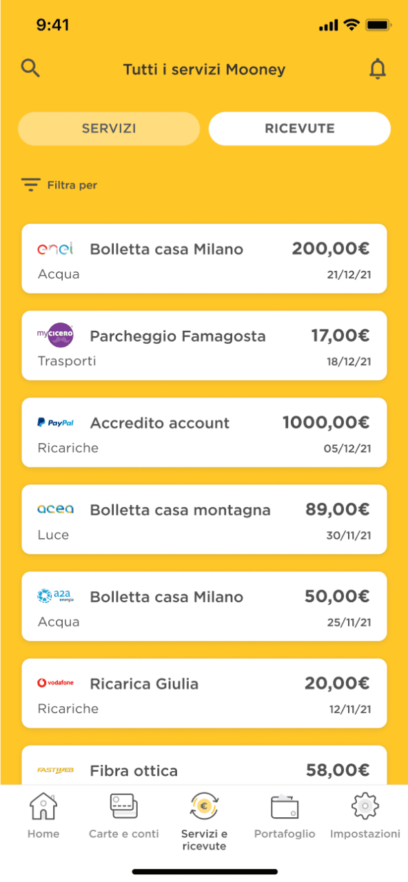
Thanks to its extensive network of over 45.000 points of sale throughout Italy that are fully integrated with the digital ecosystem, Mooney plays an important social role in providing consumers with a simple, quick and easy access to a wide range of payment solutions, namely bills, prepaid cards, telephone recharge cards as well as facilities such as cash withdrawals, wire transfers and payment orders, formerly possible only through banks.
THE CHALLENGE
Mooney decided to renovate its mobile app identity by choosing a fresher mood able to represent the clarity smartness and simplicity of the functionalities offered through their digital channels.
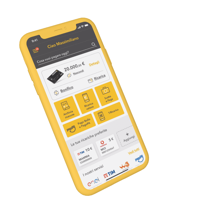
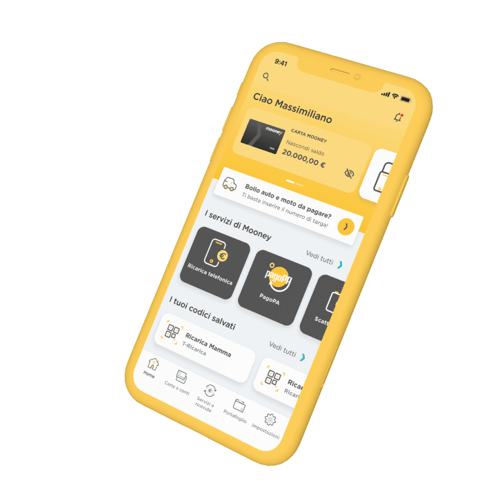
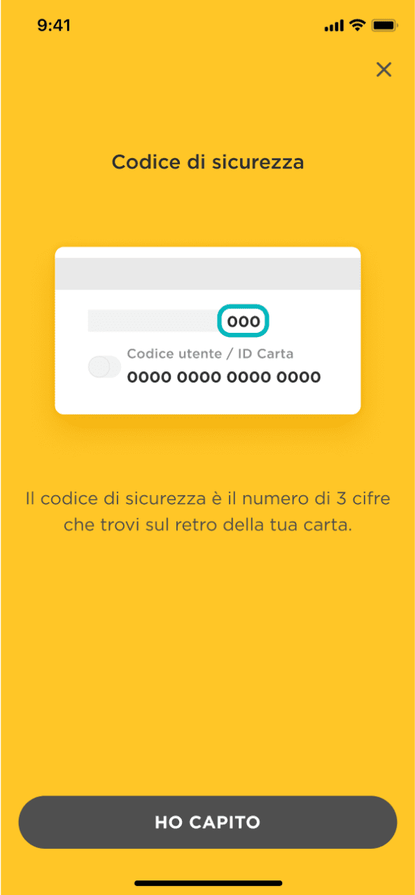
Collaborating with Mooney Design Studio, we redesigned the app interface, where customer has access to all personal and payment services, using up to 6 payment methods, including the Mooney prepaid card. The challenge was to create a virtual environment that was fresh and institutional at the same time, able to fit both existing flows and the latest services introduced.
Old homepage
New homepage
CREATIVE DIRECTION
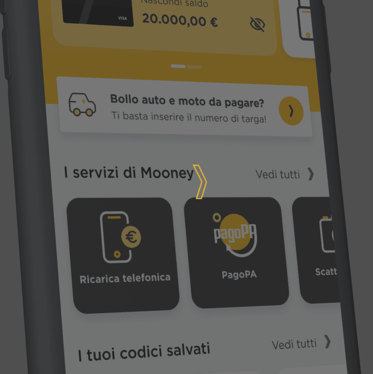
Starting from the concept of the new brand identity and the app user experience, we created the UI design system of the new Mooney app.
Our first task was to choose the newest features and assets introduced into the UX, giving them the right relevance in the UI and making them appealing for the customers. Afterwards, we developed the other components applying the same logic of attractiveness and functionality and considering each element not as a separate unit but as a whole within the page.
RESULT
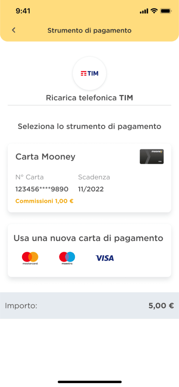
Through the new app, we shaped a human and smart experience that make customers feel like if someone is taking care of them step by step.
We placed modern animated illustrations in key points of the digital flows, such as the end of a transaction or tutorials to involve users during their daily usage. Our creative direction definitely contributed in achieving Mooney’s business goals in 2021.
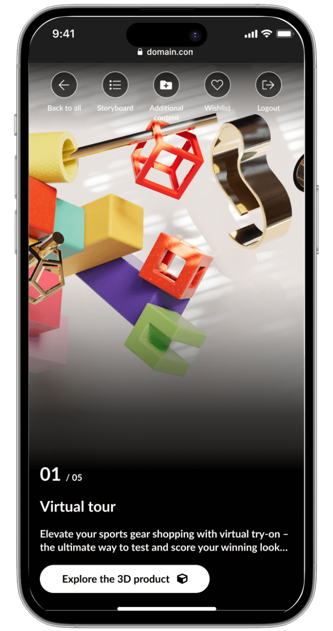
Brandoh! is a digital storytelling platform created and developed by Reload S.r.l.
Brandoh! is designed for brands to deliver content innovatively. It serves as a creative playground for both companies and creatives to convey meaningful messages and reach their target audience.
THE CHALLENGE
Reload initially launched Brandoh! to create tailor-made narrative experiences for multiple brands like Timberland, Valentino, Barilla and many more through a meticulous consulting process. Starting from the specific communication goal, they select “elements” to compose ad hoc storyboards.
The goal was to evolve Brandoh! into an online no-code platform accessible to content creators, transforming it into a stage for everyone in the ever-evolving narrative of the digital age.
APPROACH
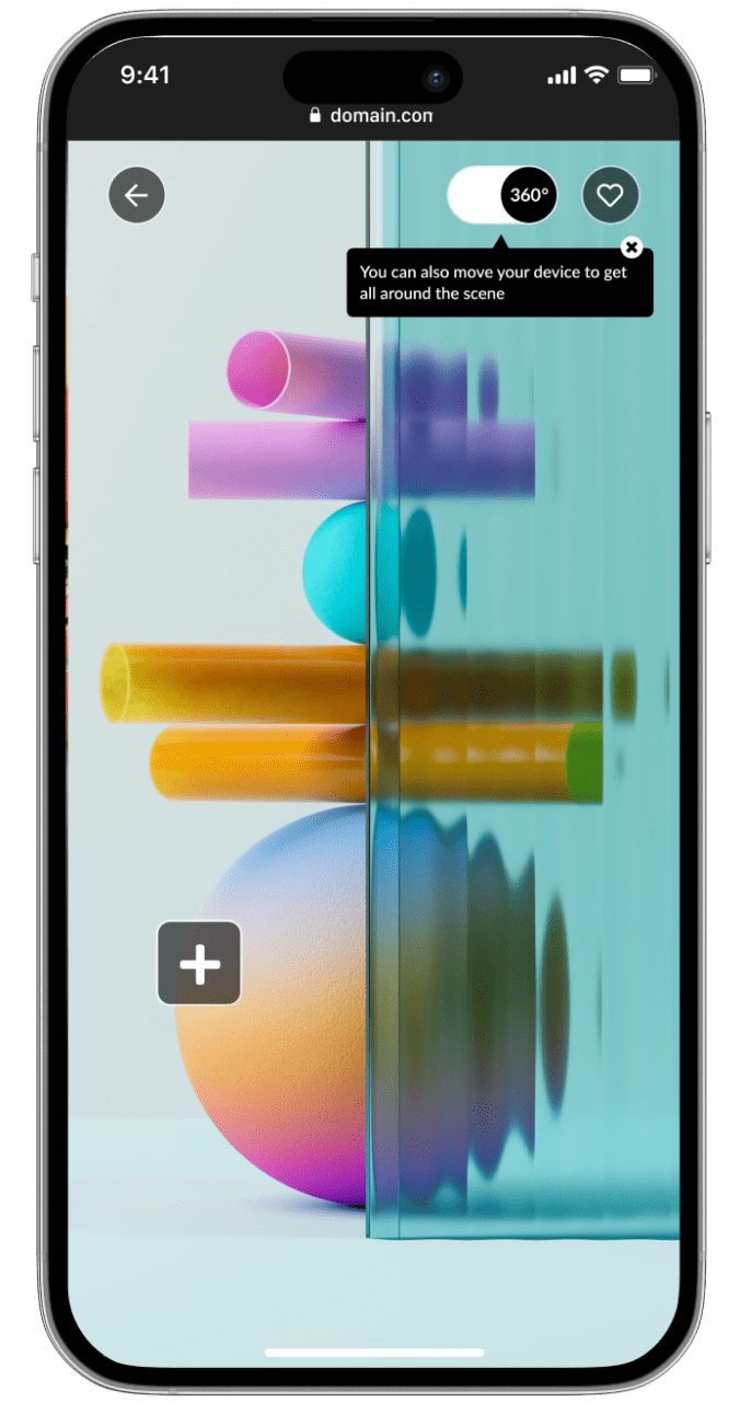
We were already responsible for the frontend platform design, which had continually evolved over the years, due to the integration of third-party services such as 3D object and space visualizers.
To tackle this new challenge, we conducted market research to identify new product opportunities that could arise from this new product evolution.
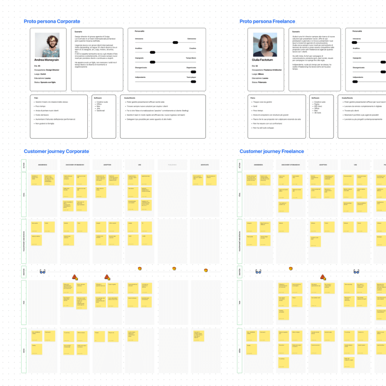
We then shifted our focus to the user experience, holding co-design workshops to create proto personas and user journeys.
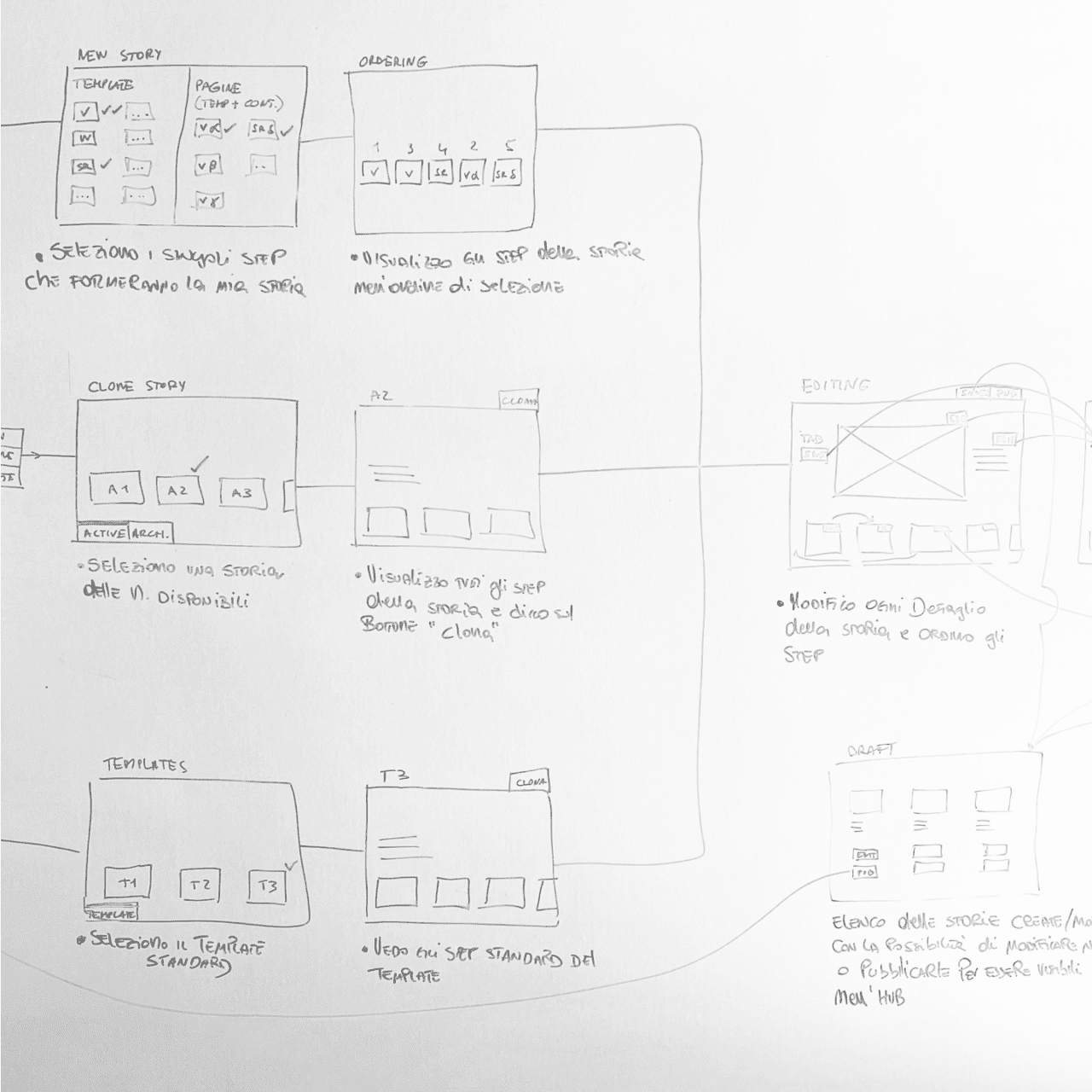
Having defined the taxonomy and main functionalities of the software, we then designed the complete UX for the CMS.
RESULT
We launched the Brandoh! beta with three plans (free, starter, and custom licenses) to quickly gather feedback from existing clients as well as first-time users.
The story-builder software facilitates team collaboration with user profiling, interactive story configuration, and publishing options. The platform is code-free, offers Single-Sign-On authentication, and tracks performance.
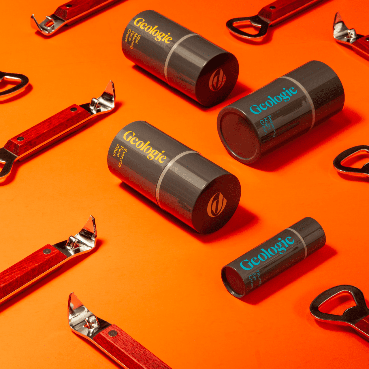
Geologie, a US skincare brand, specializes inpersonalized, subscription-based skincare services.
Geologie was founded by Nick Allen and Dave Skaff, friends and innovators, with a shared vision to offer men the best skincare experience, encompassing top-quality products and exceptional service.
the challEnge
We were asked to improve the overall user experience (UX) in order to better differentiate between single products and bundles, and to highlight the subscription model’s significant discounts. Another focus was improving the private area for customers to renew and manage their subscriptions.
Our challenge was to redesign the Product Listing Page and Product Detail Page UX/UI, making the various sizes, categories, and discounts more visible, and drive users to choose the bundle option. Clarifying the individual product advantages on the PDP was another key objective.
Our Approach
First, we developed two alternative UX designs for the PDP and PLP.
The focus was on enhancing subscription visibility and the different available formats. We also made category selection clearer in the PLP with a sidebar for subcategories.
In terms of aesthetics, we preserved the brand’s color identity while improving product card and bundle content clarity. We also highlighted the product benefits and created a straightforward tool for selecting bundles or individual products.
results
We were able to increase conversions to larger product formats and increase the number of subscription users who did not come from specific campaigns. We also made package contents clearer, boosting retention and reducing service unsubscribes.
Additionally, the new PLP structure allows the brand to expand its product range without redesigning the PLPs and PDPs.
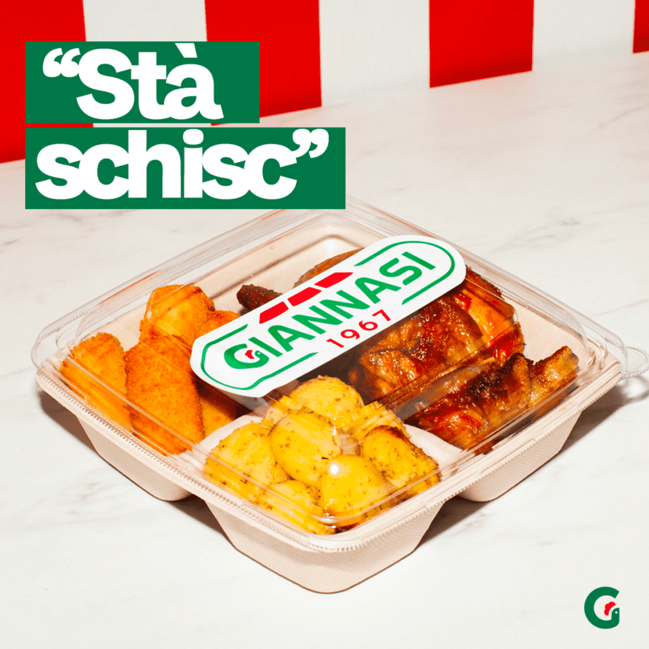
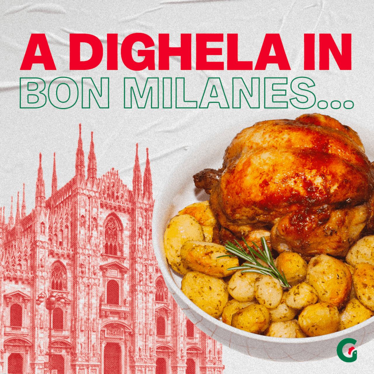
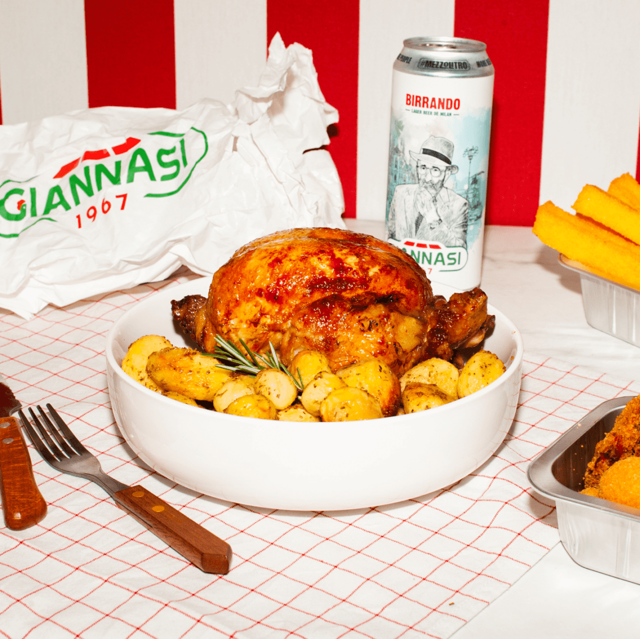
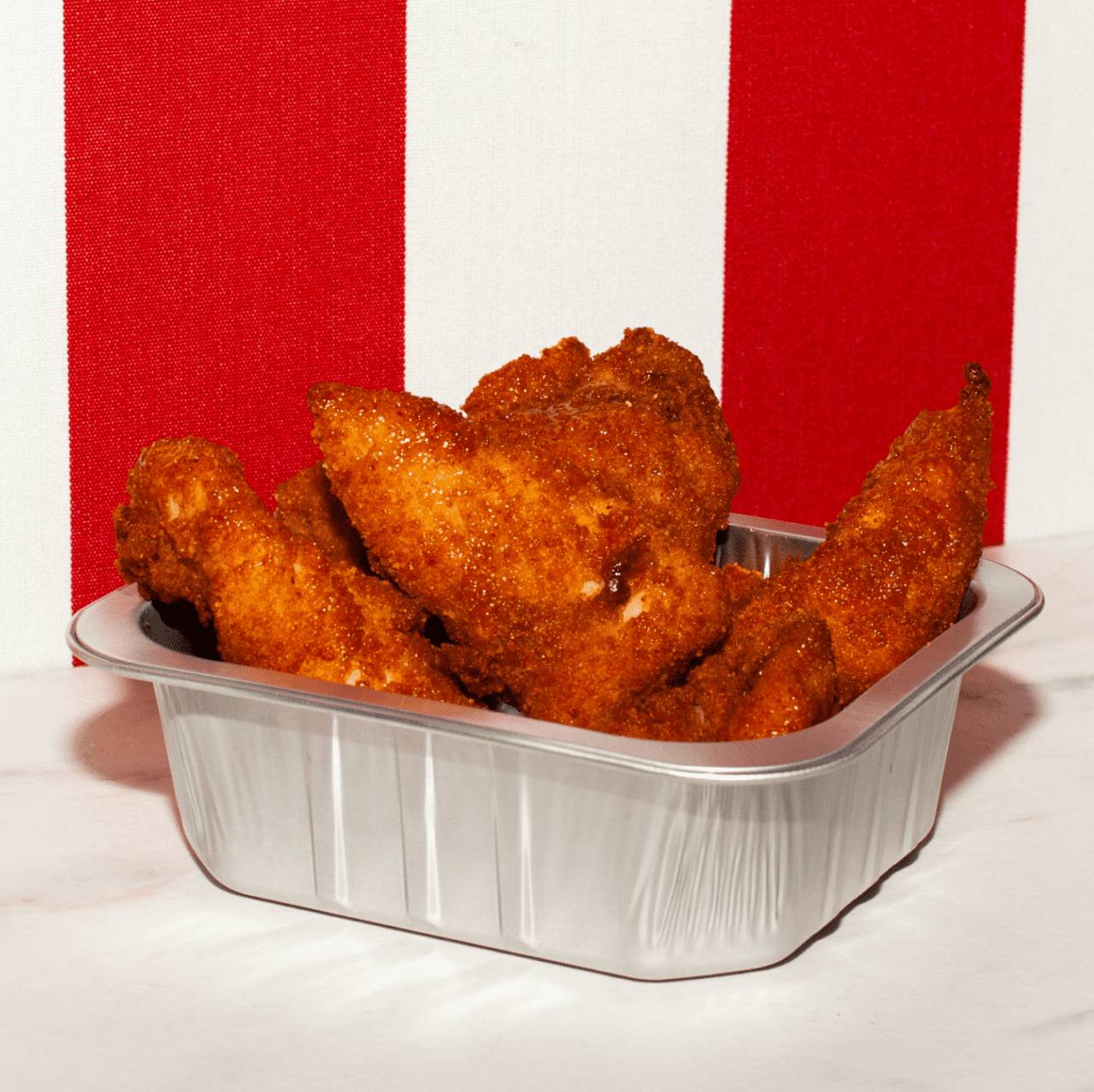
Giannasi 1967 is the historical kiosk of roast chicken in Milan Porta Romana area
Giannasi was founded by Dorando Giannasi in 1967. Started as a butcher became the hot spot of take away food in Milan especially for they freshly roasted chicken and many others traditional dishes.
the challEnge
Giannasi asked our support to change the perception of the kiosk itself going moving forward to a real lifestyle brand, to do that the main request was to increase the fan base and engagment on social pages getting also a new target of users, but at the same time keeping the historical heritage perception of a real Milanese shop.
Our strategy was to increase the brand reputation creating a real lifestyle brand. Giannasi being an iconic “Milanese” shop, we understood from clients that it represents the way to feel yourself a little more “insider” so we created the concept “Giannasi opens the doors of Milan to you.”
actions
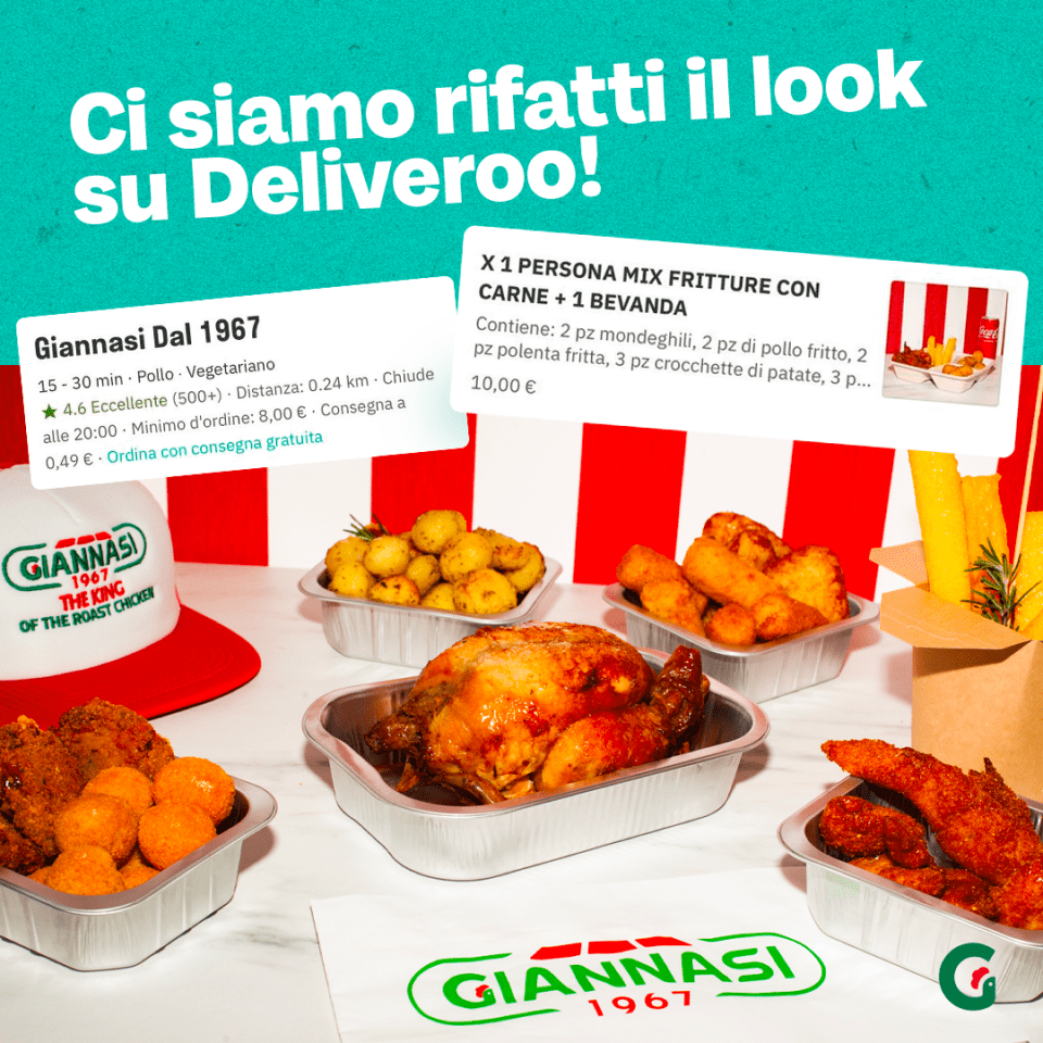
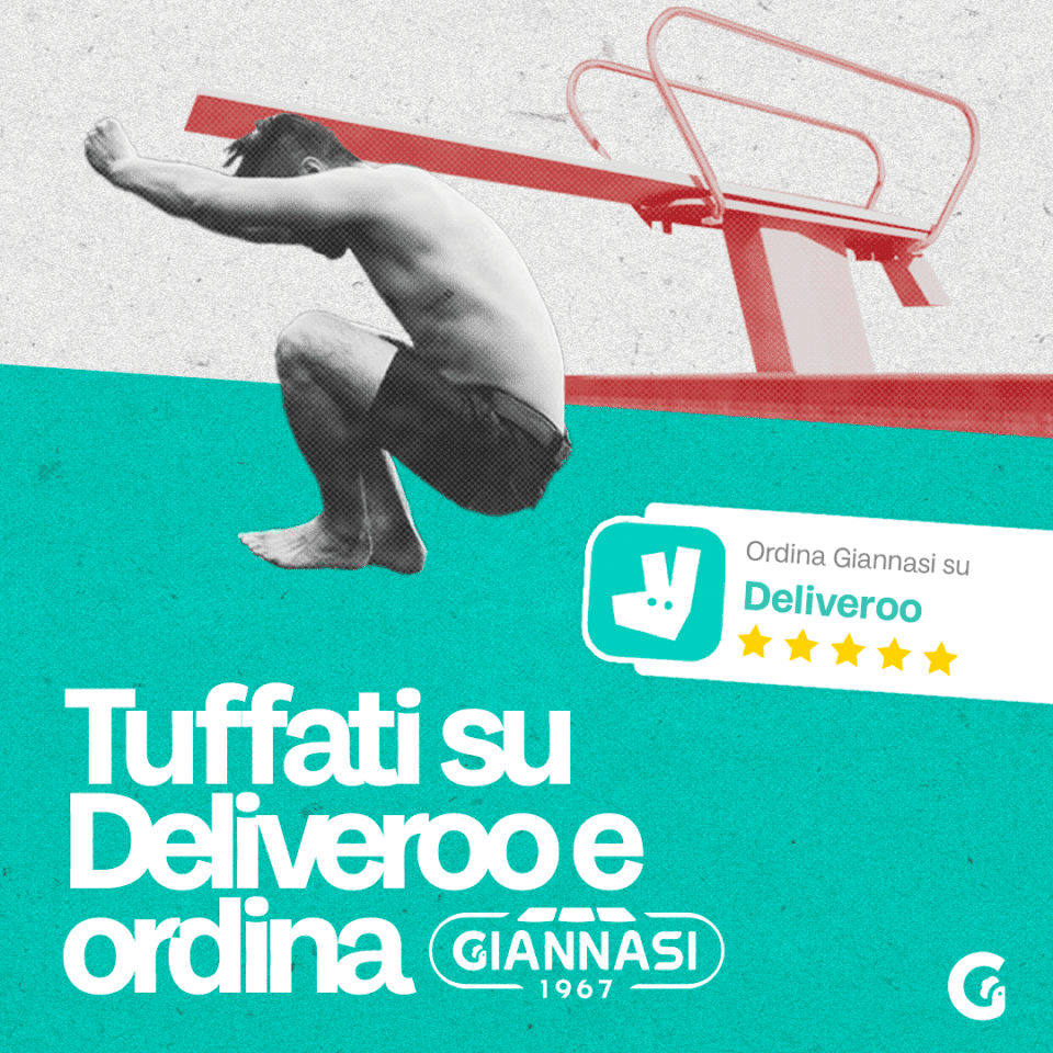
We gave the brand a new creative approach for the Instagram editorial plan, making shoots for the Deliveroo menu, for our customers, and dishes with a “homemade” treatment.
We reinforced the brand’s presence through the creation of limited edition merchandising dedicated to the Milanese areas and the brand. We created the first Milanese festival by offering some traditional dishes made by the brand paired with the craft beer “Birrando La birra di Dorando” gathering occasion for our customers.
results
We had a pretty good result in a year. We grew by +40.3% in terms of followers. 2,096,557 people reached (coverage) 5,364,715 total impressions 5,138 link clicks
In addition, the work done brought us many opportunities for collaboration, we made catering for fashion week, collaborated with Family First (A milanese fashion brand) created an event with Ceres “street legends” thanks to the new positioning and collaborated for the merchandising of Fedez and JAx Love Mi concert.
Today Giannasi is no longer a kiosk but has become a real Love Brand.
Costa dei Rosmarini is a brand of excellence, chosen by the most prestigious hotels in Italy and by the most renowned gourmet shops in the world.
Costa dei Rosmarini was born in 1995 as a family project, the olive grove was put back in order, starting a limited production of rare quality extra virgin olive oil for haute cuisine and gourmets. The first customer was the Hotel Cipriani in Venice. Since then, other prestigious names and famous chefs have decided to buy the oil.
THE CHALLENGE
The company after a period of inactivity was taken over by new partners.
The desire was to have a website able to communicate with customers as the present one is dated and not aligned with a 2020 site.
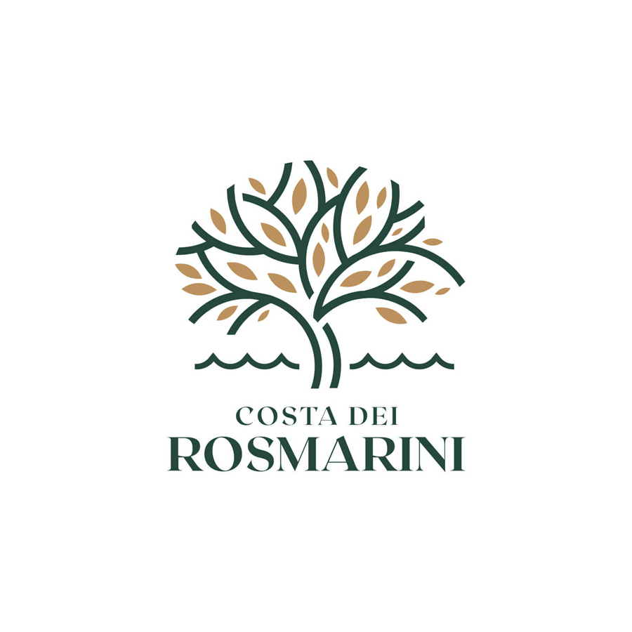
At this point, picking up the need, we proposed to the customer to face a complete rebranding. This, because the high quality of the product was not reflected in the brand image. The logo and the bottle itself did not give the impression of a premium and luxury product.
Old logo
New logo
CREATIVE DIRECTION
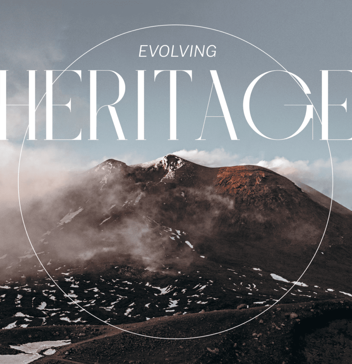
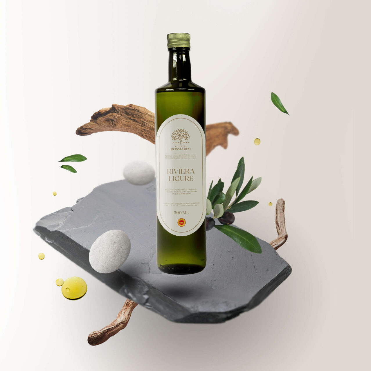
This oil is characterized by an incredible aroma and taste of fresh olives, which pervades the senses like a perfume. We, therefore, decided to treat our product just like an essence by depicting the elements and components of the territory that make it so with a “beauty” style. We were inspired by Liguria and its distinctive elements, the pebbles of the stony beaches, the slate of the roofs in the small villages, and the olive essences that produce this oil.
For the logo, we opted for a restyling. We decided to keep in the pictogram the presence of the redesigned olive tree, combined with the stylized element of the sea from the original logo, where a glimpse of the coast was depicted. In this way, we immediately make visible the combination of the olive tree and the water element representative of the Gulf of Tigullio from which the product comes.
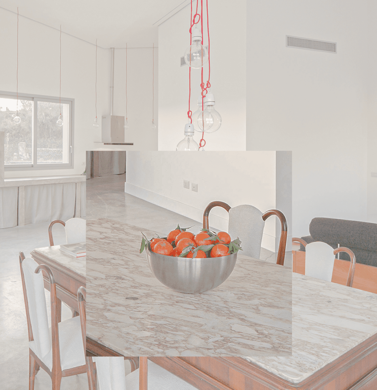
WEBSITE
Through the new site, we wanted to create an elegant and minimal experience that represents the brand through the colors chosen and an authentic photographic treatment that represents the Ligurian territory, and let the true essence of this fragrant oil “breathe” with the current treatment.
The site has been developed in WordPress, preferring large spaces for images and texts, thus giving a feeling of general clarity and geometric elegance.