EssilorLuxottica is a global leader in eyewear, combining expertise in lenses and frames to create innovative vision solutions.
EssilorLuxottica, established in 2018, is a prominent global eyewear conglomerate formed by merger of Essilor, a lens manufacturing expert, and Luxottica, a leading frame designer and retailer.
THE CHALLENGE
Our task was to create a website for EssilorLuxottica that seamlessly integrated the brand’s values and aspirations. Our goal was to establish a visual identity that conveyed a sense of heritage while maintaining a clean and polished look.
We used sleek design elements, elegant typography, and an iridescent color palette to reach the whole spectrum and represent the essence of the brand. The result was a visually captivating website that radiated refinement and exclusivity, ensuring a user-friendly browsing experience.
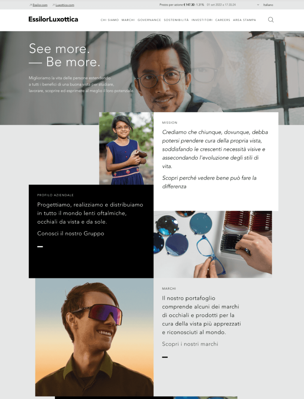
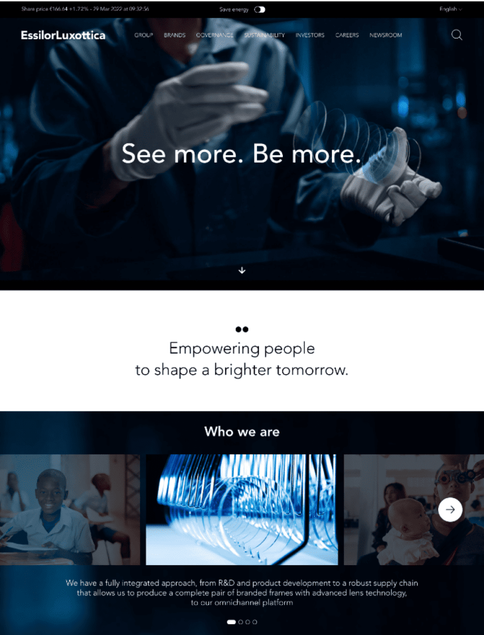
Before
After
CREATIVE DIRECTION
We imagined a new way to define the loading icon with a modern approach. We started adding movement to the GRTSK Peta Grotesque, creating a completely new typography that starts from a single point and defines each letter with a smooth and round movement.
To give even more strength to the concept and a modern and digital treatment to the letters, we used a shade of vibrant pink degrading to electrical blue that illuminates the tip of the letter and resembles the typical loading spinners effect.
RESULTS
We managed to give EssilorLuxottica a distinctive digital branding identity, even though it’s a brand that has to accommodate many others.
We struck an ideal balance between design and identity, ensuring it doesn’t overshadow the other brands while also not getting lost among them. At the same time, the goal was to corporately represent the brand while offering an international scope.
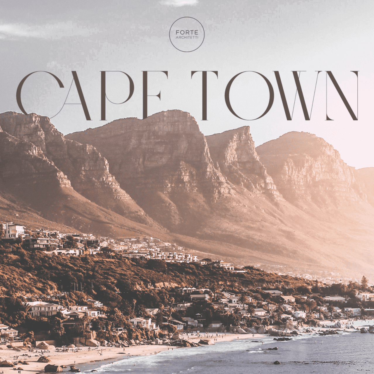
Forte Architetti is an internationally-acclaimed architectural firm, comprising architects, landscape designers, engineers, and interior designers.
The firm handles a wide range of projects, from urban planning to landscaping, residential to commercial buildings, and interior to furniture design. They employ strategic design thinking for both small and large-scale projects, offering feasibility studies, full architectural and planning services, site management, supervision, and various problem-solving techniques.
THE CHALLENGE
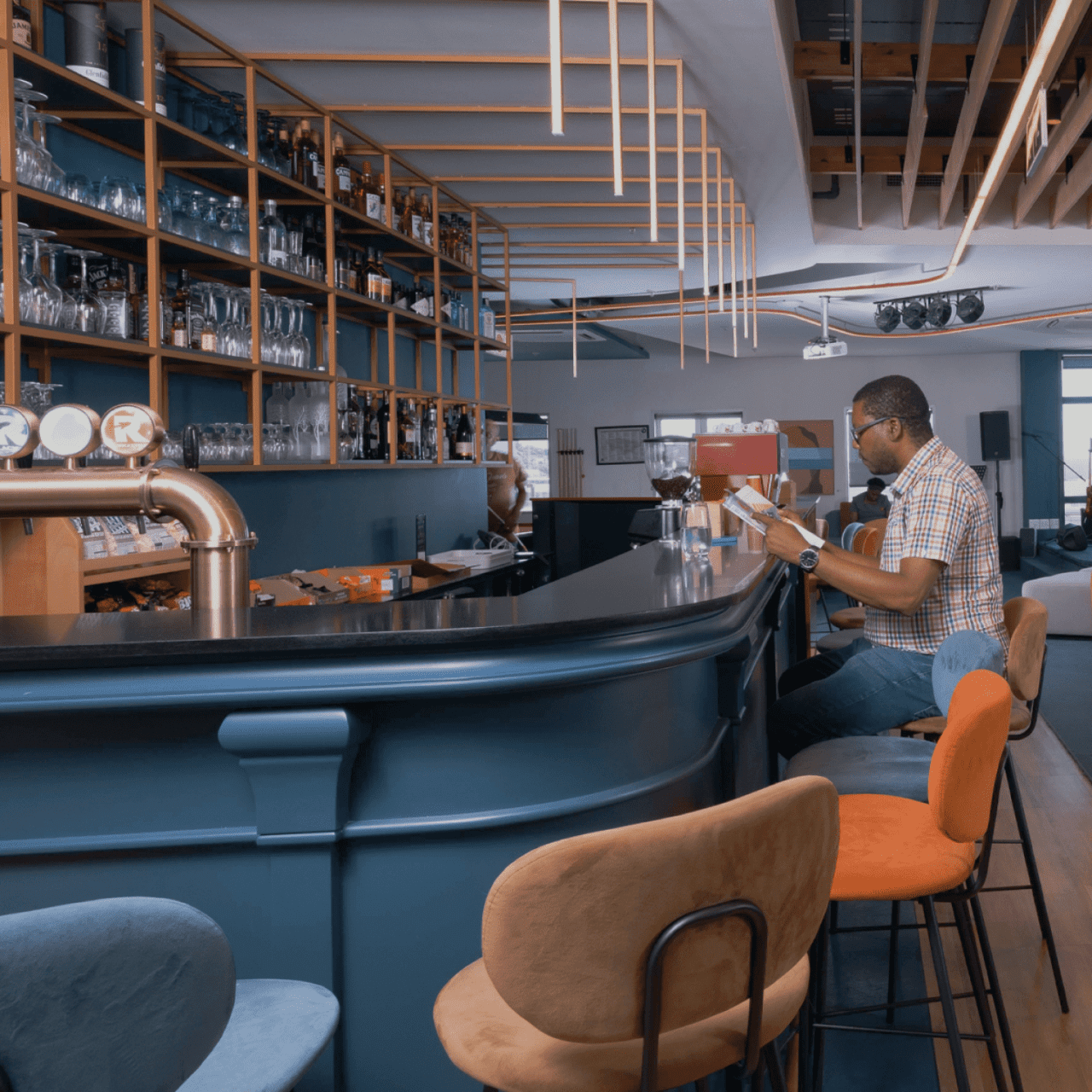
The client expressed a desire to conduct a comprehensive review of their website with the aim of enhancing communication regarding their projects and their presence in various countries. Specifically, the client tasked us with targeting South African and Nigerian high net worth individuals, given that these two countries are the most significant in terms of the client’s revenue and opportunities.
We developed a benchmark by studying U.S. luxury real estate communication methods as a model for our target countries. We incorporated Italian design aesthetics to engage our audience and compete with international design studios. Our research revealed a key insight: architectural firms often communicate internally, neglecting their intended audience, which hinders effective client engagement and issue resolution.
DESIGN direction
Based on the insights gained by our research, we adopted a customer-centric strategy, aiming to vividly narrate the stories behind the studio’s projects and how they meet clients’ needs and aspirations. We introduced a fresh creative concept called “Behind the House,” a creative concept spotlighting clients and all aspects of the projects – an approach that’s in stark contrast to the conventional communication style of architectural studios.
Our goal was to connect users with our projects. To achieve this, we adopted an editorial approach that bridges the gap between an interior magazine and an architectural studio, offering users an immersive narrative experience of Forte Architetti’s work.
website
We designed a website that offers a dynamic, engaging user experience, using subtle animations to introduce primary photo-text content. This approach was chosen to create an editorial experience that aligns with the storytelling aspect of the studio’s projects.
Our art direction used cool, dark colors against bright optical white, and a large serif font for headlines, mirroring the aesthetic of a luxury architecture magazine. The website showcases the studio’s projects, team, and operational methods, presenting them as a collection of narratives that challenge the traditional approach of a typical showcase website.
Brandoh! is a digital storytelling platform created and developed by Reload S.r.l.
Brandoh! is designed for brands to deliver content innovatively. It serves as a creative playground for both companies and creatives to convey meaningful messages and reach their target audience.
THE CHALLENGE
Reload initially launched Brandoh! to create tailor-made narrative experiences for multiple brands like Timberland, Valentino, Barilla and many more through a meticulous consulting process. Starting from the specific communication goal, they select “elements” to compose ad hoc storyboards.
The goal was to evolve Brandoh! into an online no-code platform accessible to content creators, transforming it into a stage for everyone in the ever-evolving narrative of the digital age.
APPROACH
We were already responsible for the frontend platform design, which had continually evolved over the years, due to the integration of third-party services such as 3D object and space visualizers.
To tackle this new challenge, we conducted market research to identify new product opportunities that could arise from this new product evolution.
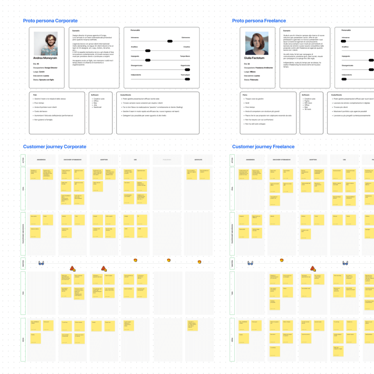
We then shifted our focus to the user experience, holding co-design workshops to create proto personas and user journeys.
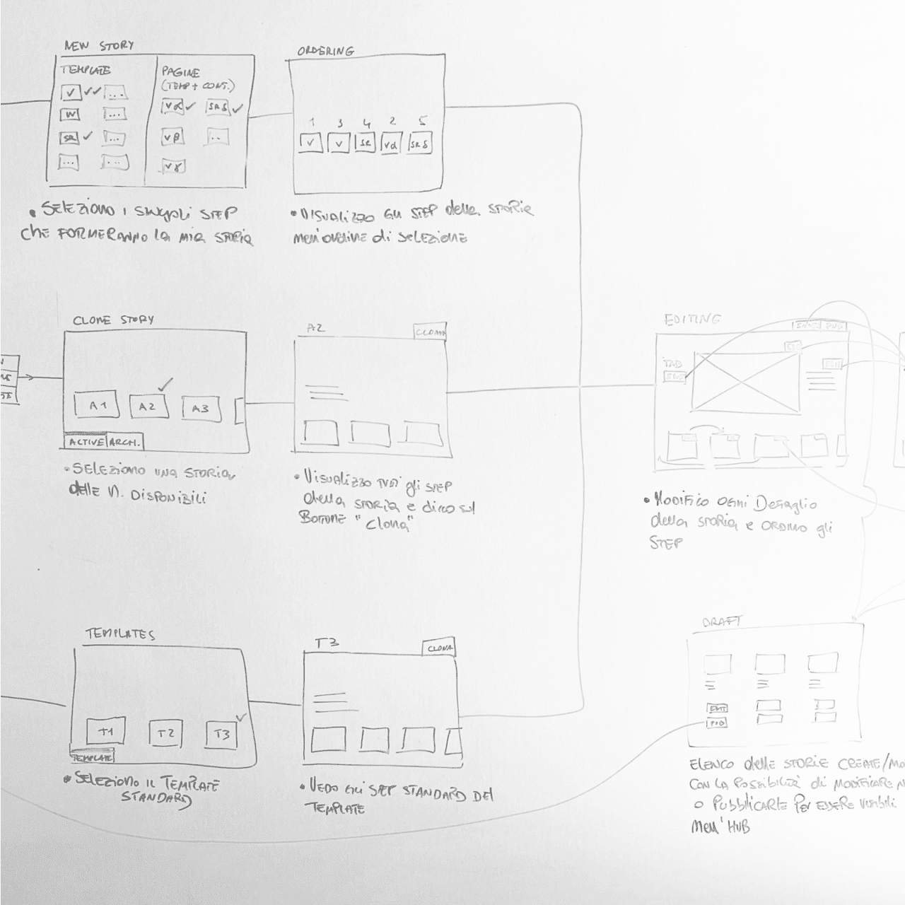
Having defined the taxonomy and main functionalities of the software, we then designed the complete UX for the CMS.
RESULT
We launched the Brandoh! beta with three plans (free, starter, and custom licenses) to quickly gather feedback from existing clients as well as first-time users.
The story-builder software facilitates team collaboration with user profiling, interactive story configuration, and publishing options. The platform is code-free, offers Single-Sign-On authentication, and tracks performance.
Costa dei Rosmarini is a brand of excellence, chosen by the most prestigious hotels in Italy and by the most renowned gourmet shops in the world.
Costa dei Rosmarini was born in 1995 as a family project, the olive grove was put back in order, starting a limited production of rare quality extra virgin olive oil for haute cuisine and gourmets. The first customer was the Hotel Cipriani in Venice. Since then, other prestigious names and famous chefs have decided to buy the oil.
THE CHALLENGE
The company after a period of inactivity was taken over by new partners.
The desire was to have a website able to communicate with customers as the present one is dated and not aligned with a 2020 site.
At this point, picking up the need, we proposed to the customer to face a complete rebranding. This, because the high quality of the product was not reflected in the brand image. The logo and the bottle itself did not give the impression of a premium and luxury product.
Old logo
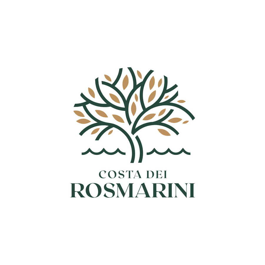
New logo
CREATIVE DIRECTION
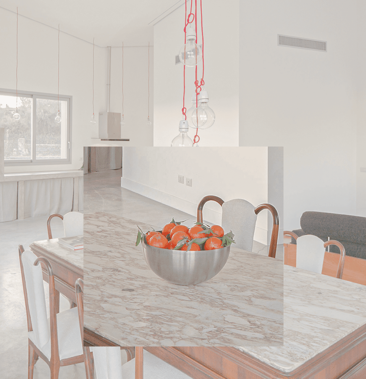
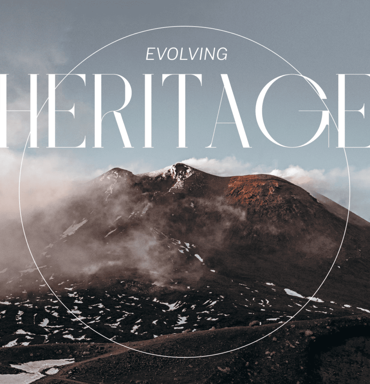
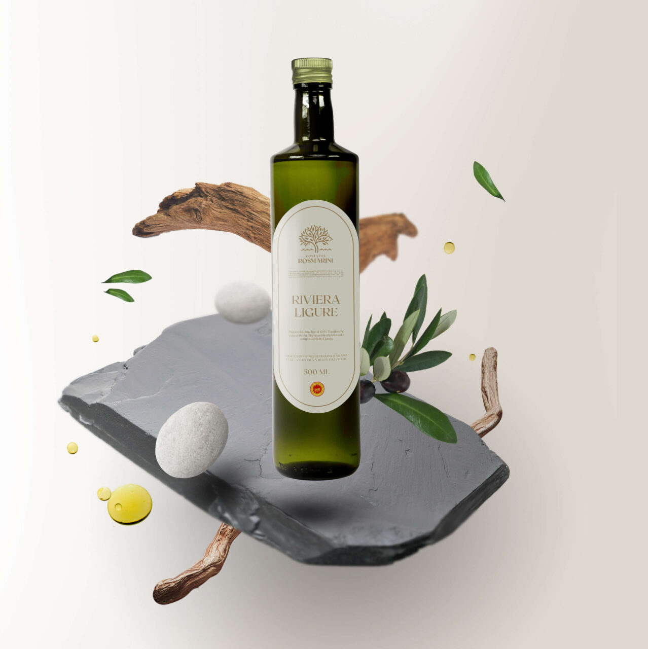
This oil is characterized by an incredible aroma and taste of fresh olives, which pervades the senses like a perfume. We, therefore, decided to treat our product just like an essence by depicting the elements and components of the territory that make it so with a “beauty” style. We were inspired by Liguria and its distinctive elements, the pebbles of the stony beaches, the slate of the roofs in the small villages, and the olive essences that produce this oil.
For the logo, we opted for a restyling. We decided to keep in the pictogram the presence of the redesigned olive tree, combined with the stylized element of the sea from the original logo, where a glimpse of the coast was depicted. In this way, we immediately make visible the combination of the olive tree and the water element representative of the Gulf of Tigullio from which the product comes.
WEBSITE
Through the new site, we wanted to create an elegant and minimal experience that represents the brand through the colors chosen and an authentic photographic treatment that represents the Ligurian territory, and let the true essence of this fragrant oil “breathe” with the current treatment.
The site has been developed in WordPress, preferring large spaces for images and texts, thus giving a feeling of general clarity and geometric elegance.