All Communication is a dominant force in the Italian event landscape, boasting over a decade of expertise in producing large-scale experiences for global icons.
From high-energy public activations to sophisticated corporate storytelling, the agency operates at the intersection of creativity and flawless execution. Our goal was to encapsulate this vast experience into a fresh, "pop" aesthetic that feels both premium and approachable, perfectly aligning with the new core philosophy: All Moments Matter.
THE CHALLENGE
Despite their impressive portfolio, the agency’s visual language had become stagnant. Our mission was to bridge the gap between their extensive legacy and a future-facing identity.
We aimed to evolve ALL Communication from a traditional agency with a discreet presence into a vibrant and versatile creative hub: an identity bold enough to stand on its own, yet flexible enough to integrate with the aesthetic of any international brand they partner with.
APPROACH
The transformation began before a single pixel was moved. We believe that a brand’s visual evolution must be rooted in its core purpose, which is why we kicked off the project with an intensive Design Thinking workshop. This collaborative immersion allowed us to deconstruct a decade of success and identify the emotional triggers that define ALL Communication’s relationship with international brands.
Rather than simply updating a logo, we navigated through the agency’s DNA to define a new strategic positioning. We explored how the concept of “spectacle” has evolved in a hyper-connected world, ensuring that the new identity wouldn’t just be a fresh coat of paint, but a distinctive ecosystem. This strategic foundation allowed us to transition the brand from its historical roots toward a more agile, “pop-versatile” powerhouse.
CREATIVE DIRECTION
The rebranding was a meticulous exercise in distillation. We evolved the historical logo by stripping away the unnecessary, leaving behind a sharp, iconic mark that commands attention. This evolved into a comprehensive visual identity “pop-versatile” system designed to be as loud or as subtle as the project requires.
To ensure the brand feels alive in a digital-first era, we engineered a signature motion language. These custom transitions aren’t just decorative; they provide a rhythmic pulse across digital touchpoints, from high-stakes commercial pitch decks to cinematic video content, ensuring the agency’s energy is felt even before the event begins.
DIGITAL EXPERIENCE
The new digital home for ALL Communication was built to be as immersive as the events they produce. Moving away from the constraints of standard templates, we developed a high-performance custom front-end that prioritizes movement and impact. The interface is defined by fluid animations and a bold UX/UI strategy that mirrors the agency’s new visual energy.
Behind the scenes, we integrated a bespoke, streamlined WordPress back-end, allowing the team to manage their extensive portfolio with ease while maintaining the integrity of a sophisticated, code-driven design.
The result is a digital stage where international brands can see their future events come to life.
RESULTS
The project completely redefined ALL Communication’s ecosystem. By synchronizing the new logo, dynamic motion assets, and a high-performance web platform, we delivered a brand that is finally as loud and clear as the events it creates. Today, our visual system is being deployed across every touchpoint: the custom motion transitions have become the agency’s signature “stacco” for video content, while the social media ensures the consistency and professionalism required for international partnerships.
As part of a major corporate group, All Communication now possesses the prestige and visual weight it deserves. The rebranding hasn’t just refreshed their look; it has re-energized their market position, proving that when the identity is right, the impact is undeniable. All Moments Matter, and now, the brand finally lives up to its promise.
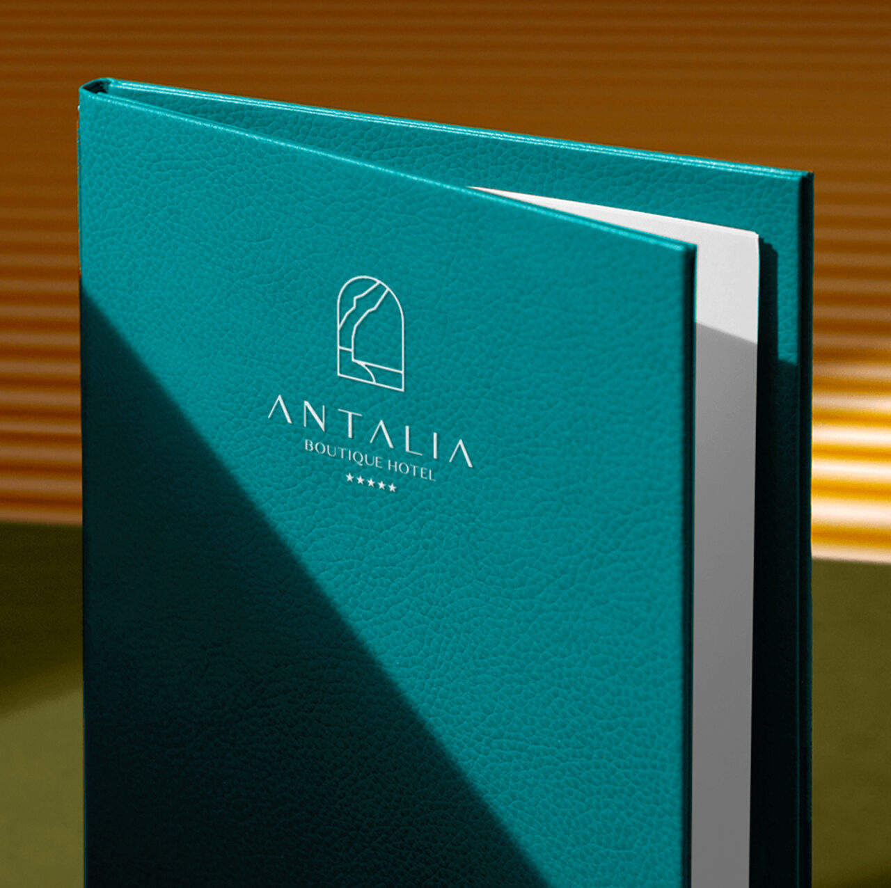
Perched above Montepertuso, Antalia Boutique Hotel embodies luxury, framed by sweeping sea views and Mediterranean serenity.
From brand identity to digital presence, our vision centered on translating tranquility and refined hospitality into an immersive online experience
THE CHALLENGE
Antalia sought a full digital transformation: a website capable of echoing its boutique charm, exclusive amenities, and gastronomic experiences, while communicating prestige without pretension.
The objective: deliver a digital showcase that speaks to discerning travelers and elevates Antalia beyond standard hospitality messaging.
APPROACH
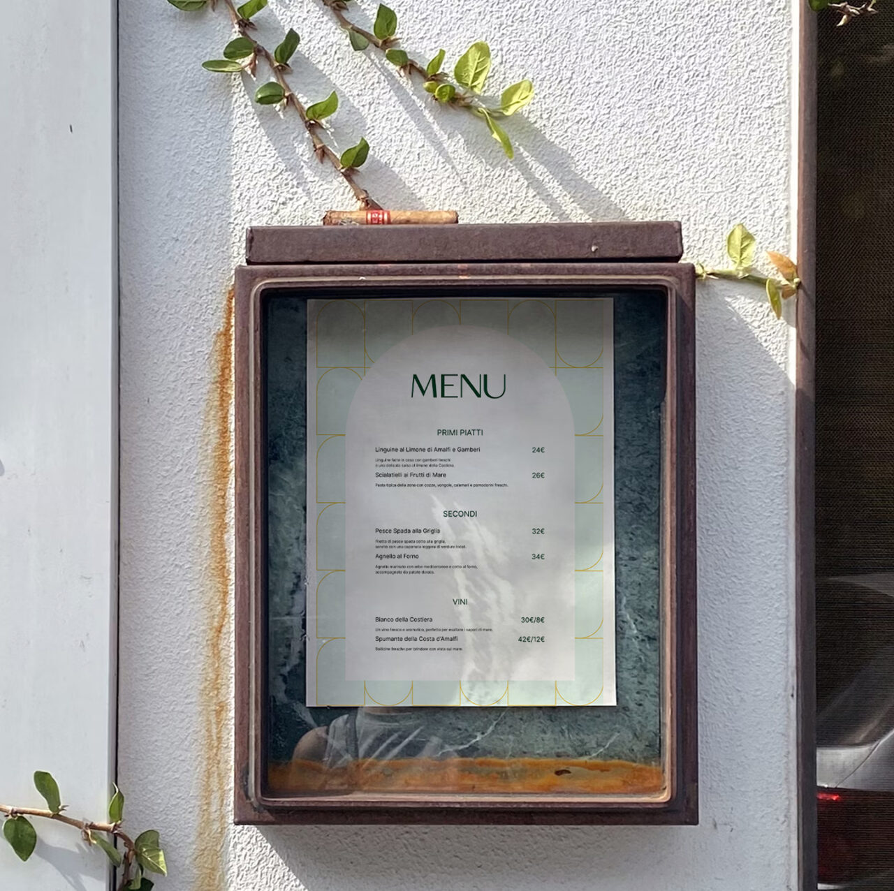
We grounded the project in Antalia’s essence: tranquility, exclusivity, and connection to the Amalfi Coast, crafting a logo that captures the iconic silhouette of Positano. Our narrative arc placed suites, dining, and curated experiences center stage, while voice and visuals reflected Mediterranean refinement.
Content strategy aligned storytelling with SEO, structuring pages around key services: elegant rooms with sea views, gourmet dining experiences (like Chic Mama restaurant and wine tastings), exclusive beach club access, and unique events like the Clicquot picnic or cooking classes
CREATIVE DIRECTION
The visual design reflects Antalia’s identity: clean lines, generous white space, and a palette drawn from Mediterranean tones: sea-blues, white stone, olive, and terracotta.
Typography is elegant and modern, complementing editorial layouts that combine imagery and storytelling. Imagery showcases sea-facing suites, chic bar moments at sunset, and sensory dining experiences, creating a site that feels like a window on Positano’s beauty.
DEVELOPMENT
We implemented a completely responsive front-end, ensuring the site performs beautifully across devices, vital for travelers browsing on mobile from the Amalfi Coast.
A custom CMS empowers the hotel team to update suites, seasons, experiences, and event offerings with ease. Fast load times, smooth animations, and adaptive layout support an experience that mirrors Antalia’s refined hospitality.
All development choices, from image optimization to navigation design, were made to support performance, scalability, and clarity.
RESTAURANT
Adjacent to Antalia Boutique Hotel, Chic Mama offers a dining experience that blends gourmet cuisine with vibrant entertainment on the Amalfi Coast. In creating its visual identity, we maintained a clear connection to Antalia’s brand, reflecting their proximity and shared sense of refinement, while introducing a distinct palette and a touch of playful elegance.
The logo retains the harmony and minimal precision of Antalia’s mark but evolves with warmer, more dynamic tones and subtle decorative accents. This “chic” twist elevates the restaurant’s personality, distinguishing it as a destination for elevated dining and nightlife, yet still part of the Antalia world.
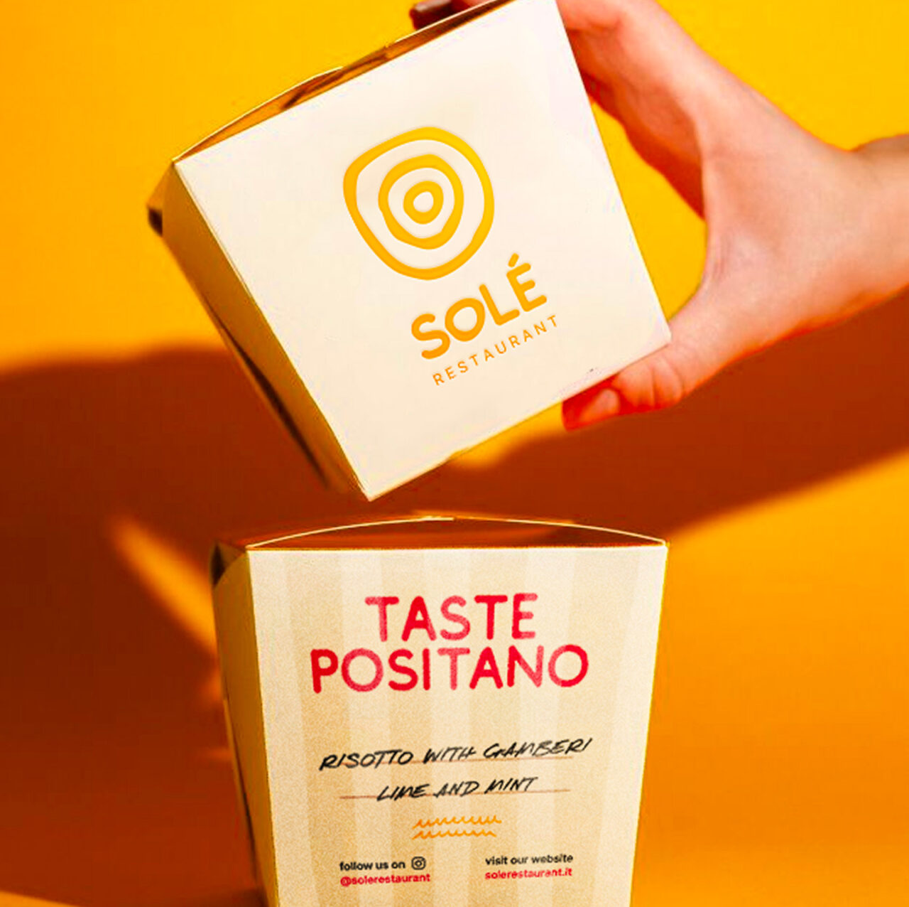
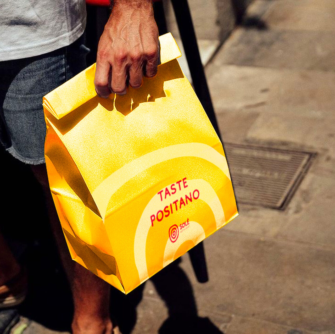
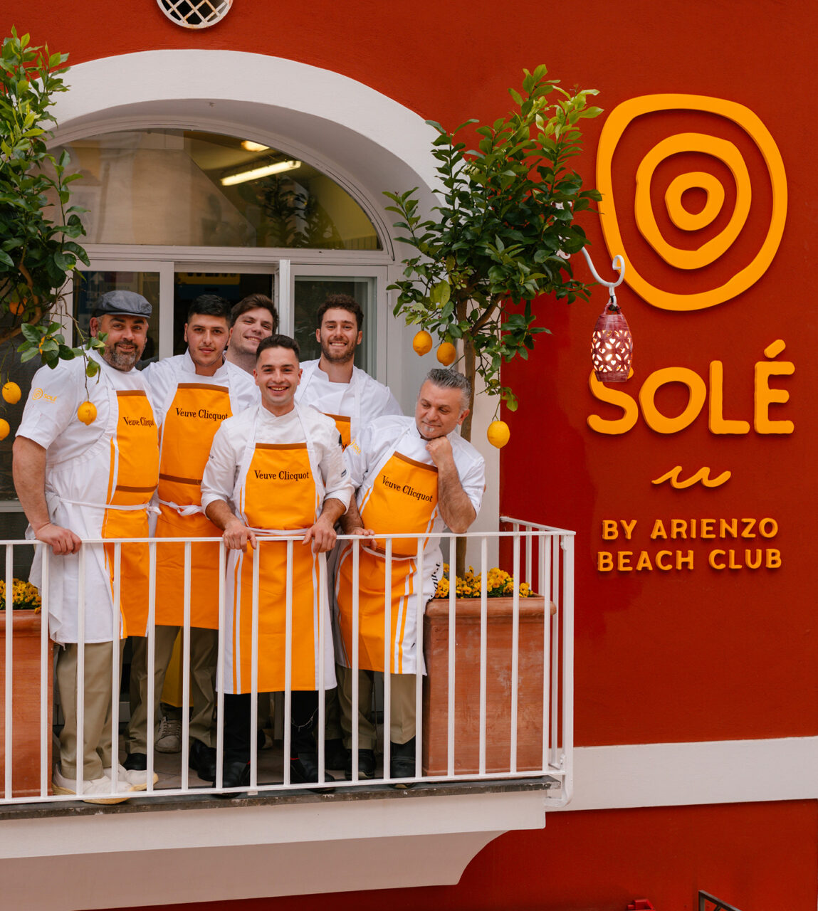
Inspired by the relaxed rhythm of Mediterranean living, Solè reimagines the concept of daytime dining in Positano.
No rush, no rules, just good food and radiant energy from morning to evening. Born from the legacy of Arienzo Beach Club and Veuve Clicquot, Solè is more than a bistrot: it’s a lifestyle ritual made of freedom, flavor, and effortless elegance. A digital identity was needed to reflect all of that, with clarity, depth, and emotion.
THE CHALLENGE
Solè needed to craft its brand from scratch. From logo and storytelling to a complete website that could express its unique experience.
The goal was to turn the Solè vision into a compelling digital presence. We developed a custom web experience that translated the atmosphere of Positano into an intuitive interface. We shaped a voice, a visual identity, and content architecture that made the brand’s values tangible. A system built to inspire bookings and brunch rituals.
APPROACH
We started from the essence of Solè: freedom, light, and spontaneity. We built a narrative framework rooted in place, feeling, and simplicity.
Our process included deep research into the local vibe and target audience, shaping both visuals and copy around the idea of timeless Mediterranean joy. The website was structured to highlight the all-day brunch concept and its vibrant location, in the center of the city. The tone is warm, casual, and international, like the guests themselves.
CREATIVE DIRECTION
We designed Solè to feel like Positano looks at golden hour soft, glowing, and full of possibility. The color palette is drawn from local textures: terracotta, linen, lemon, and sun-bleached stone. Typography is clean yet characterful, echoing signage from vintage coastlines. Layouts are airy and cinematic, balancing editorial storytelling with their clear mood.
From logo to layout, every element was built to elevate Solè into a modern icon of coastal dining. With a digital flavour, but deeply rooted in place of Positano beach.
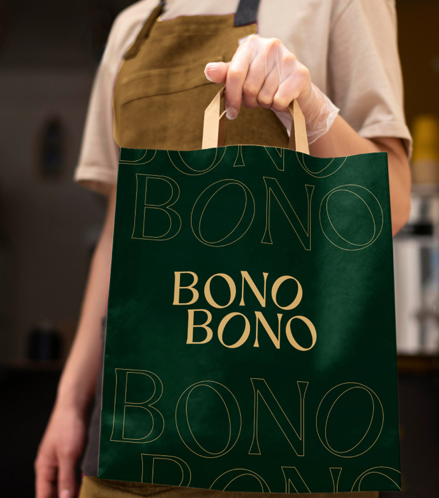
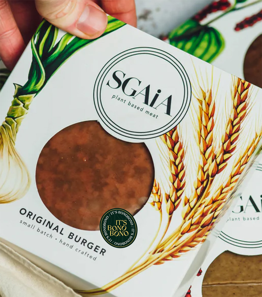
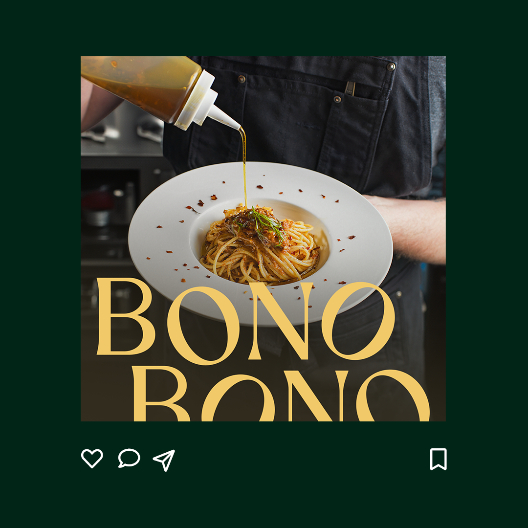
Bonobono is more than a marketplace, it’s a destination for those who seek high-quality vegan food without compromise.
Inspired by Italian culinary traditions, Bonobono curates a selection of artisanal vegan products designed to elevate everyday meals into something extraordinary. By blending authenticity with innovation, the aim is to brings together taste, quality, and conscious living, making premium vegan food accessible across the UK.
THE CHALLENGE
The challenge was to craft a brand and digital experience that captured both vegan food lovers and vegan curious.
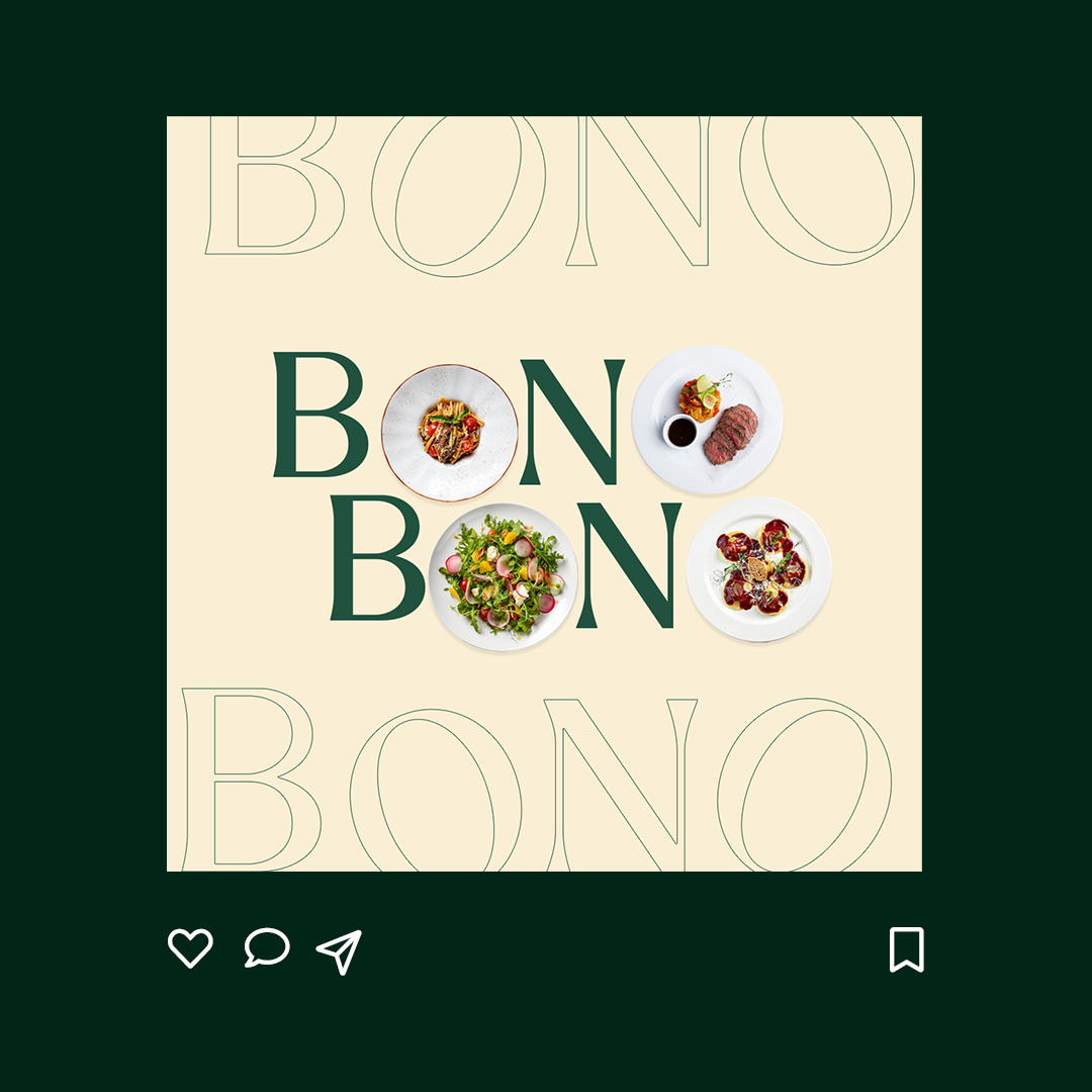
We started by shaping a strong visual identity, developing a logo, a fresh color palette, a distinctive typography system, to create a brand that felt both sophisticated and inviting.
The selected proposal balances premium culinary heritage with a modern and vibrant personality. Especially within digital tools the overall look and feel resonates with Bonobono’s vision, that of providing the highest quality artisanal plant-based produce available through an engaging user experience.
approach
To bring this vision to life, we designed and built a custom Shopify e-commerce platform tailored to brand’s audience. We conducted extensive benchmark research to gain insights into existing vegan marketplaces targeting the UK market. At the same time, we analyzed multiple Shopify themes to identify the best fit for BonoBono’s needs.
Beyond theme selection, we carefully assessed and integrated plugins that enhanced functionality while developing custom solutions where needed. This ensured a frictionless shopping journey, from intuitive navigation to seamless checkout.
RESULT
The result is a Shopify e-commerce platform that goes beyond transactions, creating a digital space where customers can fully immerse themselves in Bonobono’s world, to explore and discover a new dining philosophy.
We carefully balanced functionality and storytelling, ensuring that customers don’t just browse but experience brand’s commitment to high-quality vegan food.
Brandoh! redefines presentation engagement by converting static slides into dynamic, interactive experiences.
Its drag-and-drop editor allows users to create engaging stories, personalizing content for lasting impact. This tool goes beyond regular presentations, engaging audiences deeply and making storytelling in presentations more immersive.
Before
After
THE CHALLENGE
The challenge was reinventing Brandoh!’s identity to resonate with audiences seeking innovative presentation tools. We revamped its digital presence and offline representation, enhancing the dynamic appeal through gadgets and products.
This redesign aimed to create an eye-catching identity that piques the curiosity of people looking for a more visually appealing tool.
The video
We produced an intuitive video illustrating Brandoh!’s functionalities. This visual representation effectively differentiated it from traditional presentation methods, ensuring a clear and straightforward understanding of its unique capabilities.
The video positioned Brandoh! as an innovative, user-friendly solution for captivating and impactful presentations.
website
We designed an informative landing page detailing Brandoh!’s core features. This platform serves as an educational hub, showcasing how users can enhance presentations by seamlessly integrating enriched content elements.
The landing page blends brand content with tool functionalities, offering a comprehensive understanding of Brandoh!’s capabilities.
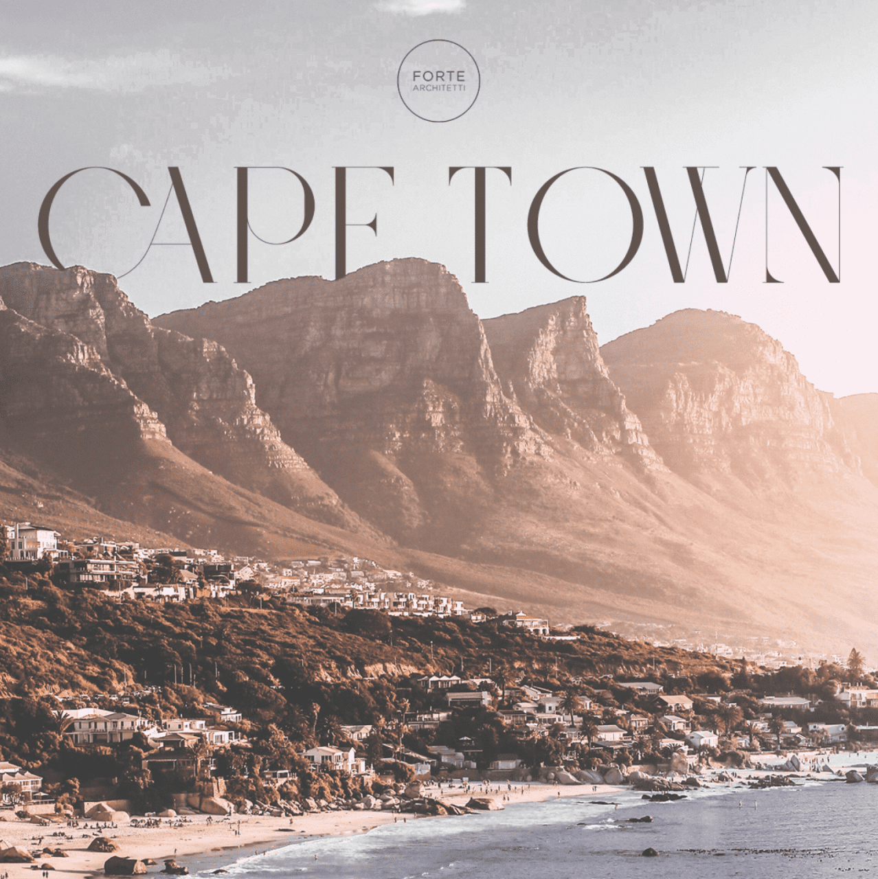
Forte Architetti is an internationally-acclaimed architectural firm, comprising architects, landscape designers, engineers, and interior designers.
The firm handles a wide range of projects, from urban planning to landscaping, residential to commercial buildings, and interior to furniture design. They employ strategic design thinking for both small and large-scale projects, offering feasibility studies, full architectural and planning services, site management, supervision, and various problem-solving techniques.
THE CHALLENGE
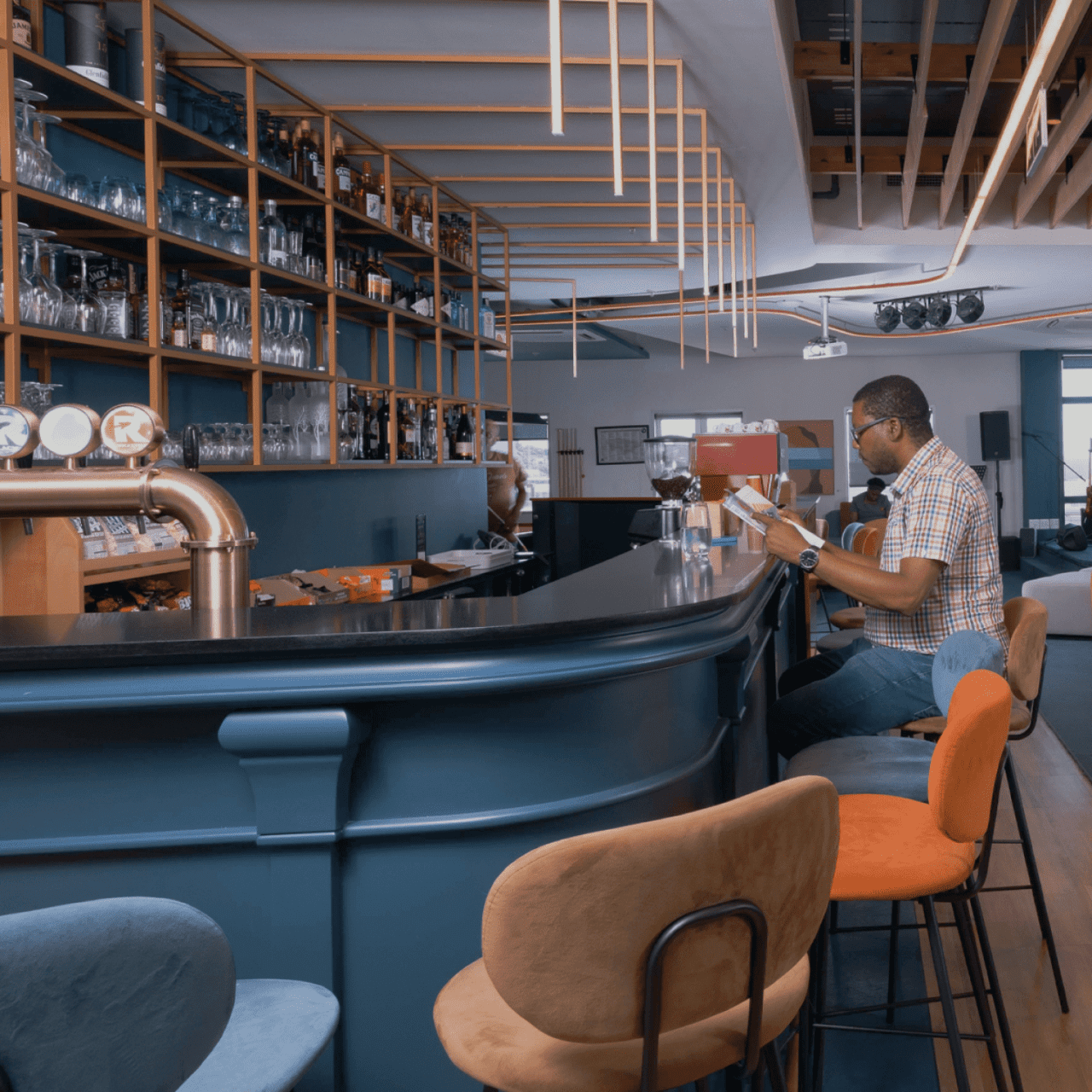
The client expressed a desire to conduct a comprehensive review of their website with the aim of enhancing communication regarding their projects and their presence in various countries. Specifically, the client tasked us with targeting South African and Nigerian high net worth individuals, given that these two countries are the most significant in terms of the client’s revenue and opportunities.
We developed a benchmark by studying U.S. luxury real estate communication methods as a model for our target countries. We incorporated Italian design aesthetics to engage our audience and compete with international design studios. Our research revealed a key insight: architectural firms often communicate internally, neglecting their intended audience, which hinders effective client engagement and issue resolution.
DESIGN direction
Based on the insights gained by our research, we adopted a customer-centric strategy, aiming to vividly narrate the stories behind the studio’s projects and how they meet clients’ needs and aspirations. We introduced a fresh creative concept called “Behind the House,” a creative concept spotlighting clients and all aspects of the projects – an approach that’s in stark contrast to the conventional communication style of architectural studios.
Our goal was to connect users with our projects. To achieve this, we adopted an editorial approach that bridges the gap between an interior magazine and an architectural studio, offering users an immersive narrative experience of Forte Architetti’s work.
website
We designed a website that offers a dynamic, engaging user experience, using subtle animations to introduce primary photo-text content. This approach was chosen to create an editorial experience that aligns with the storytelling aspect of the studio’s projects.
Our art direction used cool, dark colors against bright optical white, and a large serif font for headlines, mirroring the aesthetic of a luxury architecture magazine. The website showcases the studio’s projects, team, and operational methods, presenting them as a collection of narratives that challenge the traditional approach of a typical showcase website.
Reload S.r.l. is an Italian tech company that aims to transform the business challenges of their client into innovative solutions
They are a digital boutique that support businesses through the process of digital transformation. They operate to speed up the transformation of complex business processes with scalable and innovative digital services and products, giving users the best support to optimize their activities.
THE CHALLENGE
They contacted us to refresh and restyle their branding that was felt by the whole team as something static and not representative of the state-of-the-art tech developing and integration skills they have.
Our goal was to transform the perception of Reload S.r.l. into a 2020
technology company. The challenge was to create something fresh and corporate at the
same time and to have a pretty reliable identity to communicate but maintaining the
original loading icon concept.
Old logo
New logo
CREATIVE DIRECTION
We imagined a new way to define the loading icon with a modern approach. We started adding movement to the GRTSK Peta Grotesque, creating a completely new typography that starts from a single point and defines each letter with a smooth and round movement.
To give even more strength to the concept and a modern and digital treatment to the letters, we used a shade of vibrant pink degrading to electrical blue that illuminates the tip of the letter and resembles the typical loading spinners effect.
WEBSITE
For the website, one of the biggest issues was the lack of images by the brand that prefers not to expose works for the privacy of their clients. We implemented best website design rules
to imagined a way to communicate concepts through conceptual lines and shapes made by our pink/blue gradient in order to give movement and an abstract sensation to communicate visually.
Brandoh! is a digital storytelling platform created and developed by Reload S.r.l.
Brandoh! is designed for brands to deliver content innovatively. It serves as a creative playground for both companies and creatives to convey meaningful messages and reach their target audience.
THE CHALLENGE
Reload initially launched Brandoh! to create tailor-made narrative experiences for multiple brands like Timberland, Valentino, Barilla and many more through a meticulous consulting process. Starting from the specific communication goal, they select “elements” to compose ad hoc storyboards.
The goal was to evolve Brandoh! into an online no-code platform accessible to content creators, transforming it into a stage for everyone in the ever-evolving narrative of the digital age.
APPROACH
We were already responsible for the frontend platform design, which had continually evolved over the years, due to the integration of third-party services such as 3D object and space visualizers.
To tackle this new challenge, we conducted market research to identify new product opportunities that could arise from this new product evolution.
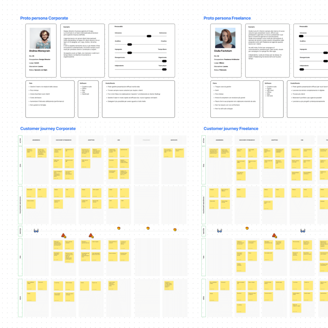
We then shifted our focus to the user experience, holding co-design workshops to create proto personas and user journeys.
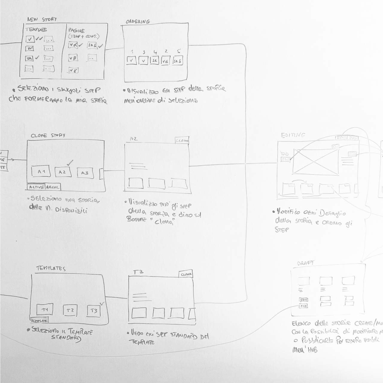
Having defined the taxonomy and main functionalities of the software, we then designed the complete UX for the CMS.
RESULT
We launched the Brandoh! beta with three plans (free, starter, and custom licenses) to quickly gather feedback from existing clients as well as first-time users.
The story-builder software facilitates team collaboration with user profiling, interactive story configuration, and publishing options. The platform is code-free, offers Single-Sign-On authentication, and tracks performance.
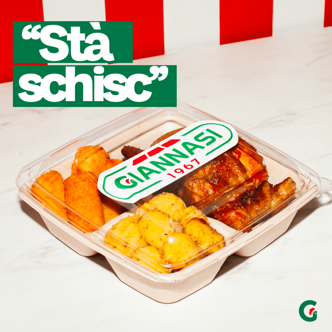
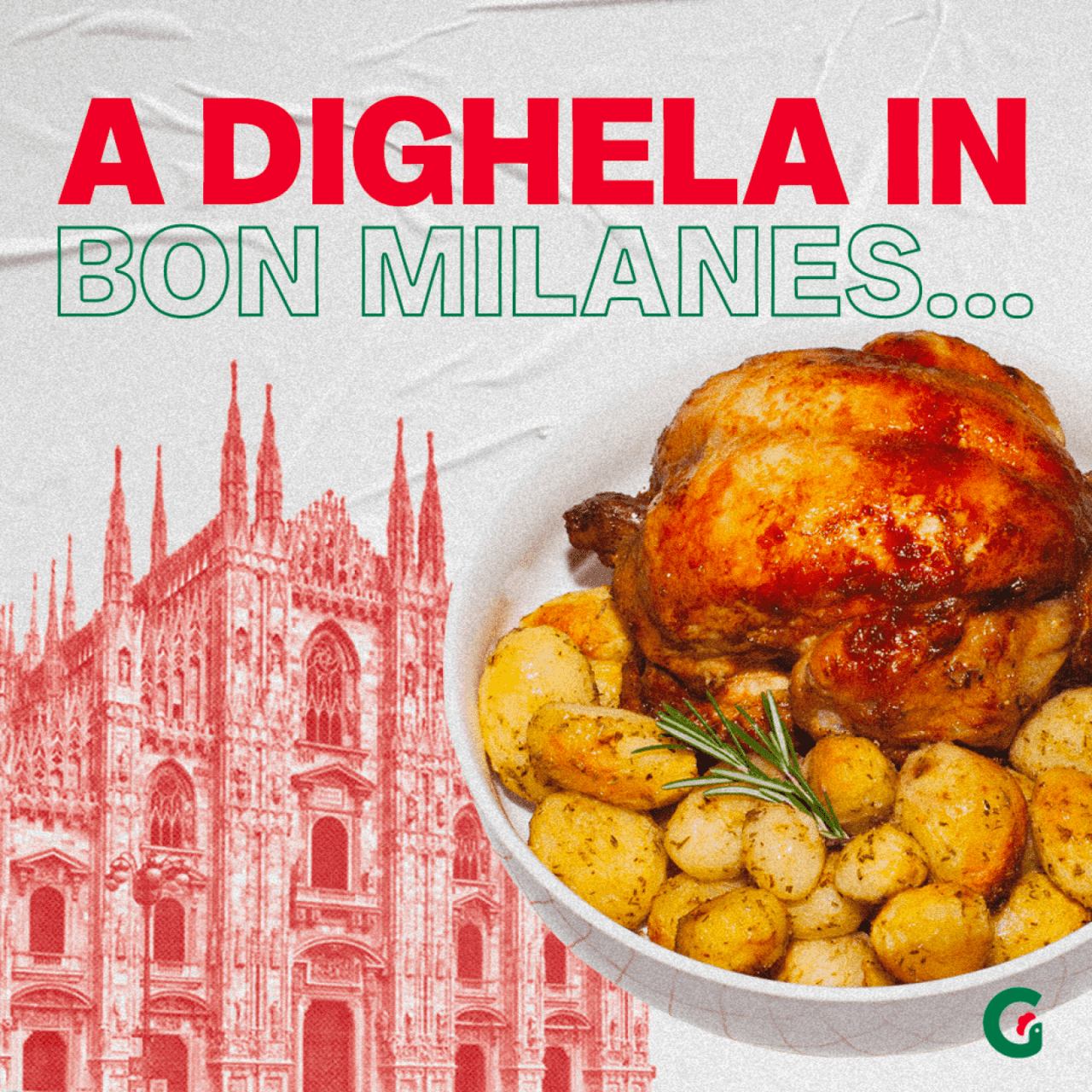
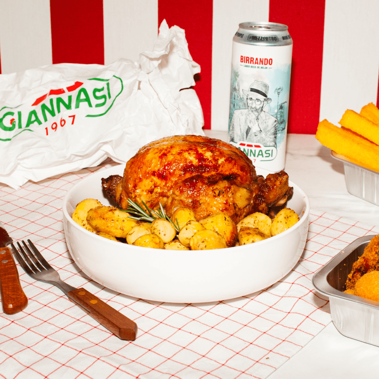
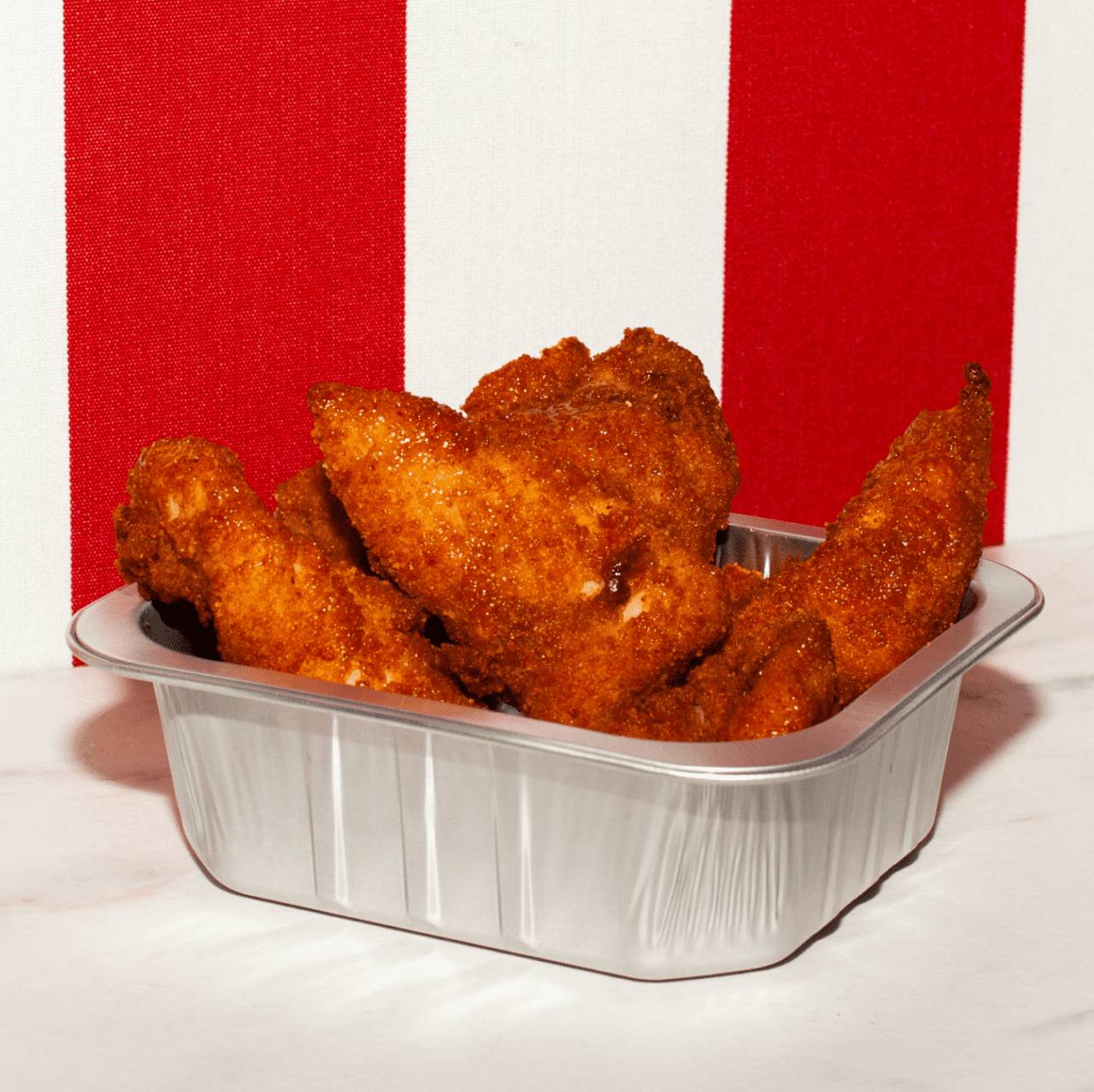
Giannasi 1967 is the historical kiosk of roast chicken in Milan Porta Romana area
Giannasi was founded by Dorando Giannasi in 1967. Started as a butcher became the hot spot of take away food in Milan especially for they freshly roasted chicken and many others traditional dishes.
the challEnge
Giannasi asked our support to change the perception of the kiosk itself going moving forward to a real lifestyle brand, to do that the main request was to increase the fan base and engagment on social pages getting also a new target of users, but at the same time keeping the historical heritage perception of a real Milanese shop.
Our strategy was to increase the brand reputation creating a real lifestyle brand. Giannasi being an iconic “Milanese” shop, we understood from clients that it represents the way to feel yourself a little more “insider” so we created the concept “Giannasi opens the doors of Milan to you.”
actions
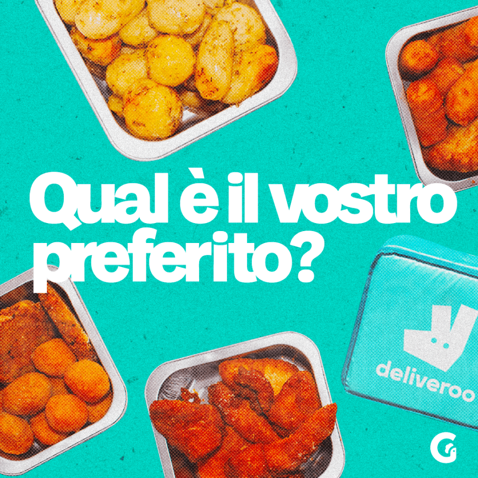
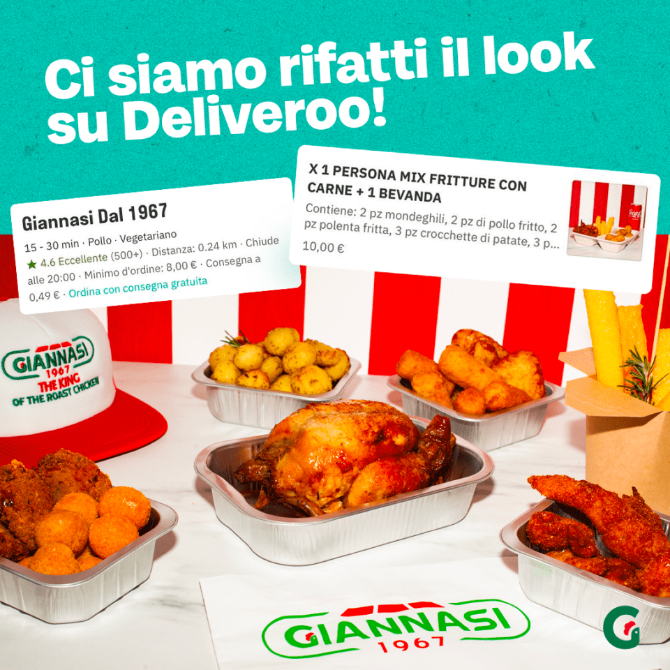
We gave the brand a new creative approach for the Instagram editorial plan, making shoots for the Deliveroo menu, for our customers, and dishes with a “homemade” treatment.
We reinforced the brand’s presence through the creation of limited edition merchandising dedicated to the Milanese areas and the brand. We created the first Milanese festival by offering some traditional dishes made by the brand paired with the craft beer “Birrando La birra di Dorando” gathering occasion for our customers.
results
We had a pretty good result in a year. We grew by +40.3% in terms of followers. 2,096,557 people reached (coverage) 5,364,715 total impressions 5,138 link clicks
In addition, the work done brought us many opportunities for collaboration, we made catering for fashion week, collaborated with Family First (A milanese fashion brand) created an event with Ceres “street legends” thanks to the new positioning and collaborated for the merchandising of Fedez and JAx Love Mi concert.
Today Giannasi is no longer a kiosk but has become a real Love Brand.
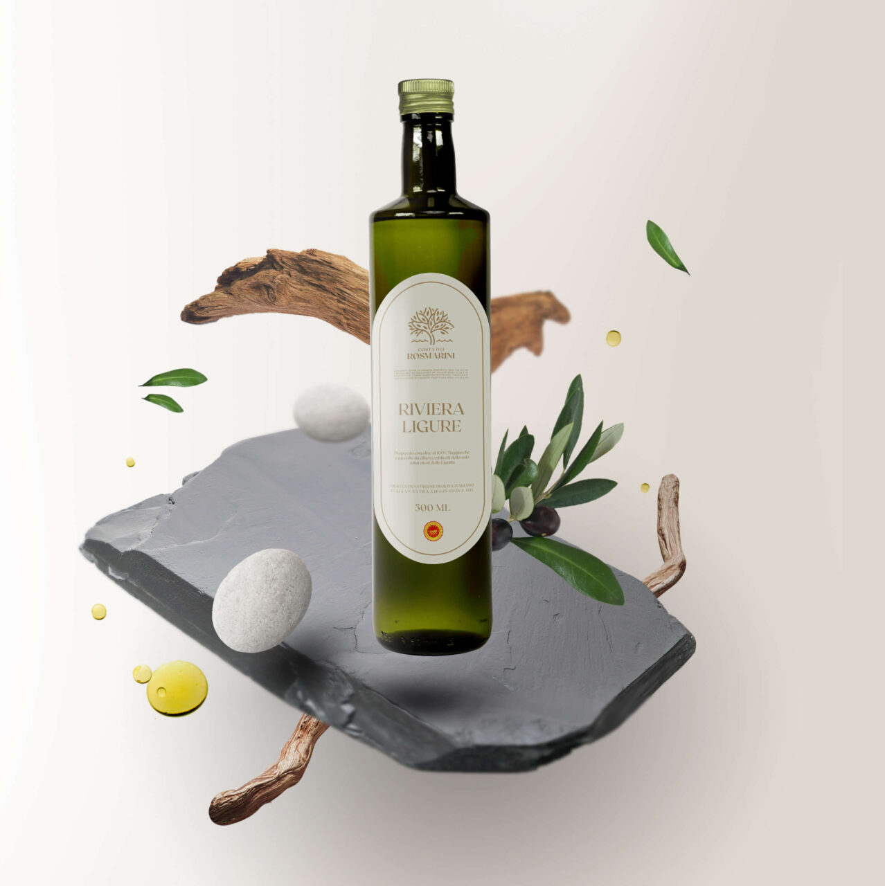
Costa dei Rosmarini is a brand of excellence, chosen by the most prestigious hotels in Italy and by the most renowned gourmet shops in the world.
Costa dei Rosmarini was born in 1995 as a family project, the olive grove was put back in order, starting a limited production of rare quality extra virgin olive oil for haute cuisine and gourmets. The first customer was the Hotel Cipriani in Venice. Since then, other prestigious names and famous chefs have decided to buy the oil.
THE CHALLENGE
The company after a period of inactivity was taken over by new partners.
The desire was to have a website able to communicate with customers as the present one is dated and not aligned with a 2020 site.
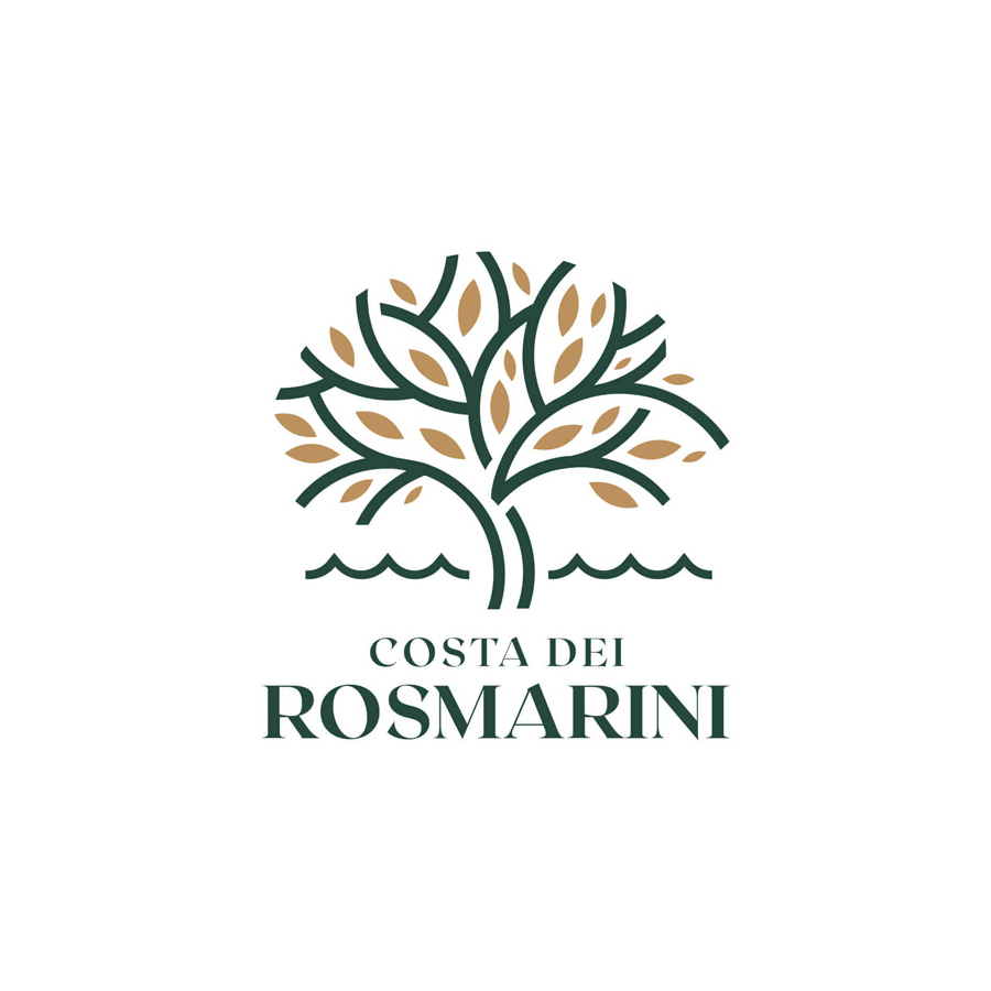
At this point, picking up the need, we proposed to the customer to face a complete rebranding. This, because the high quality of the product was not reflected in the brand image. The logo and the bottle itself did not give the impression of a premium and luxury product.
Old logo
New logo
CREATIVE DIRECTION
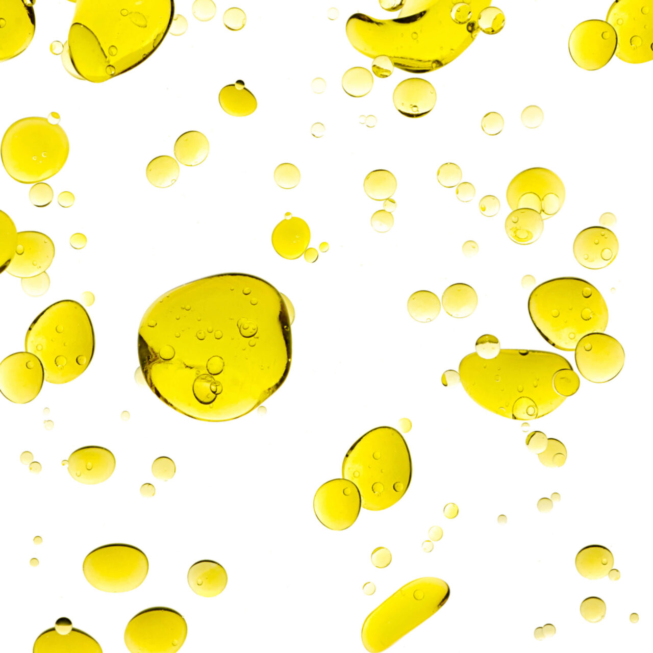
This oil is characterized by an incredible aroma and taste of fresh olives, which pervades the senses like a perfume. We, therefore, decided to treat our product just like an essence by depicting the elements and components of the territory that make it so with a “beauty” style. We were inspired by Liguria and its distinctive elements, the pebbles of the stony beaches, the slate of the roofs in the small villages, and the olive essences that produce this oil.
For the logo, we opted for a restyling. We decided to keep in the pictogram the presence of the redesigned olive tree, combined with the stylized element of the sea from the original logo, where a glimpse of the coast was depicted. In this way, we immediately make visible the combination of the olive tree and the water element representative of the Gulf of Tigullio from which the product comes.
WEBSITE
Through the new site, we wanted to create an elegant and minimal experience that represents the brand through the colors chosen and an authentic photographic treatment that represents the Ligurian territory, and let the true essence of this fragrant oil “breathe” with the current treatment.
The site has been developed in WordPress, preferring large spaces for images and texts, thus giving a feeling of general clarity and geometric elegance.