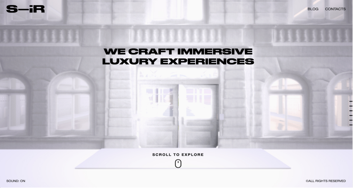
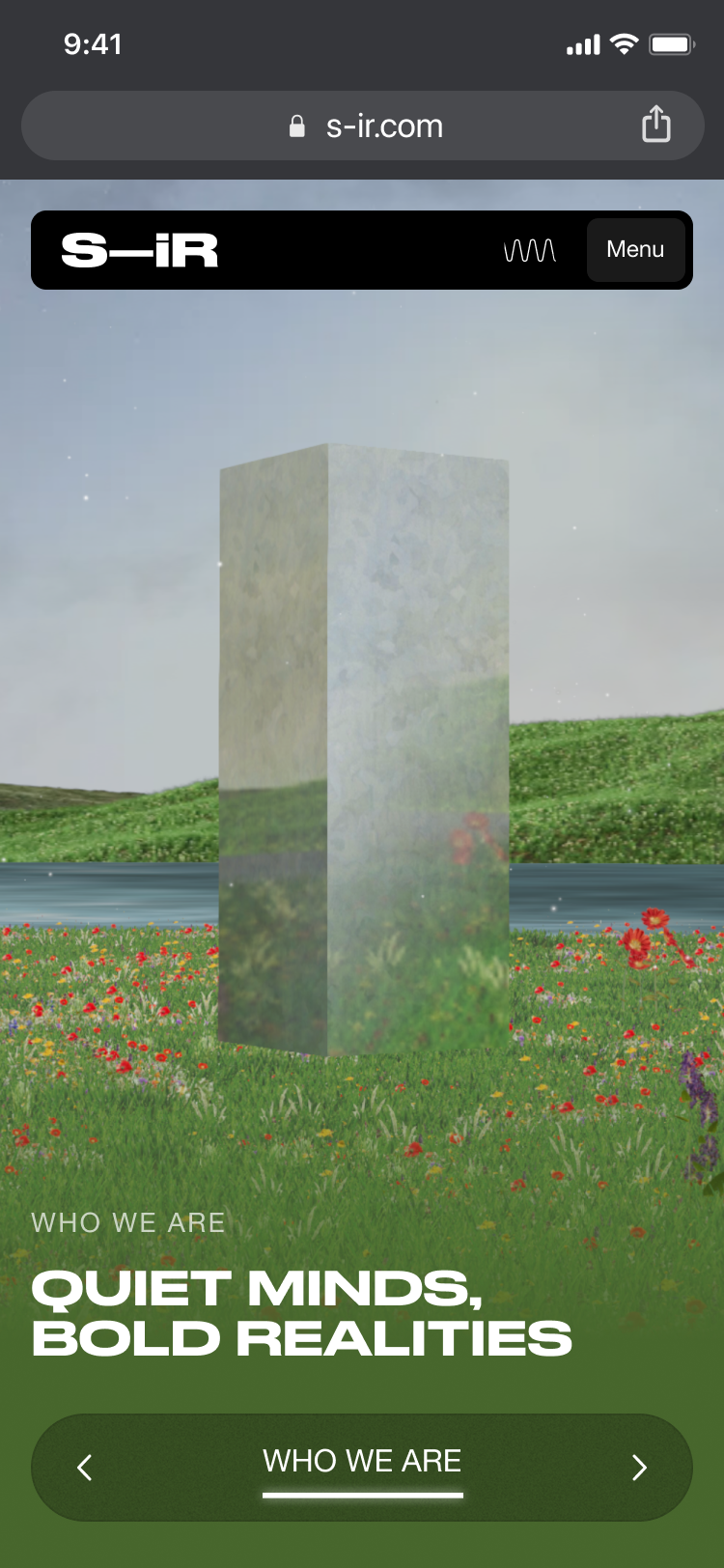
S–iR is a cutting-edge agency specializing in Augmented Reality experiences designed to amplify a product’s impact by transforming the environment around it.
By deconstructing physical objects and rebuilding them as limitless digital possibilities, S–iR bridges the gap between the tangible world and high-end brand storytelling, creating immersive engagement for global leaders in luxury and retail.
THE CHALLENGE
S–iR needed to translate a highly complex and technical technological offering into a clear, scalable, and premium digital presence.
The goal was to move from a fragmented vision of AR possibilities to a structured platform capable of showcasing a vast range of services, from 3D billboards to digital twins, while positioning the brand as an “up-to-date” leader in the Augmented Retail market.
Before
After
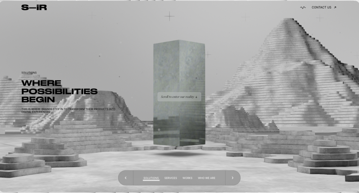
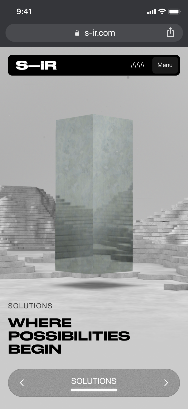
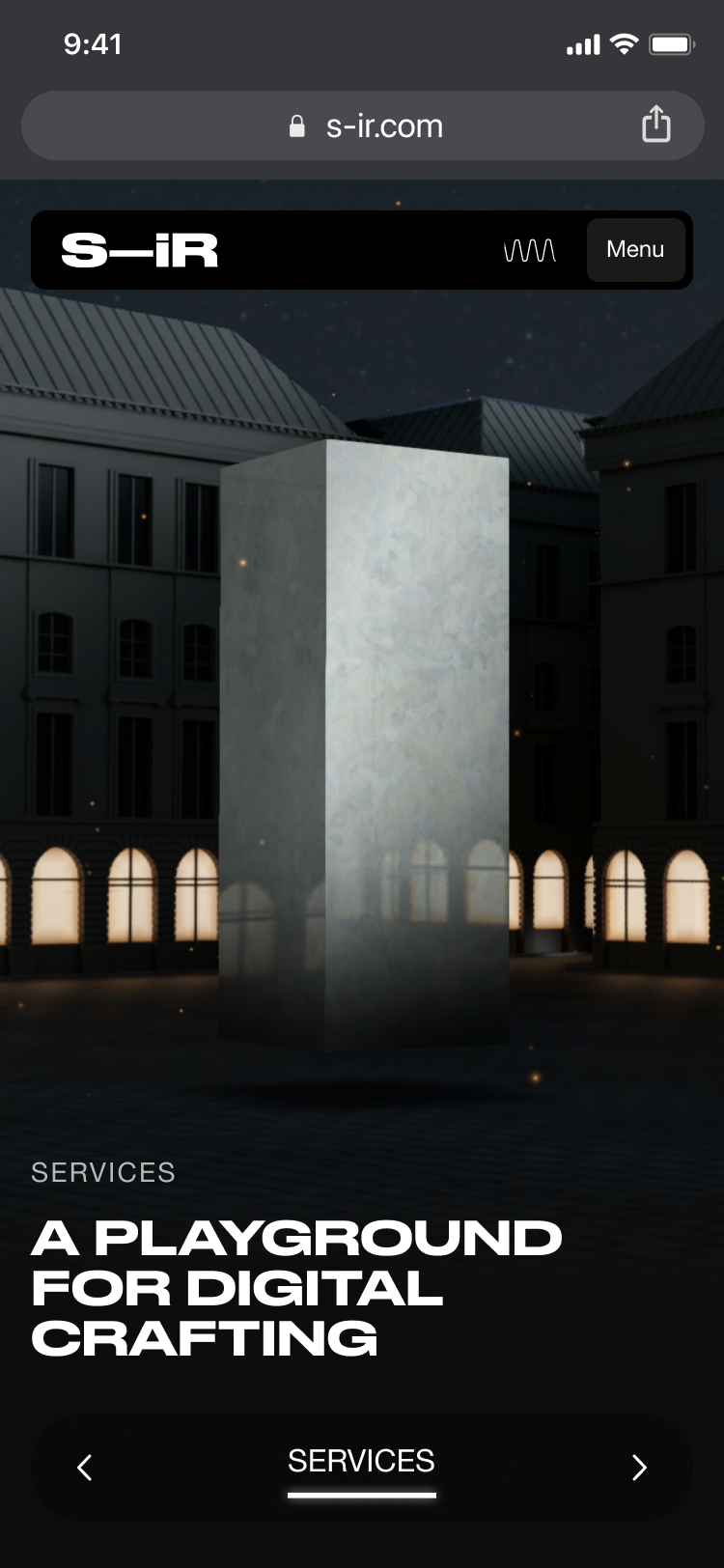
APPROACH
We initiated the project with strategic workshops (Value Proposition & Target Audience Canvas) to define a clear market identity. This led to the creative concept of the “Monolith”: a multi-faceted digital portal that organizes S–iR’s complex AR services into an intuitive and high-profile user journey, transforming technical specifications into an immersive and coherent narrative.
On the technological front, we developed immersive 3D environments by integrating Three.js and WebGL, applying advanced optimization techniques to ensure smooth and high-performance rendering. The entire ecosystem is supported by a headless architecture on Netlify, ensuring agile, secure, and scalable content management.
RESULTS
In just two weeks, S–iR has transformed from a conceptual idea to an MVP ready for development. The project has delivered a digital ecosystem that effectively categorizes the agency’s experience.
Proven scalability: Clear distinction between high-impact cases (e.g., Expo ’24) and scalable retail products (i-fabric, Appeal).
Market leadership: A sophisticated visual identity and UX that reflect the innovation of their AR solutions.
Key milestones: Integration of various formats (AR Geolocation, 3D Out-of-Home, Virtual Rooms) into a cohesive and “future-proof” design.
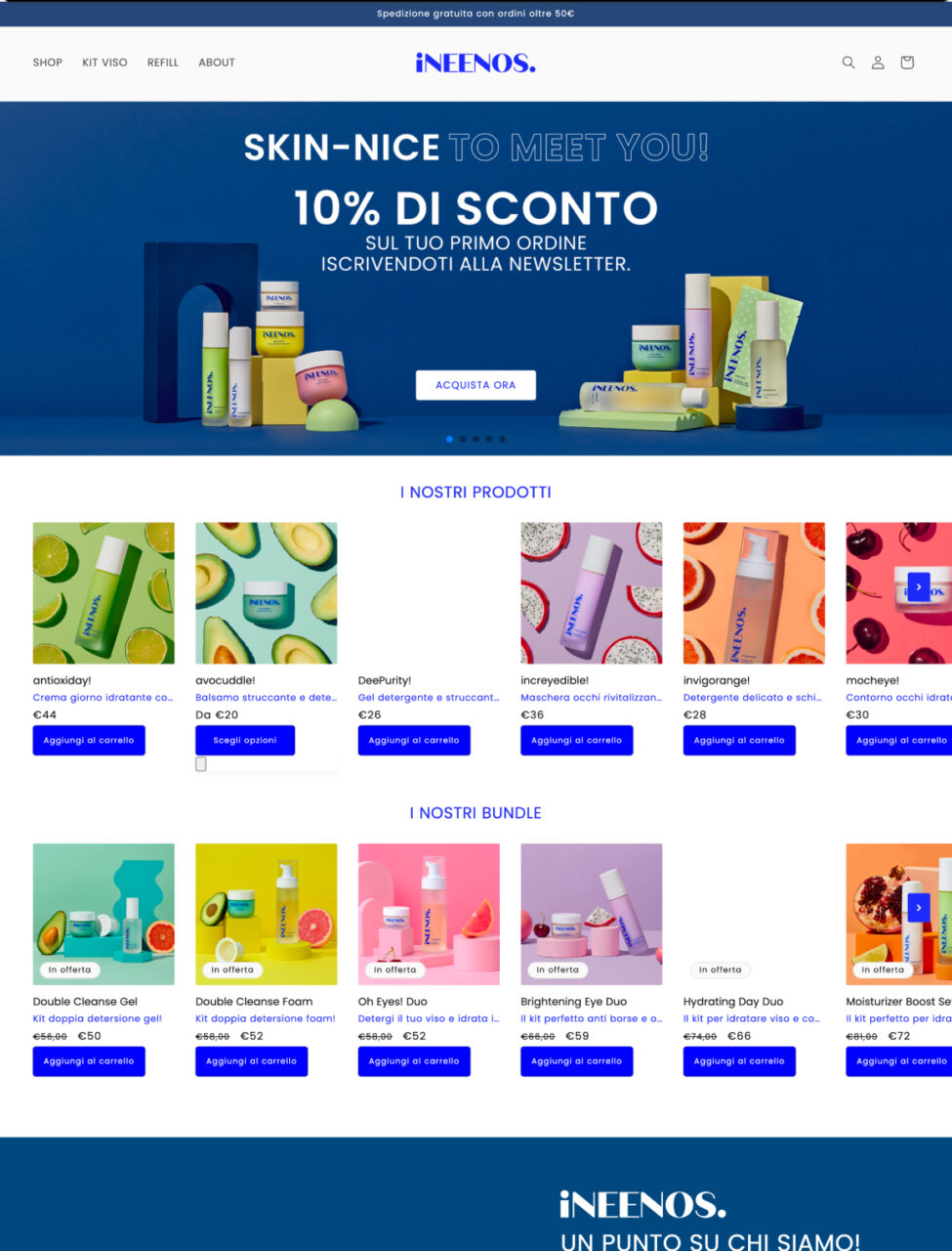
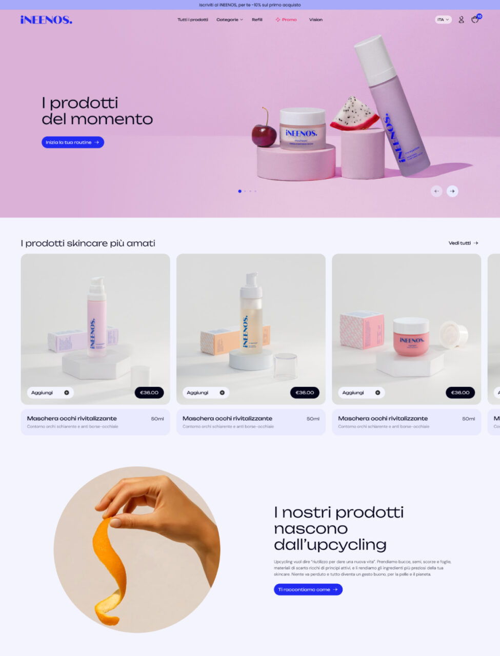
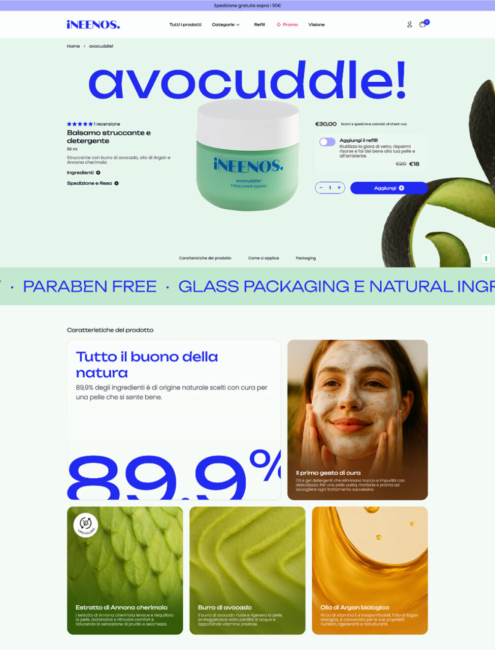
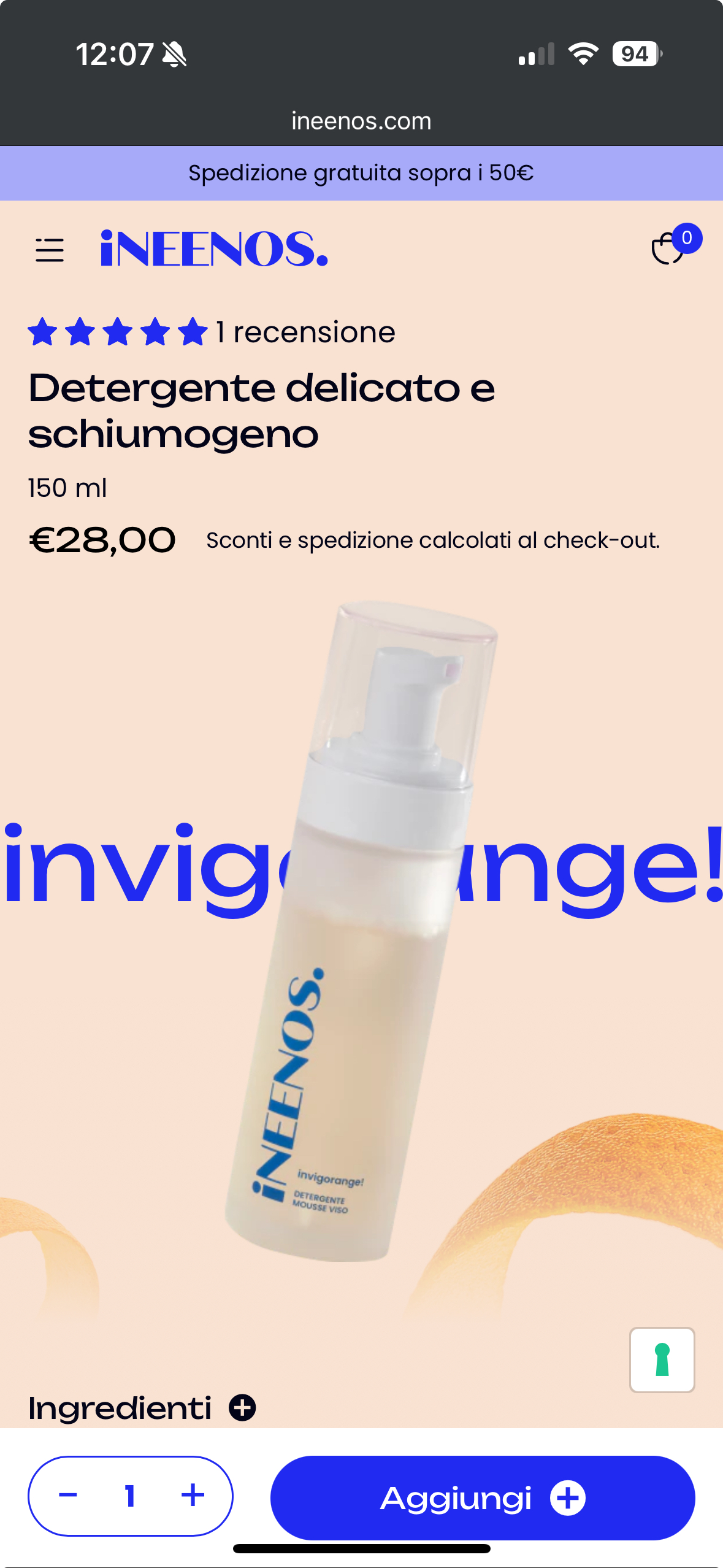
iNEENOS. is a cosmetic brand built on a radical idea: skincare that gives a second life to nature. By upcycling fruits and vegetables
More than cosmetics, iNEENOS. is a holistic vision of beauty: simple routines, complete rituals, and an essential link between inner well-being and environmental responsibility.
THE CHALLENGE
iNEENOS needed to differentiate itself in the crowded cosmetics market while communicating an innovative positioning: effective skincare that values sustainability, circular economy, and conscious beauty.
The brand also had to boost conversions and overcome the “scam effect” of an unreliable digital presence. The old site lacked reviews, product storytelling, and a sales strategy. The real challenge was to build credibility and a scalable content system to support launch and growth.
Before
After
Before
After
APPROACH
We initiated the project with a thorough UX/UI audit to identify structural gaps and content deficiencies. Our first step was to enrich product information, developing complete and engaging descriptions and integrating review systems.
We then focused on clarity, defining a strategic content design to highlight the core Unique Selling Proposition: making the product refills and the use of upcycled materials immediately visible. Concurrently, we executed a complete overhaul of the site architecture to ensure an intuitive user journey. This combined strategy delivered structural clarity and a compelling brand narrative, simplifying the user experience from discovery to purchase.
RESULTS
The comprehensive strategy combining UX clarity, refined UI, and a focused content narrative yielded immediate and substantial commercial results. The new e-commerce proved to be significantly more effective at converting visitors into engaged users.
Increased Intent: The improved UX/UI and content clarity made products more appealing, boosting the Add to Cart Rate by 39.80%.
Sales Explosion: This effectiveness translated directly into sales, with the overall Conversion Rate soaring by +733% (from 0.03% to 0.25%). This dramatic shift resulted in a +179% in total Transactions.
October 2024 (Pre-Redesign) vs. October 2025 (Post-Redesign)
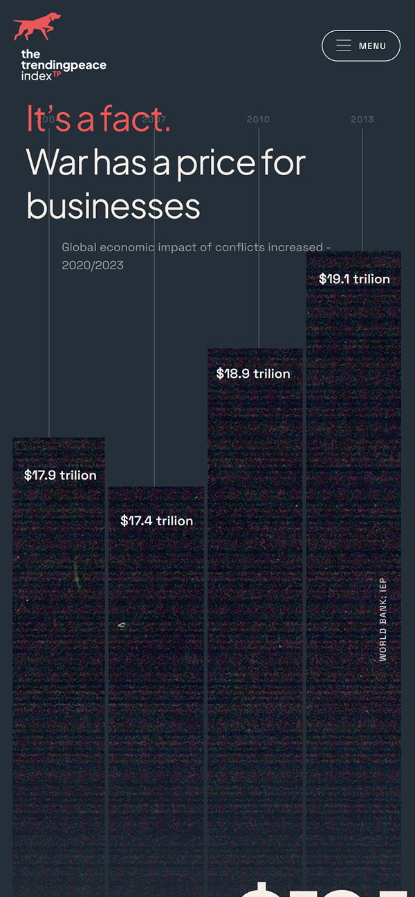
Trending Peace Index is a company that helps businesses foster Positive Peace, which in turn accelerates their growth and impact.
They provides innovative strategies for the private sector to develop meaningful and sustainable initiatives, enabling faster growth and amplifying their global impact. Their focus on impactful programs helps companies achieve robust growth and contribute to a more peaceful world through their business practices.
THE CHALLENGE
Trending Peace Index came to us with a clear objective: they needed a partner who could translate the core concept of their idea into a fully functional and compelling website. Their vision for Trending Peace Index was robust, but the challenge lay in transforming this innovative idea into an engaging digital experience.
Our primary challenge was to build the entire storytelling framework for the website completely from scratch. This wasn’t merely about writing copy, it involved a deep dive into the complex world of peace metrics and initiatives. We had to meticulously gather information and data on peace from a diverse array of sources, primarily relying on academic papers, research documents, and official reports.
APPROACH
This intensive research process was crucial. It allowed us to identify the most impactful angles, articulate the nuances of “Positive Peace,” and effectively communicate how Trending Peace empowers businesses.
Ultimately, the goal was to translate intricate data and concepts into a clear, engaging, and persuasive narrative that resonated with our audience and effectively conveyed the value proposition of Trending Peace.
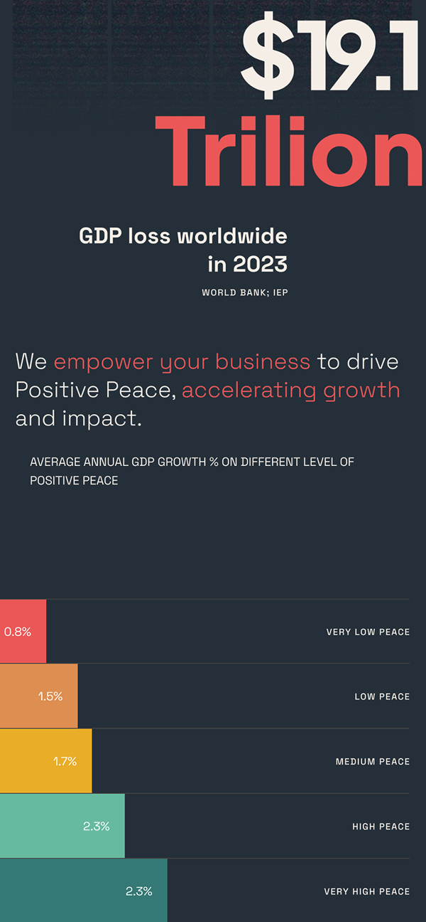
CREATIVE DIRECTION
The creative direction was fundamental in shaping the visual identity and user experience of the website. Our objective was to translate complex peace data and metrics into an intuitive and visually appealing interface.
We aimed for a design that was both professional and reassuring, utilizing a color palette and aesthetics that evoked a sense of calm and trust, aligning with the theme of ‘Positive Peace.’ The challenge lay in making the data not just understandable, but also emotionally engaging, ensuring that the visual narrative guided the user through the site, highlighting the impact and value of Trending Peace for businesses and society.
Allimb transforms physiotherapy with AI-powered, science-backed solutions for personalized recovery and prevention. Letting their patients get moving again with progress they can track every day.
Allimb is redefining digital healthcare by making physiotherapy accessible to everyone. Guided by expert physiotherapists and powered by AI, the app delivers personalized exercise plans tailored to individual needs. With a focus on scientifically proven methods and real-time tracking, Allimb ensures effective recovery and injury prevention. Committed to closing gaps in healthcare, especially in women’s health, empower individuals and professionals alike to take control of rehabilitation.
THE CHALLENGE
Allimb needed a complete product transformation—from a redesigned app interface to a reimagined digital presence that better communicated its mission and value.
Our goal was to elevate Allimb’s user experience by revamping its app, ensuring seamless navigation and engagement. We also designed a comprehensive landing page to articulate the app’s benefits, making its features clear and compelling. Finally, we optimized Allimb’s digital platform for healthcare professionals, improving usability and accessibility for doctors managing rehabilitation courses
APPROACH
We took a strategic approach, analyzing user needs to refine the experience, restructure content, and create a cohesive digital ecosystem.
The process began with a deep dive into user pain points, informing the redesign of Allimb’s app to offer an intuitive and efficient physiotherapy experience. We then restructured the website, ensuring clear messaging that speaks to both individuals and medical professionals. Every step was guided by strategic content development to enhance clarity, engagement, and accessibility.
CREATIVE DIRECTION
To align with Allimb’s mission, we crafted a visual identity that merges calm technology with medical precision. The new color palette instills trust while promoting ease of use for patients.
A refined UI ensures a seamless experience, reducing cognitive load and making rehabilitation more approachable. By integrating supportive design elements and thoughtful interaction patterns, we created a digital environment that fosters confidence in recovery and long-term well-being.
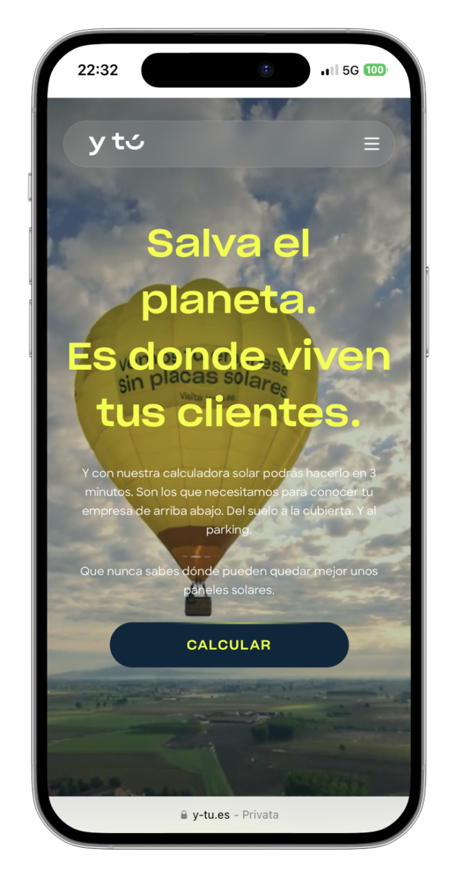
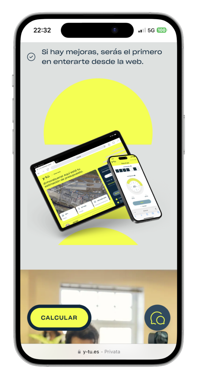
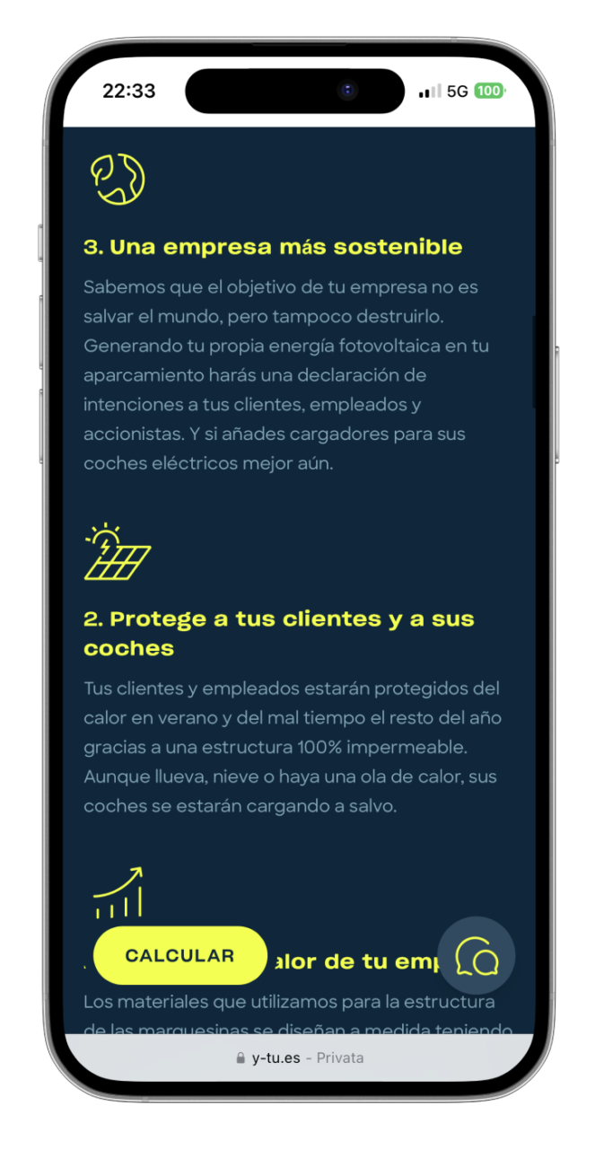
Y Tú is a company specialized in the installation of custom photovoltaic systems for businesses.
New to Spain but backed by decades of expertise, Y Tú creates solar systems tailored to fit seamlessly into any setting, from rooftops and wide-open fields to parking spaces. The company oversees every aspect of the process, including system design, installation, monitoring, and maintenance.
the challEnge
The client needed a website that could effectively showcase their solar panel installations and offerings while reflecting their unique brand identity and marketing objectives.
The goal was to create an interface and user experience that felt both editorial and aesthetically refined, striking a perfect balance between clarity, functionality, and their distinctive tone of voice.
the solution
We developed a website that combines visual storytelling with a seamless user experience, featuring real projects with real clients to build trust and credibility. Every page was carefully designed to highlight Y Tu’s solar solutions, providing users with an engaging and intuitive journey into the world of self-consumption energy. To ensure consistency and scalability, we created a robust design system that supports a wide range of content types, from videos and images to carousels and text.
This modular approach allows the client to easily build new pages while maintaining visual harmony across the platform. The website, has been celebrated within Best Corporate Website Designs, seamlessly represents the brand both editorially and aesthetically while inspiring users to explore Y Tu’s offerings in a unique and purposeful way.
RESULT
The new website successfully elevated Y Tu’s digital presence, offering a cohesive experience that aligns with their brand and business goals. By combining a strong design system with engaging content, we enabled the client to showcase their solar solutions with clarity and impact.
The platform now empowers users to explore projects, understand offerings, and connect with Y Tu effortlessly—driving both engagement and conversions.
Sailsquare is the website that simplifies your journey into the world of yacht and boat bookings.
Whether you're looking to sail in the Mediterranean or explore the Pacific, Sailsquare offers curated experiences across the globe, allowing you to search, book, and embark on your dream adventure with ease.
the challEnge
Sailsquare needed a comprehensive overhaul of its website’s design system to enhance its user interface and user experience. The goal was to improve the conversion rate while maintaining the site’s existing structure. We faced the challenge of balancing a redesign that felt both familiar to current users yet fresh and inviting to new ones.
The objective was to recreate the user’s boating experience right from the website, ensuring that users felt like they were already boarding their yacht from the moment they landed on the homepage.
Creative direction
Our creative approach centered around transporting users into the world of boating from their first interaction with the website. The design was crafted to reflect the excitement of sailing, with a user journey that flows as smoothly as a boat on calm waters.
We revamped the website’s interface, making the search and booking processes smoother and more engaging, offering users the ability to feel as if their nautical adventure had already begun.
RESULTS
The redesigned Sailsquare website saw a significant improvement in performance across the board, from enhanced user experience to a sharp increase in bookings. The site’s conversion rate increased, and the seamless user journey has led Sailsquare to become one of the top booking platforms for yacht and boating experiences worldwide.
This success highlights our dedication to delivering exceptional design and functionality in the digital travel industry.
MooneyGo is the app that streamline your journeys: parkings, buses, trains, taxis, ferries and mobility sharing options are there for you.
It's the app that empowers you to move, travel, and pay with complete freedom, offering a bunch of mobility services within and beyond the city: from parking to public transportation, all the way to highways, MooneyGo is your travel companion for every moment.
the challEnge
Mooney Go acquired MyCicero to integrate all the new payment systems into the new app. This challenge led us to find compatibility solutions between the two working environments. Our goal was to maintain a user-friendly structure that would allow existing MyCicero users to continue using and leveraging the skills they had already acquired from the app.
We collaborated with the MooneyGo Design and Product team and the MyCicero development team to achieve the goal of merging these two entities. We acted as a bridge, facilitating the discovery of the best connections between them, ultimately leading to the creation of MooneyGo’s new and innovative user experience.
Creative direction
We started working with the MooneyGo app’s design and teamed up with its project owner to create a design system that took the app to a whole new level. We didn’t just integrate features, we envision a new way to make people live the city on the go and deal with the frictions of daily travels.
Within this app, it’s even possible for registered users to discover, buy and then manage the recently launched E-tolling solution.
Now, booking parking, buying tickets, and getting around Italy is more seamless than ever before.
results
Mooney Go has been named the 2023 Consumer Product of the Year, recognizing it as an innovative mobility application.
This award fills us with immense pride and reflects our dedication to delivering exceptional work in this field.
Renowned for its flawless craftsmanship and iconic style, Valentino embodies timeless elegance and luxury.
As happens every year, also in 2023 by the end of November, Valentino unveiled The Party Collection, enchanting fashion enthusiasts across the globe.
THE CHALLENGE
Valentino’s Digital Team asked us to develop a digital catalog for their 2023 Party Collection, showcasing handpicked items photographed at the prestigious Place Vendome Palace in Paris. The aim of this initiative was to captivate clients’ interest and guide them towards a personalized shopping experience with boutique advisors.
Thanks to our ongoing collaboration, we presented an immersive concept: a virtual exploration of the Place Vendome palace. Users could step inside the 3D Palace through its windows to access the party and discover the entire collection room by room.
APPROACH & RESULT
As we were responsible for both design and development phase, we collaborated with a 3D artist to craft the Place Vendome model and engaged a 3D front-end developer. Leveraging WebGL and Three.js technology, we handled 3D graphics, lighting, cameras, and interactions. Meanwhile, we focused on UX/UI design, emphasizing interactions and integrating key conversion points to ensure a memorable and seamless experience.
The Palace is immersed in an evening atmosphere, where users’ attention is captured by its illuminated windows.
It’s just by touching them, that users can unlock the Party Collection, and explore diverse galleries of videos, photos, and copylines. Users can bookmark their favorite pieces, download or share them, and access to the online shopping experience by selecting their preferred Valentino boutique.
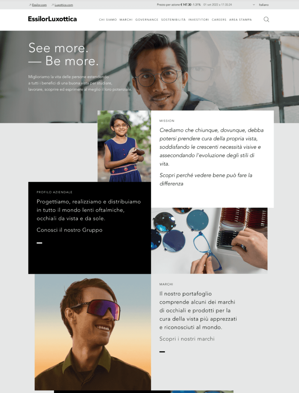
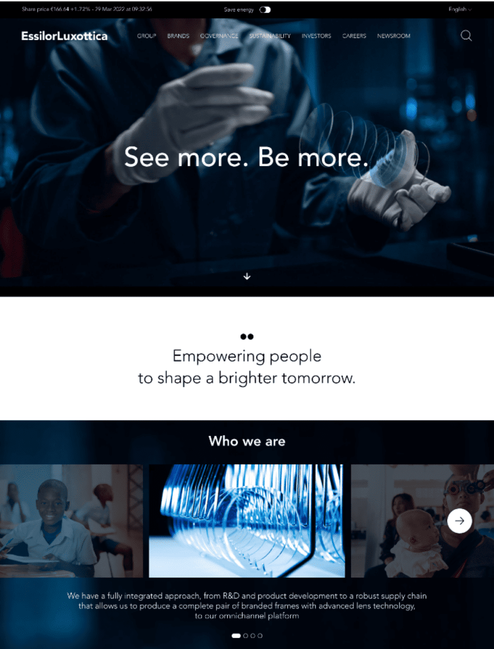
EssilorLuxottica is a global leader in eyewear, combining expertise in lenses and frames to create innovative vision solutions.
EssilorLuxottica, established in 2018, is a prominent global eyewear conglomerate formed by merger of Essilor, a lens manufacturing expert, and Luxottica, a leading frame designer and retailer.
THE CHALLENGE
Our task was to create a website for EssilorLuxottica that seamlessly integrated the brand’s values and aspirations. Our goal was to establish a visual identity that conveyed a sense of heritage while maintaining a clean and polished look.
We used sleek design elements, elegant typography, and an iridescent color palette to reach the whole spectrum and represent the essence of the brand. The result was a visually captivating website that radiated refinement and exclusivity, ensuring a user-friendly browsing experience.
Before
After
CREATIVE DIRECTION
We imagined a new way to define the loading icon with a modern approach. We started adding movement to the GRTSK Peta Grotesque, creating a completely new typography that starts from a single point and defines each letter with a smooth and round movement.
To give even more strength to the concept and a modern and digital treatment to the letters, we used a shade of vibrant pink degrading to electrical blue that illuminates the tip of the letter and resembles the typical loading spinners effect.
RESULTS
We managed to give EssilorLuxottica a distinctive digital branding identity, even though it’s a brand that has to accommodate many others.
We struck an ideal balance between design and identity, ensuring it doesn’t overshadow the other brands while also not getting lost among them. At the same time, the goal was to corporately represent the brand while offering an international scope.
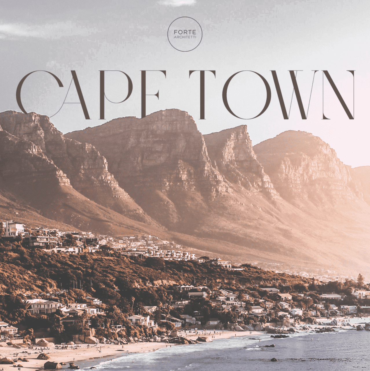
Forte Architetti is an internationally-acclaimed architectural firm, comprising architects, landscape designers, engineers, and interior designers.
The firm handles a wide range of projects, from urban planning to landscaping, residential to commercial buildings, and interior to furniture design. They employ strategic design thinking for both small and large-scale projects, offering feasibility studies, full architectural and planning services, site management, supervision, and various problem-solving techniques.
THE CHALLENGE
The client expressed a desire to conduct a comprehensive review of their website with the aim of enhancing communication regarding their projects and their presence in various countries. Specifically, the client tasked us with targeting South African and Nigerian high net worth individuals, given that these two countries are the most significant in terms of the client’s revenue and opportunities.
We developed a benchmark by studying U.S. luxury real estate communication methods as a model for our target countries. We incorporated Italian design aesthetics to engage our audience and compete with international design studios. Our research revealed a key insight: architectural firms often communicate internally, neglecting their intended audience, which hinders effective client engagement and issue resolution.
DESIGN direction
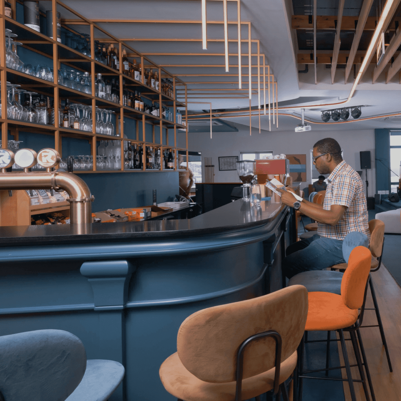
Based on the insights gained by our research, we adopted a customer-centric strategy, aiming to vividly narrate the stories behind the studio’s projects and how they meet clients’ needs and aspirations. We introduced a fresh creative concept called “Behind the House,” a creative concept spotlighting clients and all aspects of the projects – an approach that’s in stark contrast to the conventional communication style of architectural studios.
Our goal was to connect users with our projects. To achieve this, we adopted an editorial approach that bridges the gap between an interior magazine and an architectural studio, offering users an immersive narrative experience of Forte Architetti’s work.
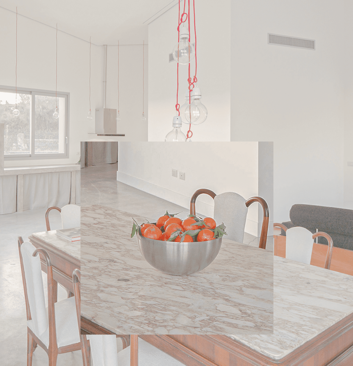
website
We designed a website that offers a dynamic, engaging user experience, using subtle animations to introduce primary photo-text content. This approach was chosen to create an editorial experience that aligns with the storytelling aspect of the studio’s projects.
Our art direction used cool, dark colors against bright optical white, and a large serif font for headlines, mirroring the aesthetic of a luxury architecture magazine. The website showcases the studio’s projects, team, and operational methods, presenting them as a collection of narratives that challenge the traditional approach of a typical showcase website.