GAS is a historical brand in the Italian fashion scene, which has its roots in the denim world.
Founded in 1984 as a family-run business, GAS sells high-quality clothing, footwear and accessories for men, women and children. Its total looks are denim-centered.
THE CHALLENGE
GAS was undergoing a rebranding initiative, aimed at expanding brand’s appeal to reach out both new generations and long-time loyal customers. The goal was to go beyond their traditional denim focus, proposing GAS as a contemporary lifestyle brand with a comprehensive offering for all genders and also genderless.
They contacted us to redesign their e-commerce, working in partnership with an external content agency and a development company. Our task was to customize a Shopify premium template to highlight GAS new identity, its historical background and its balanced connection with both women and men’s universe.
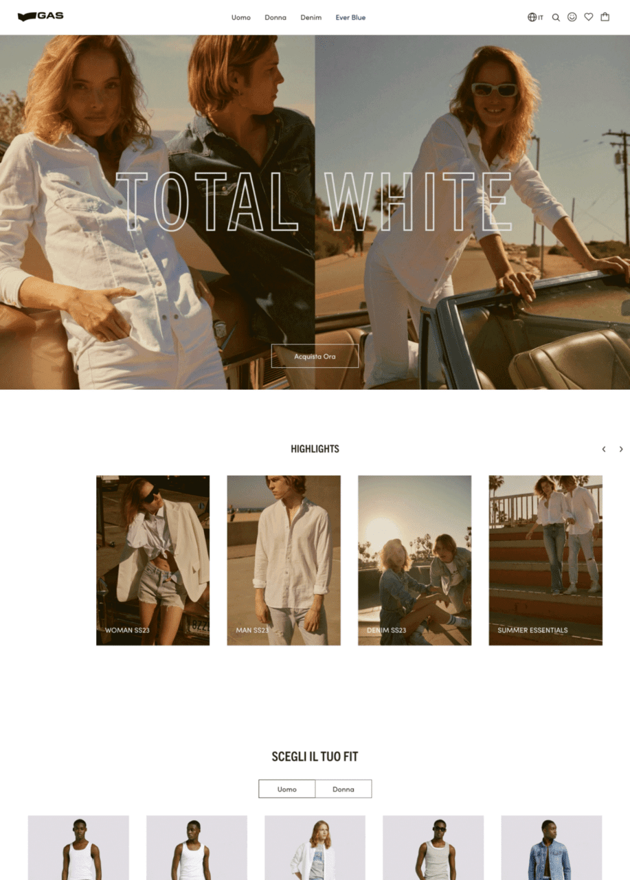
Before
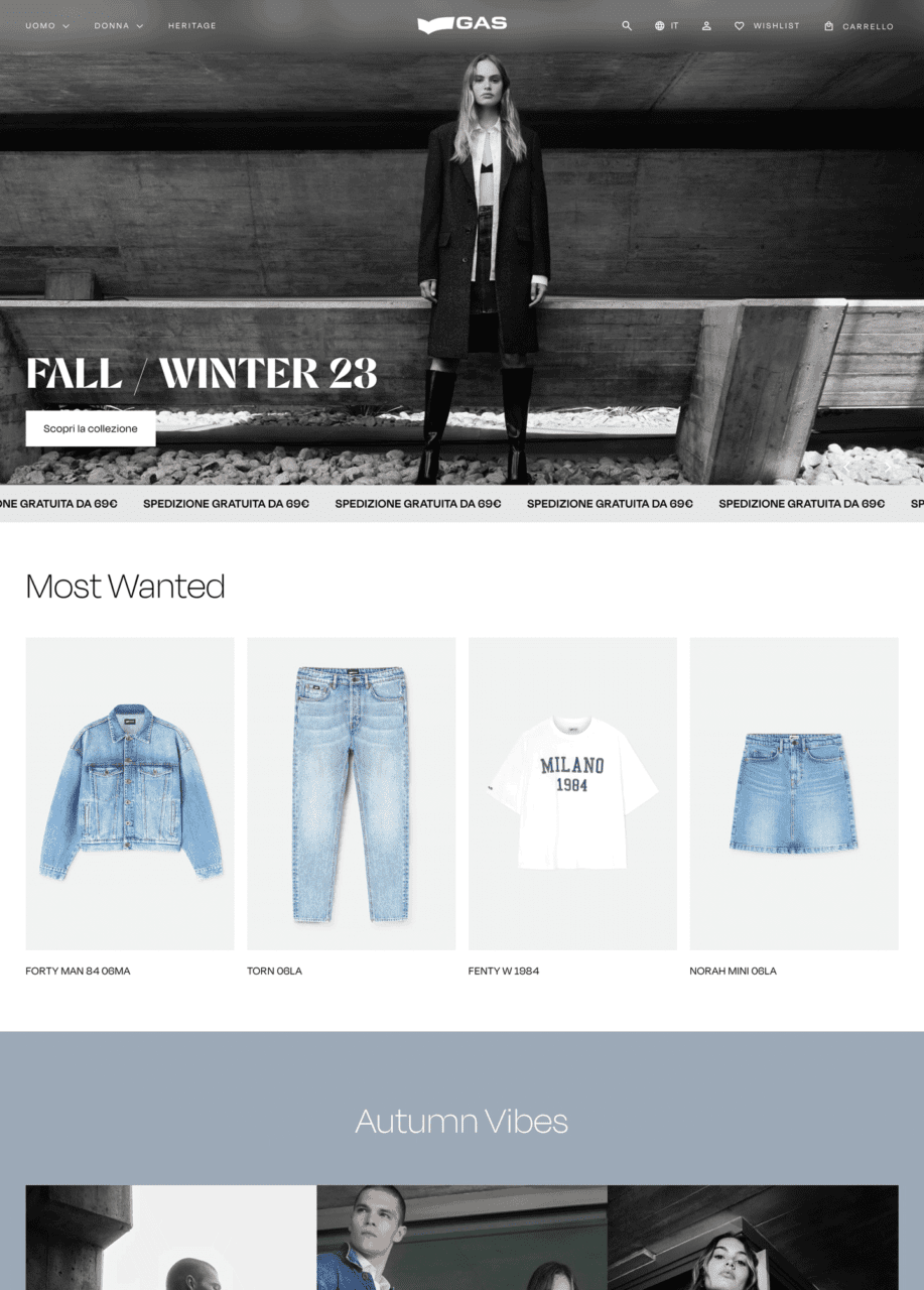
After
APPROACH & RESULT
We analyzed their current e-commerce and the proposed information architecture, to understand what were the critical points of the existing experience and the integrations that has to be implemented. Based on their goals, we selected 3 Shopify Premium templates, highlighting their distinctive features. Among them GAS team chose the Expanse – Modern style template, which was the starting point for our UI design proposal.
We crafted a creative direction focused on elegance and modernity, selecting a minimalist approach. The extensive use of black and white in various shades and sharp shapes for interactive elements serves to elevate the brand’s positioning. Abalos, chosen as the main font, adds a modern and playful touch, enhancing the new brand identity across product and category heroes, as well as cross-selling banners.
EssilorLuxottica is a global leader in eyewear, combining expertise in lenses and frames to create innovative vision solutions.
EssilorLuxottica, established in 2018, is a prominent global eyewear conglomerate formed by merger of Essilor, a lens manufacturing expert, and Luxottica, a leading frame designer and retailer.
THE CHALLENGE
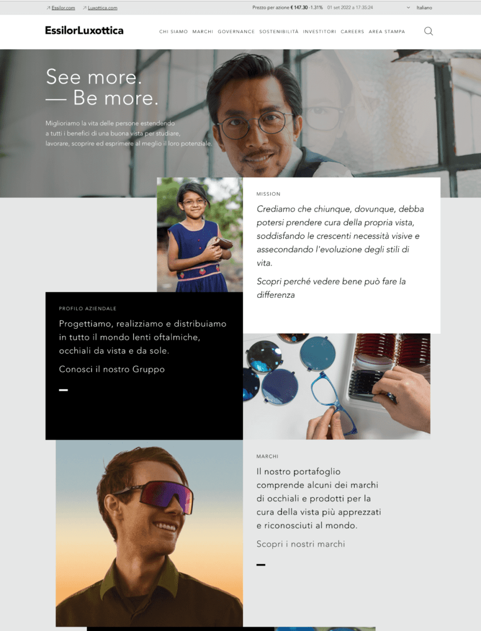
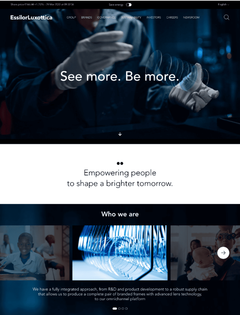
Our task was to create a website for EssilorLuxottica that seamlessly integrated the brand’s values and aspirations. Our goal was to establish a visual identity that conveyed a sense of heritage while maintaining a clean and polished look.
We used sleek design elements, elegant typography, and an iridescent color palette to reach the whole spectrum and represent the essence of the brand. The result was a visually captivating website that radiated refinement and exclusivity, ensuring a user-friendly browsing experience.
Before
After
CREATIVE DIRECTION
We imagined a new way to define the loading icon with a modern approach. We started adding movement to the GRTSK Peta Grotesque, creating a completely new typography that starts from a single point and defines each letter with a smooth and round movement.
To give even more strength to the concept and a modern and digital treatment to the letters, we used a shade of vibrant pink degrading to electrical blue that illuminates the tip of the letter and resembles the typical loading spinners effect.
RESULTS
We managed to give EssilorLuxottica a distinctive digital branding identity, even though it’s a brand that has to accommodate many others.
We struck an ideal balance between design and identity, ensuring it doesn’t overshadow the other brands while also not getting lost among them. At the same time, the goal was to corporately represent the brand while offering an international scope.
Brandoh! redefines presentation engagement by converting static slides into dynamic, interactive experiences.
Its drag-and-drop editor allows users to create engaging stories, personalizing content for lasting impact. This tool goes beyond regular presentations, engaging audiences deeply and making storytelling in presentations more immersive.
Before
After
THE CHALLENGE
The challenge was reinventing Brandoh!’s identity to resonate with audiences seeking innovative presentation tools. We revamped its digital presence and offline representation, enhancing the dynamic appeal through gadgets and products.
This redesign aimed to create an eye-catching identity that piques the curiosity of people looking for a more visually appealing tool.
The video
We produced an intuitive video illustrating Brandoh!’s functionalities. This visual representation effectively differentiated it from traditional presentation methods, ensuring a clear and straightforward understanding of its unique capabilities.
The video positioned Brandoh! as an innovative, user-friendly solution for captivating and impactful presentations.
website
We designed an informative landing page detailing Brandoh!’s core features. This platform serves as an educational hub, showcasing how users can enhance presentations by seamlessly integrating enriched content elements.
The landing page blends brand content with tool functionalities, offering a comprehensive understanding of Brandoh!’s capabilities.
GS1 standards are the most widely used system of standards in the world, and they offer a broad portfolio of services and tools to make adoption of their standards easier and more impactful to businesses.
the challEnge
The challenge was to create an immersive experience in their showroom, Interno1, using large touchscreen monitors.
The aim was to present GS1 standards and information for retail products through an engaging, interactive experience, demonstrating how GS1 enhances supply chain efficiency and effectiveness through their software and services.
Our Approach
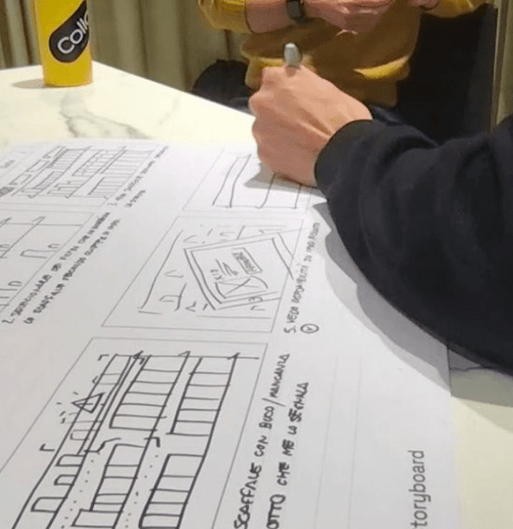
We began by analyzing the client’s content, then hand-illustrated individual storyboards to define the experience and storytelling.
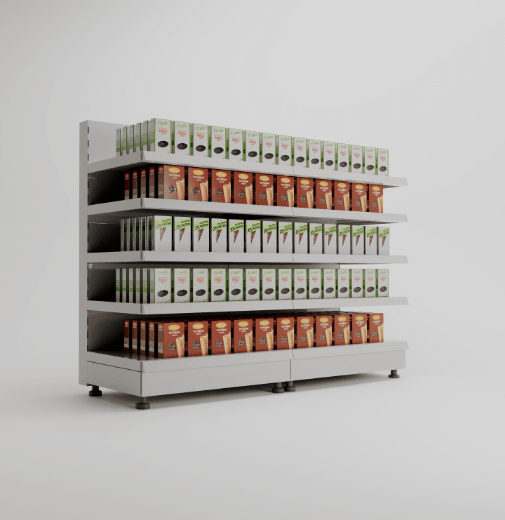
We identified a “starting point” from which we could tell all the necessary stories: a supermarket shelf.
We then created 3D models of the individual products and the shelf for storytelling reference, aligning the look and feel with GS1 Italy’s brand image.
results
We developed a web app using WebGL technology, capable of conveying information and best practices in large-scale distribution product supply chains, and how GS1 Italy’s services ensure accurate product information, satisfying all lifecycle requirements within the supply chain.
This allows the client to discuss highly technical topics like product pack information and management with their customers in an engaging and interactive way.
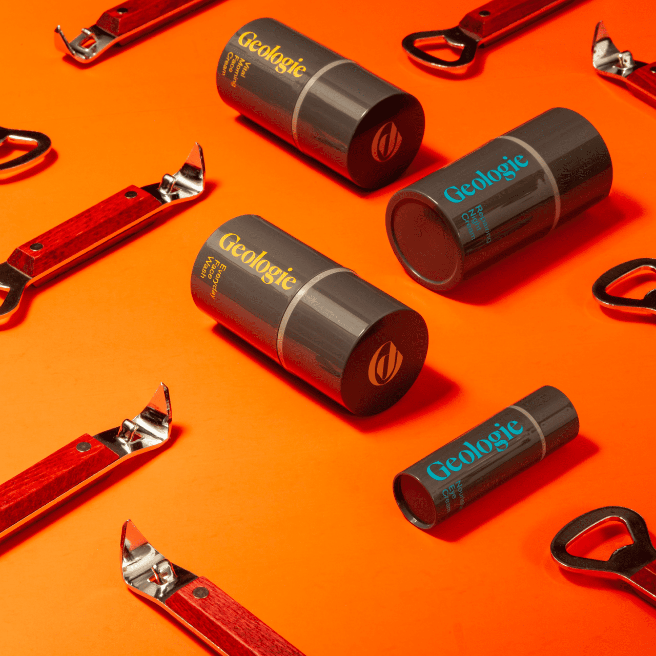
Geologie, a US skincare brand, specializes inpersonalized, subscription-based skincare services.
Geologie was founded by Nick Allen and Dave Skaff, friends and innovators, with a shared vision to offer men the best skincare experience, encompassing top-quality products and exceptional service.
the challEnge
We were asked to improve the overall user experience (UX) in order to better differentiate between single products and bundles, and to highlight the subscription model’s significant discounts. Another focus was improving the private area for customers to renew and manage their subscriptions.
Our challenge was to redesign the Product Listing Page and Product Detail Page UX/UI, making the various sizes, categories, and discounts more visible, and drive users to choose the bundle option. Clarifying the individual product advantages on the PDP was another key objective.
Our Approach
First, we developed two alternative UX designs for the PDP and PLP.
The focus was on enhancing subscription visibility and the different available formats. We also made category selection clearer in the PLP with a sidebar for subcategories.
In terms of aesthetics, we preserved the brand’s color identity while improving product card and bundle content clarity. We also highlighted the product benefits and created a straightforward tool for selecting bundles or individual products.
results
We were able to increase conversions to larger product formats and increase the number of subscription users who did not come from specific campaigns. We also made package contents clearer, boosting retention and reducing service unsubscribes.
Additionally, the new PLP structure allows the brand to expand its product range without redesigning the PLPs and PDPs.
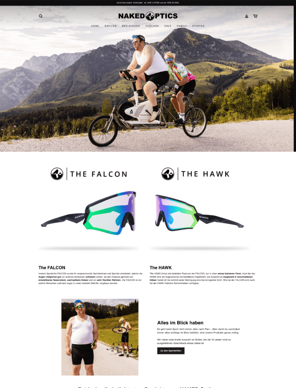
Naked optics is an Austrian company that produces extreme sports Goggles and Glasses
They produce glasses and goggles covering major extreme sports such as Ski, snowboarding, downhill, biking, and outdoor. The brand does not have physical stores and sells mainly from e-commerce and Amazon.
the challenge
Naked Optics was seeking a complete redesign of their Shopify store, nakedoptics.net, maintaining the original identity but visually improving the site and increasing their conversion rate, with a special focus on enhancing the experience design for bundles.
They wanted to create a modern, user-friendly e-commerce website that was optimized for conversions and provided a seamless shopping experience for their customers. The main goal was to pass from a standard Shopify theme to a complete custom one based on Shopify premium installation.
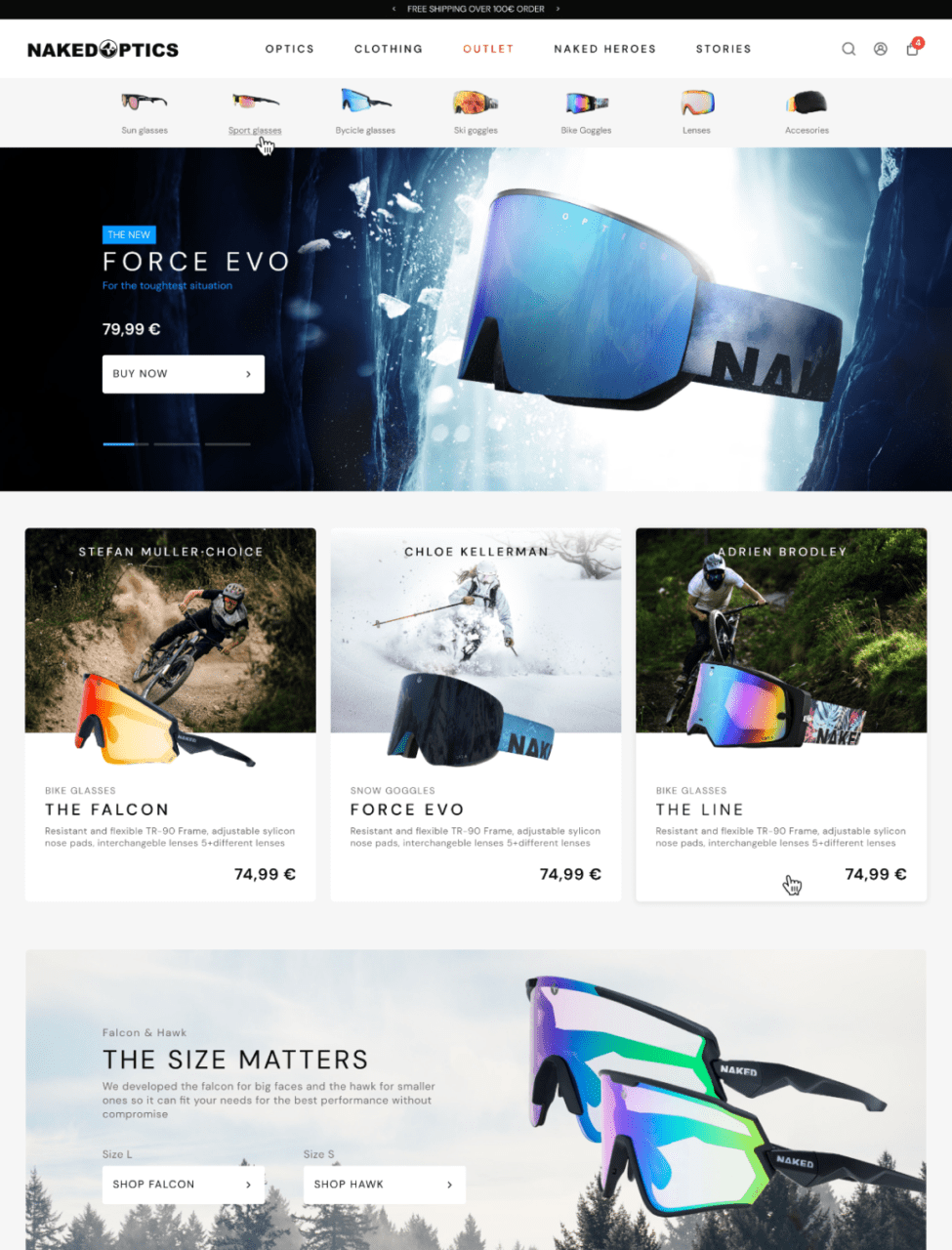
Before
After
approach
We started researching competitors to identify a style for an underdog brand that wanted to become a premium one. The research included UX assessment on every page and overall UI and creative direction. Once identified some issues we started with a UX process that redefined taxonomy, user journey, and functionalities.
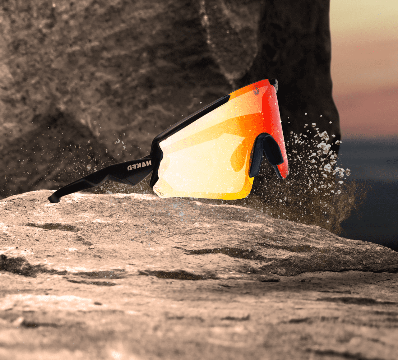
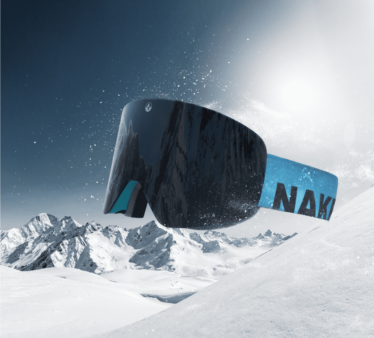
We also developed the UI design creating a Figma design system, overall look n feel and some creative direction for products picture.
After the design, we decided with the client to develop a Shopify custom theme to fulfill our experience requirement.
Result
The result of the redesign was a visually stunning and highly functional e-commerce website that provided a seamless shopping experience for customers.
The new website saw a significant increase in conversion rates, which passed from 2.0% to over 3% and we’ve got a great increase in bundle purchases.