All Communication is a dominant force in the Italian event landscape, boasting over a decade of expertise in producing large-scale experiences for global icons.
From high-energy public activations to sophisticated corporate storytelling, the agency operates at the intersection of creativity and flawless execution. Our goal was to encapsulate this vast experience into a fresh, "pop" aesthetic that feels both premium and approachable, perfectly aligning with the new core philosophy: All Moments Matter.
THE CHALLENGE
Despite their impressive portfolio, the agency’s visual language had become stagnant. Our mission was to bridge the gap between their extensive legacy and a future-facing identity.
We aimed to evolve ALL Communication from a traditional agency with a discreet presence into a vibrant and versatile creative hub: an identity bold enough to stand on its own, yet flexible enough to integrate with the aesthetic of any international brand they partner with.
APPROACH
The transformation began before a single pixel was moved. We believe that a brand’s visual evolution must be rooted in its core purpose, which is why we kicked off the project with an intensive Design Thinking workshop. This collaborative immersion allowed us to deconstruct a decade of success and identify the emotional triggers that define ALL Communication’s relationship with international brands.
Rather than simply updating a logo, we navigated through the agency’s DNA to define a new strategic positioning. We explored how the concept of “spectacle” has evolved in a hyper-connected world, ensuring that the new identity wouldn’t just be a fresh coat of paint, but a distinctive ecosystem. This strategic foundation allowed us to transition the brand from its historical roots toward a more agile, “pop-versatile” powerhouse.
CREATIVE DIRECTION
The rebranding was a meticulous exercise in distillation. We evolved the historical logo by stripping away the unnecessary, leaving behind a sharp, iconic mark that commands attention. This evolved into a comprehensive visual identity “pop-versatile” system designed to be as loud or as subtle as the project requires.
To ensure the brand feels alive in a digital-first era, we engineered a signature motion language. These custom transitions aren’t just decorative; they provide a rhythmic pulse across digital touchpoints, from high-stakes commercial pitch decks to cinematic video content, ensuring the agency’s energy is felt even before the event begins.
DIGITAL EXPERIENCE
The new digital home for ALL Communication was built to be as immersive as the events they produce. Moving away from the constraints of standard templates, we developed a high-performance custom front-end that prioritizes movement and impact. The interface is defined by fluid animations and a bold UX/UI strategy that mirrors the agency’s new visual energy.
Behind the scenes, we integrated a bespoke, streamlined WordPress back-end, allowing the team to manage their extensive portfolio with ease while maintaining the integrity of a sophisticated, code-driven design.
The result is a digital stage where international brands can see their future events come to life.
RESULTS
The project completely redefined ALL Communication’s ecosystem. By synchronizing the new logo, dynamic motion assets, and a high-performance web platform, we delivered a brand that is finally as loud and clear as the events it creates. Today, our visual system is being deployed across every touchpoint: the custom motion transitions have become the agency’s signature “stacco” for video content, while the social media ensures the consistency and professionalism required for international partnerships.
As part of a major corporate group, All Communication now possesses the prestige and visual weight it deserves. The rebranding hasn’t just refreshed their look; it has re-energized their market position, proving that when the identity is right, the impact is undeniable. All Moments Matter, and now, the brand finally lives up to its promise.
Perched above Montepertuso, Antalia Boutique Hotel embodies luxury, framed by sweeping sea views and Mediterranean serenity.
From brand identity to digital presence, our vision centered on translating tranquility and refined hospitality into an immersive online experience
THE CHALLENGE
Antalia sought a full digital transformation: a website capable of echoing its boutique charm, exclusive amenities, and gastronomic experiences, while communicating prestige without pretension.
The objective: deliver a digital showcase that speaks to discerning travelers and elevates Antalia beyond standard hospitality messaging.
APPROACH
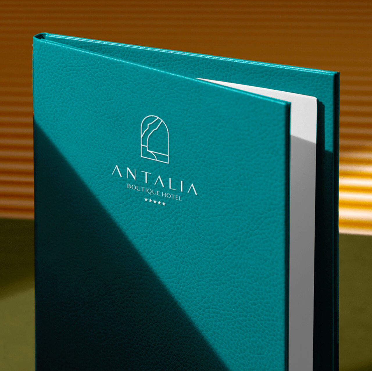
We grounded the project in Antalia’s essence: tranquility, exclusivity, and connection to the Amalfi Coast, crafting a logo that captures the iconic silhouette of Positano. Our narrative arc placed suites, dining, and curated experiences center stage, while voice and visuals reflected Mediterranean refinement.
Content strategy aligned storytelling with SEO, structuring pages around key services: elegant rooms with sea views, gourmet dining experiences (like Chic Mama restaurant and wine tastings), exclusive beach club access, and unique events like the Clicquot picnic or cooking classes
CREATIVE DIRECTION
The visual design reflects Antalia’s identity: clean lines, generous white space, and a palette drawn from Mediterranean tones: sea-blues, white stone, olive, and terracotta.
Typography is elegant and modern, complementing editorial layouts that combine imagery and storytelling. Imagery showcases sea-facing suites, chic bar moments at sunset, and sensory dining experiences, creating a site that feels like a window on Positano’s beauty.
DEVELOPMENT
We implemented a completely responsive front-end, ensuring the site performs beautifully across devices, vital for travelers browsing on mobile from the Amalfi Coast.
A custom CMS empowers the hotel team to update suites, seasons, experiences, and event offerings with ease. Fast load times, smooth animations, and adaptive layout support an experience that mirrors Antalia’s refined hospitality.
All development choices, from image optimization to navigation design, were made to support performance, scalability, and clarity.
RESTAURANT
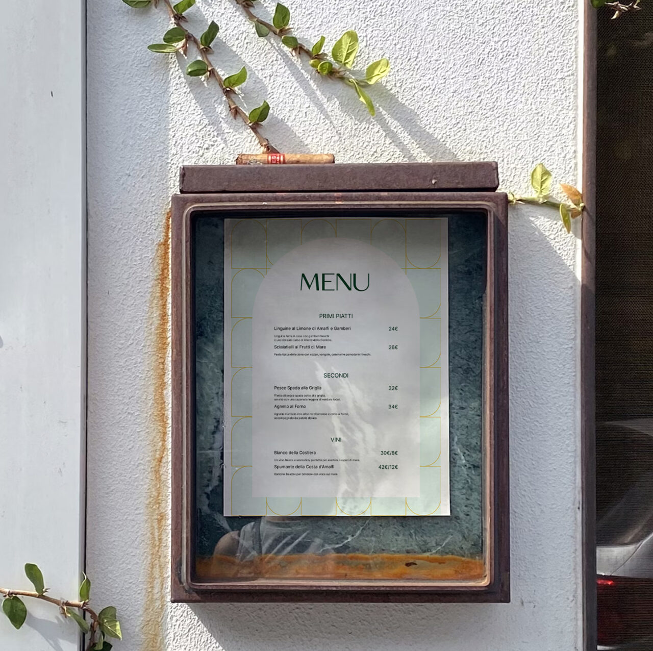
Adjacent to Antalia Boutique Hotel, Chic Mama offers a dining experience that blends gourmet cuisine with vibrant entertainment on the Amalfi Coast. In creating its visual identity, we maintained a clear connection to Antalia’s brand, reflecting their proximity and shared sense of refinement, while introducing a distinct palette and a touch of playful elegance.
The logo retains the harmony and minimal precision of Antalia’s mark but evolves with warmer, more dynamic tones and subtle decorative accents. This “chic” twist elevates the restaurant’s personality, distinguishing it as a destination for elevated dining and nightlife, yet still part of the Antalia world.
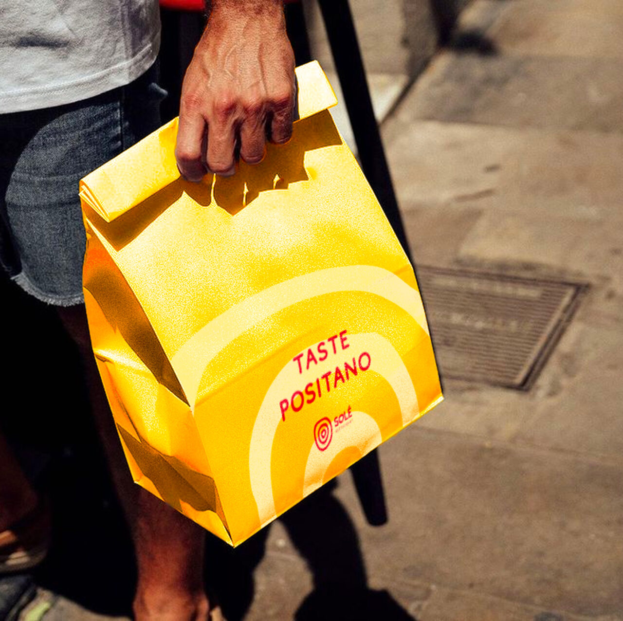
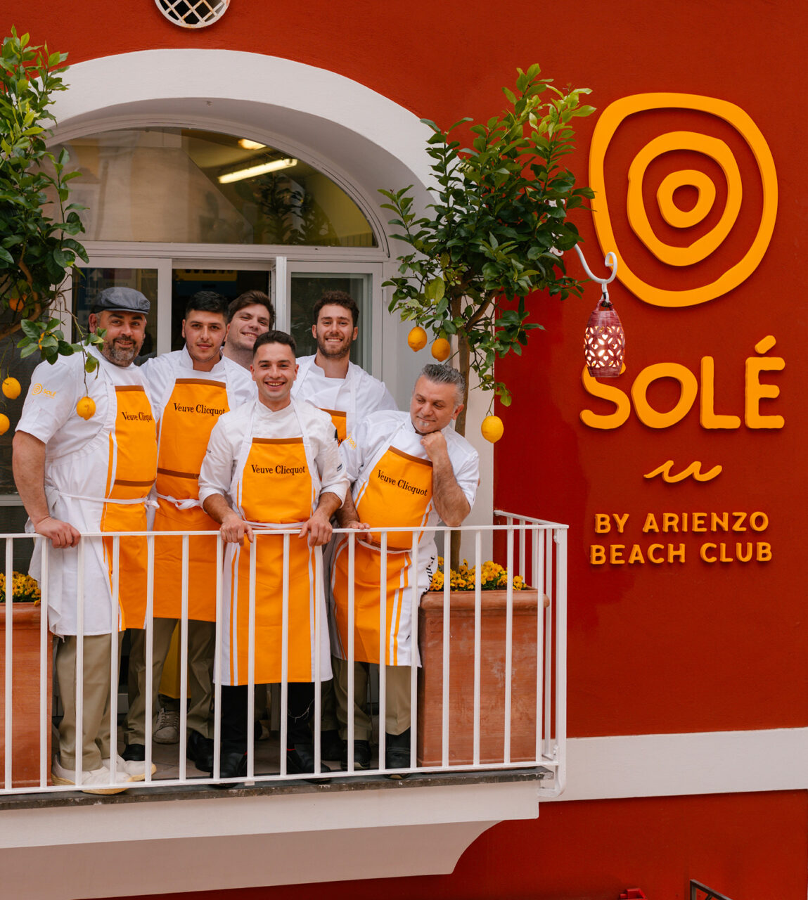
Inspired by the relaxed rhythm of Mediterranean living, Solè reimagines the concept of daytime dining in Positano.
No rush, no rules, just good food and radiant energy from morning to evening. Born from the legacy of Arienzo Beach Club and Veuve Clicquot, Solè is more than a bistrot: it’s a lifestyle ritual made of freedom, flavor, and effortless elegance. A digital identity was needed to reflect all of that, with clarity, depth, and emotion.
THE CHALLENGE
Solè needed to craft its brand from scratch. From logo and storytelling to a complete website that could express its unique experience.
The goal was to turn the Solè vision into a compelling digital presence. We developed a custom web experience that translated the atmosphere of Positano into an intuitive interface. We shaped a voice, a visual identity, and content architecture that made the brand’s values tangible. A system built to inspire bookings and brunch rituals.
APPROACH
We started from the essence of Solè: freedom, light, and spontaneity. We built a narrative framework rooted in place, feeling, and simplicity.
Our process included deep research into the local vibe and target audience, shaping both visuals and copy around the idea of timeless Mediterranean joy. The website was structured to highlight the all-day brunch concept and its vibrant location, in the center of the city. The tone is warm, casual, and international, like the guests themselves.
CREATIVE DIRECTION
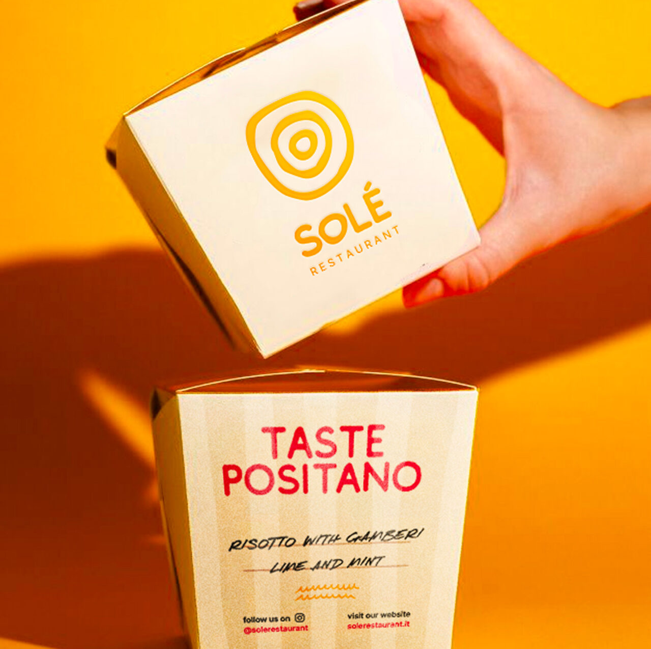
We designed Solè to feel like Positano looks at golden hour soft, glowing, and full of possibility. The color palette is drawn from local textures: terracotta, linen, lemon, and sun-bleached stone. Typography is clean yet characterful, echoing signage from vintage coastlines. Layouts are airy and cinematic, balancing editorial storytelling with their clear mood.
From logo to layout, every element was built to elevate Solè into a modern icon of coastal dining. With a digital flavour, but deeply rooted in place of Positano beach.