GAS is a historical brand in the Italian fashion scene, which has its roots in the denim world.
Founded in 1984 as a family-run business, GAS sells high-quality clothing, footwear and accessories for men, women and children. Its total looks are denim-centered.
THE CHALLENGE
GAS was undergoing a rebranding initiative, aimed at expanding brand’s appeal to reach out both new generations and long-time loyal customers. The goal was to go beyond their traditional denim focus, proposing GAS as a contemporary lifestyle brand with a comprehensive offering for all genders and also genderless.
They contacted us to redesign their e-commerce, working in partnership with an external content agency and a development company. Our task was to customize a Shopify premium template to highlight GAS new identity, its historical background and its balanced connection with both women and men’s universe.
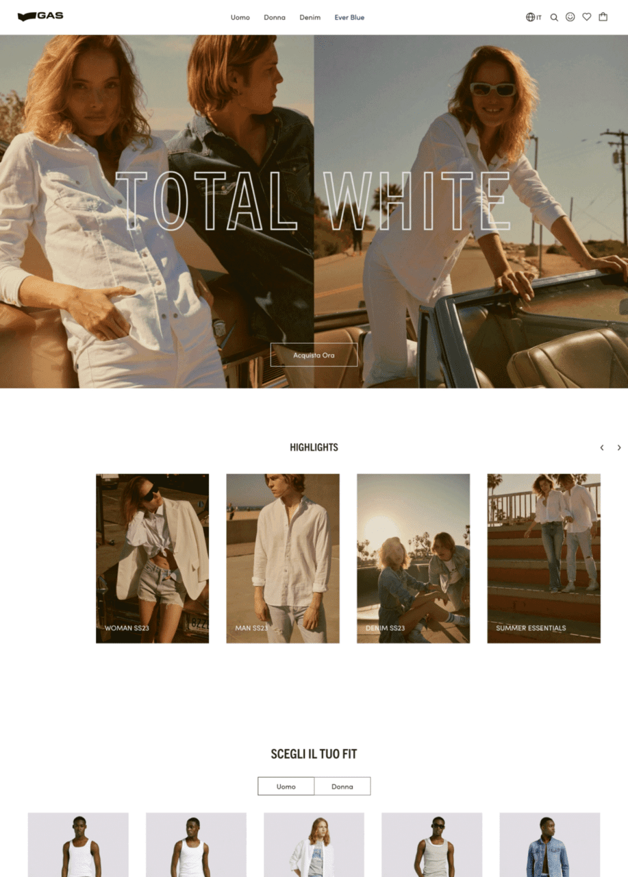
Before
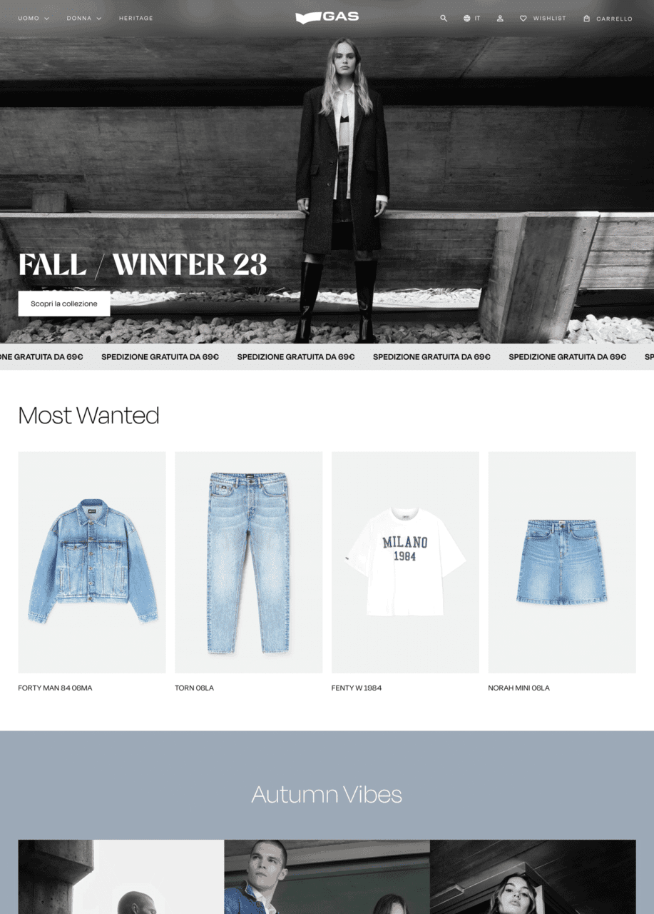
After
APPROACH & RESULT
We analyzed their current e-commerce and the proposed information architecture, to understand what were the critical points of the existing experience and the integrations that has to be implemented. Based on their goals, we selected 3 Shopify Premium templates, highlighting their distinctive features. Among them GAS team chose the Expanse – Modern style template, which was the starting point for our UI design proposal.
We crafted a creative direction focused on elegance and modernity, selecting a minimalist approach. The extensive use of black and white in various shades and sharp shapes for interactive elements serves to elevate the brand’s positioning. Abalos, chosen as the main font, adds a modern and playful touch, enhancing the new brand identity across product and category heroes, as well as cross-selling banners.
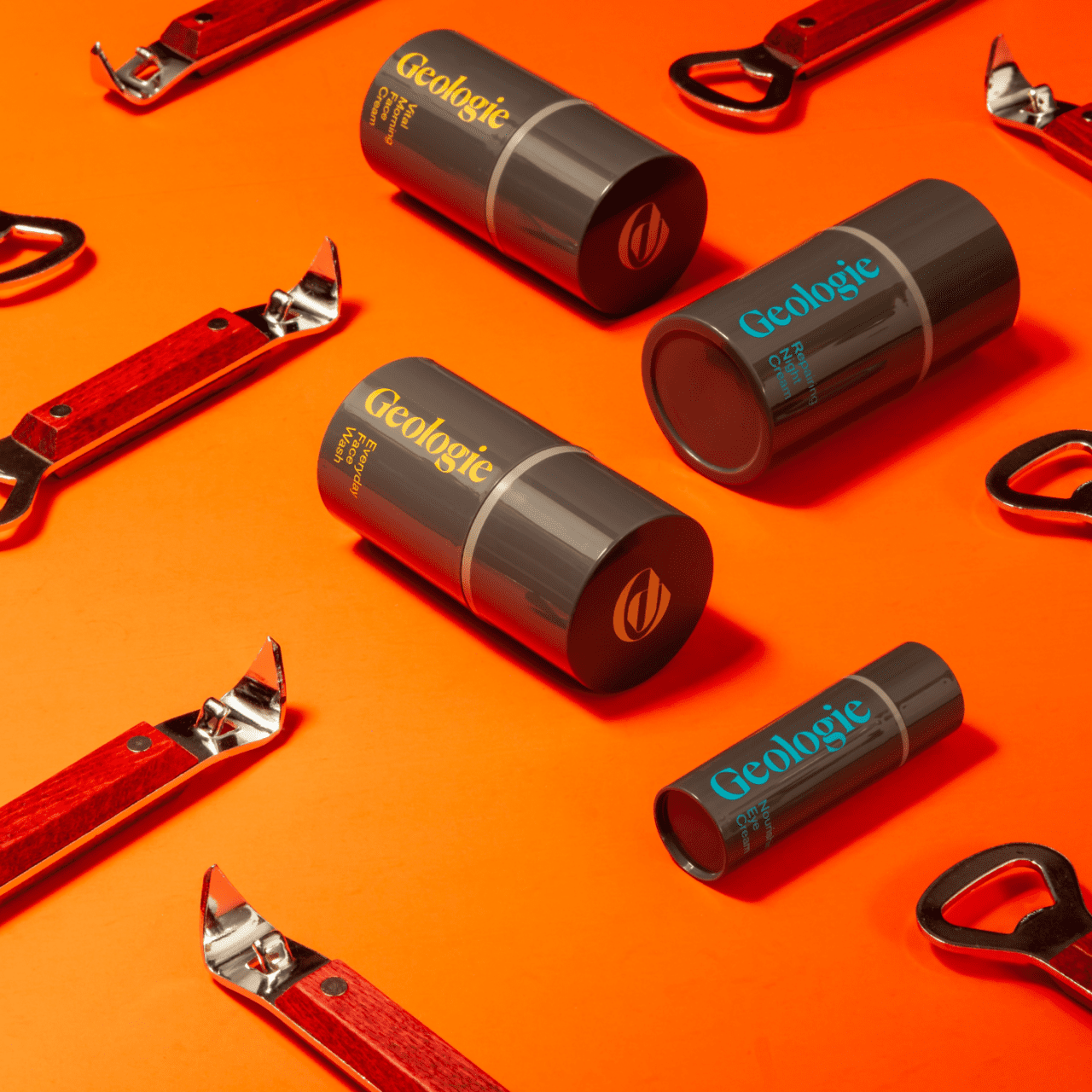
Geologie, a US skincare brand, specializes inpersonalized, subscription-based skincare services.
Geologie was founded by Nick Allen and Dave Skaff, friends and innovators, with a shared vision to offer men the best skincare experience, encompassing top-quality products and exceptional service.
the challEnge
We were asked to improve the overall user experience (UX) in order to better differentiate between single products and bundles, and to highlight the subscription model’s significant discounts. Another focus was improving the private area for customers to renew and manage their subscriptions.
Our challenge was to redesign the Product Listing Page and Product Detail Page UX/UI, making the various sizes, categories, and discounts more visible, and drive users to choose the bundle option. Clarifying the individual product advantages on the PDP was another key objective.
Our Approach
First, we developed two alternative UX designs for the PDP and PLP.
The focus was on enhancing subscription visibility and the different available formats. We also made category selection clearer in the PLP with a sidebar for subcategories.
In terms of aesthetics, we preserved the brand’s color identity while improving product card and bundle content clarity. We also highlighted the product benefits and created a straightforward tool for selecting bundles or individual products.
results
We were able to increase conversions to larger product formats and increase the number of subscription users who did not come from specific campaigns. We also made package contents clearer, boosting retention and reducing service unsubscribes.
Additionally, the new PLP structure allows the brand to expand its product range without redesigning the PLPs and PDPs.