Allimb transforms physiotherapy with AI-powered, science-backed solutions for personalized recovery and prevention. Letting their patients get moving again with progress they can track every day.
Allimb is redefining digital healthcare by making physiotherapy accessible to everyone. Guided by expert physiotherapists and powered by AI, the app delivers personalized exercise plans tailored to individual needs. With a focus on scientifically proven methods and real-time tracking, Allimb ensures effective recovery and injury prevention. Committed to closing gaps in healthcare, especially in women’s health, empower individuals and professionals alike to take control of rehabilitation.
THE CHALLENGE
Allimb needed a complete product transformation—from a redesigned app interface to a reimagined digital presence that better communicated its mission and value.
Our goal was to elevate Allimb’s user experience by revamping its app, ensuring seamless navigation and engagement. We also designed a comprehensive landing page to articulate the app’s benefits, making its features clear and compelling. Finally, we optimized Allimb’s digital platform for healthcare professionals, improving usability and accessibility for doctors managing rehabilitation courses
APPROACH
We took a strategic approach, analyzing user needs to refine the experience, restructure content, and create a cohesive digital ecosystem.
The process began with a deep dive into user pain points, informing the redesign of Allimb’s app to offer an intuitive and efficient physiotherapy experience. We then restructured the website, ensuring clear messaging that speaks to both individuals and medical professionals. Every step was guided by strategic content development to enhance clarity, engagement, and accessibility.
CREATIVE DIRECTION
To align with Allimb’s mission, we crafted a visual identity that merges calm technology with medical precision. The new color palette instills trust while promoting ease of use for patients.
A refined UI ensures a seamless experience, reducing cognitive load and making rehabilitation more approachable. By integrating supportive design elements and thoughtful interaction patterns, we created a digital environment that fosters confidence in recovery and long-term well-being.
Y Tú is a company specialized in the installation of custom photovoltaic systems for businesses.
New to Spain but backed by decades of expertise, Y Tú creates solar systems tailored to fit seamlessly into any setting, from rooftops and wide-open fields to parking spaces. The company oversees every aspect of the process, including system design, installation, monitoring, and maintenance.
the challEnge
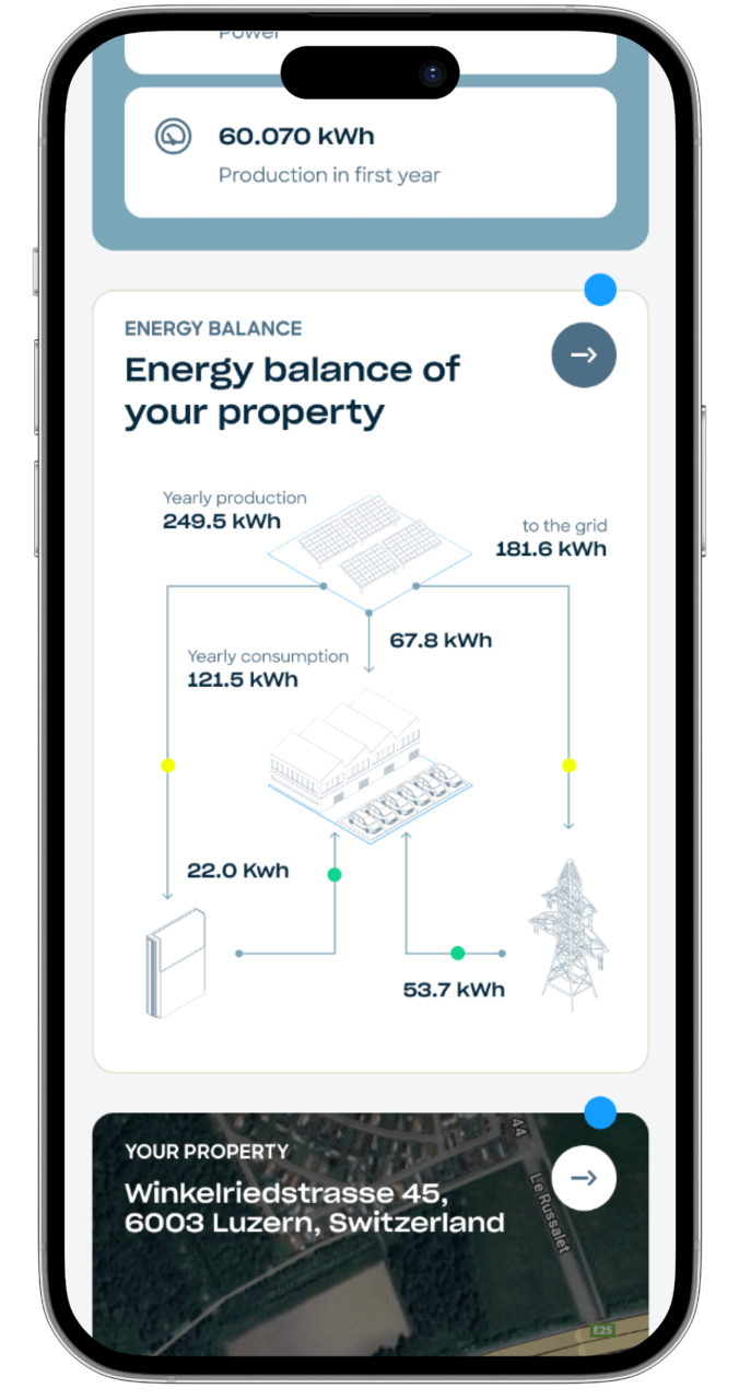
The client needed to develop a digital service that would guide users through the entire process of configuring and creating a solar energy system online. The platform had to simplify every step, making the project phases and proposal clear and easy to understand. This type of experience allows the brand to reduce commercial costs while providing greater transparency and clarity to customers, particularly in terms of offerings.
The client’s idea was to make users almost entirely autonomous after receiving an initial cost estimate on the public website. The goal was to enable them to configure and create the entire system independently, while also providing a way to monitor project steps. This was achieved through a single platform designed for the exchange of information and documents between the brand and users.
the solution
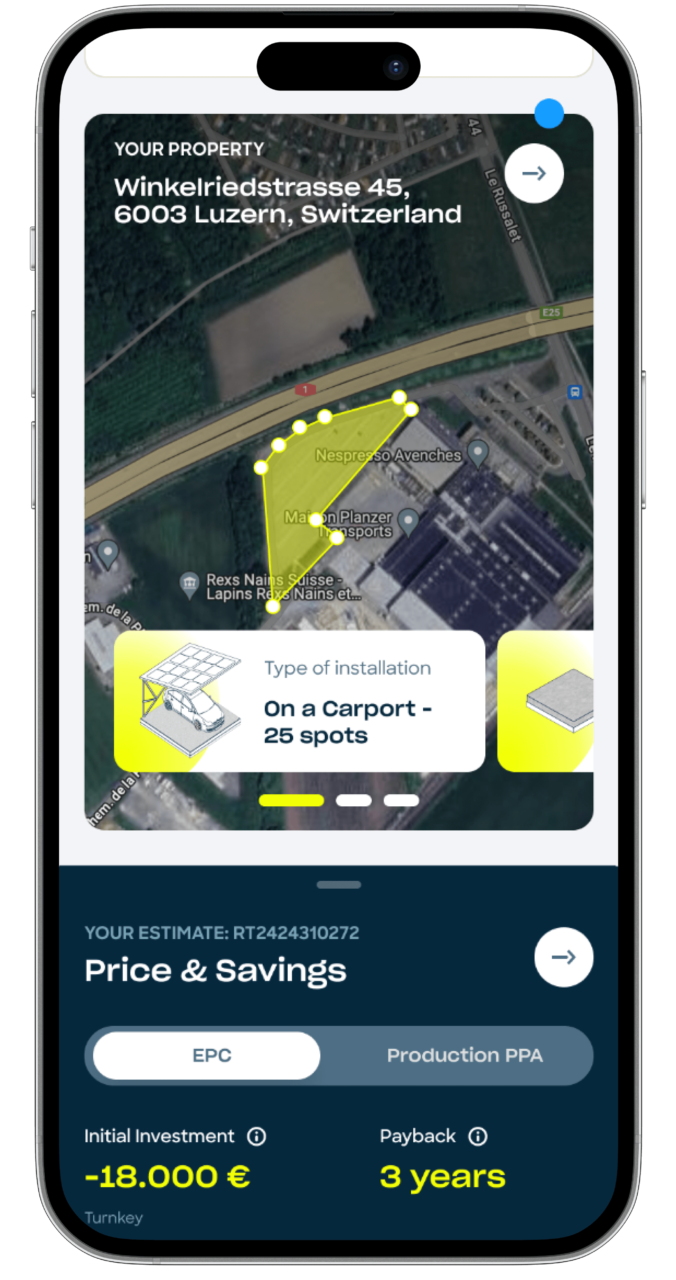
To approach a project of this scale, we conducted several design thinking exercises during an online workshop with all Y Tú team stakeholders. This allowed us to define the customer journey, identify users along with their needs and concerns, and create an experiential flow that would help the brand be more effective in sales while ensuring users could navigate the entire process without feeling lost, minimizing their cognitive load as much as possible.
We then developed wireframes guided by a clear timeline, featuring interactive areas for document uploads or parameter adjustments, and a constant recap section to keep project data visible and updated dynamically. The entire system adopts a modular, block-based approach, ensuring simplicity and ease of use despite a complex workflow.
RESULT
We successfully created a block-based, ergonomic experience that is clear and easy to use, even for inexperienced users. The platform enables the brand to seamlessly manage all project phases while serving as a single point of contact for documents and project updates. The project was also developed with an almost fully responsive design, allowing users to track progress even on the go. Additionally, we built a distinctive design system that is reliable, scalable, and ready to support future developments of the platform.
Thanks to this online configurator, Y Tú can streamline its sales process, reduce operational costs, and improve customer satisfaction. The platform empowers users to independently manage their projects while providing the brand with greater control, efficiency, and transparency throughout all phases.
Sailsquare is the website that simplifies your journey into the world of yacht and boat bookings.
Whether you're looking to sail in the Mediterranean or explore the Pacific, Sailsquare offers curated experiences across the globe, allowing you to search, book, and embark on your dream adventure with ease.
the challEnge
Sailsquare needed a comprehensive overhaul of its website’s design system to enhance its user interface and user experience. The goal was to improve the conversion rate while maintaining the site’s existing structure. We faced the challenge of balancing a redesign that felt both familiar to current users yet fresh and inviting to new ones.
The objective was to recreate the user’s boating experience right from the website, ensuring that users felt like they were already boarding their yacht from the moment they landed on the homepage.
Creative direction
Our creative approach centered around transporting users into the world of boating from their first interaction with the website. The design was crafted to reflect the excitement of sailing, with a user journey that flows as smoothly as a boat on calm waters.
We revamped the website’s interface, making the search and booking processes smoother and more engaging, offering users the ability to feel as if their nautical adventure had already begun.
RESULTS
The redesigned Sailsquare website saw a significant improvement in performance across the board, from enhanced user experience to a sharp increase in bookings. The site’s conversion rate increased, and the seamless user journey has led Sailsquare to become one of the top booking platforms for yacht and boating experiences worldwide.
This success highlights our dedication to delivering exceptional design and functionality in the digital travel industry.
MooneyGo is the app that streamline your journeys: parkings, buses, trains, taxis, ferries and mobility sharing options are there for you.
It's the app that empowers you to move, travel, and pay with complete freedom, offering a bunch of mobility services within and beyond the city: from parking to public transportation, all the way to highways, MooneyGo is your travel companion for every moment.
the challEnge
Mooney Go acquired MyCicero to integrate all the new payment systems into the new app. This challenge led us to find compatibility solutions between the two working environments. Our goal was to maintain a user-friendly structure that would allow existing MyCicero users to continue using and leveraging the skills they had already acquired from the app.
We collaborated with the MooneyGo Design and Product team and the MyCicero development team to achieve the goal of merging these two entities. We acted as a bridge, facilitating the discovery of the best connections between them, ultimately leading to the creation of MooneyGo’s new and innovative user experience.
Creative direction
We started working with the MooneyGo app’s design and teamed up with its project owner to create a design system that took the app to a whole new level. We didn’t just integrate features, we envision a new way to make people live the city on the go and deal with the frictions of daily travels.
Within this app, it’s even possible for registered users to discover, buy and then manage the recently launched E-tolling solution.
Now, booking parking, buying tickets, and getting around Italy is more seamless than ever before.
results
Mooney Go has been named the 2023 Consumer Product of the Year, recognizing it as an innovative mobility application.
This award fills us with immense pride and reflects our dedication to delivering exceptional work in this field.
GS1 standards are the most widely used system of standards in the world, and they offer a broad portfolio of services and tools to make adoption of their standards easier and more impactful to businesses.
the challEnge
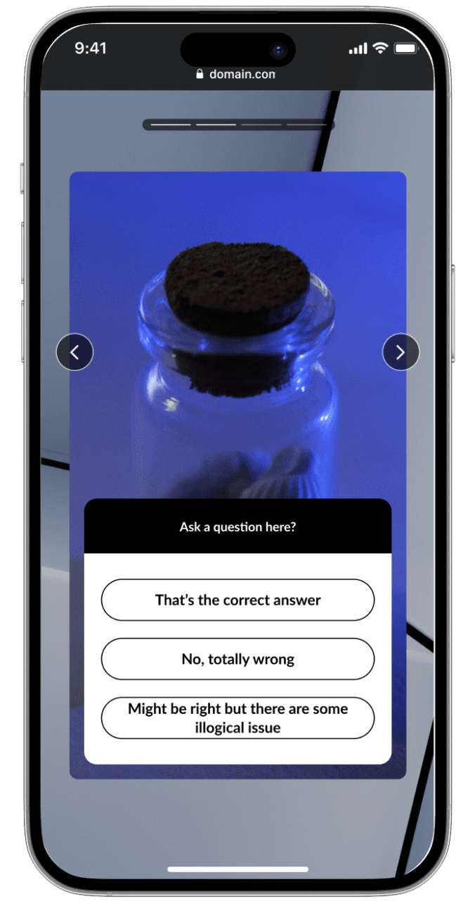
The challenge was to create an immersive experience in their showroom, Interno1, using large touchscreen monitors.
The aim was to present GS1 standards and information for retail products through an engaging, interactive experience, demonstrating how GS1 enhances supply chain efficiency and effectiveness through their software and services.
Our Approach
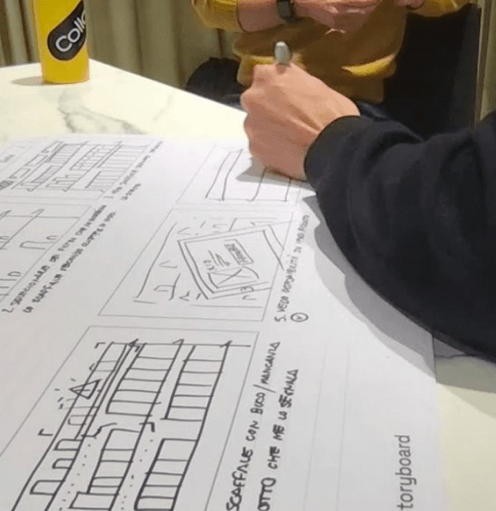
We began by analyzing the client’s content, then hand-illustrated individual storyboards to define the experience and storytelling.
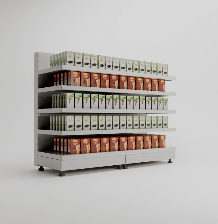
We identified a “starting point” from which we could tell all the necessary stories: a supermarket shelf.
We then created 3D models of the individual products and the shelf for storytelling reference, aligning the look and feel with GS1 Italy’s brand image.
results
We developed a web app using WebGL technology, capable of conveying information and best practices in large-scale distribution product supply chains, and how GS1 Italy’s services ensure accurate product information, satisfying all lifecycle requirements within the supply chain.
This allows the client to discuss highly technical topics like product pack information and management with their customers in an engaging and interactive way.
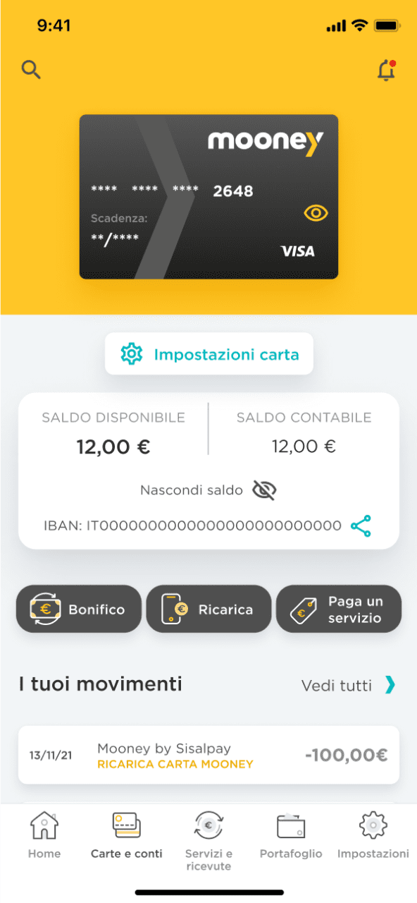
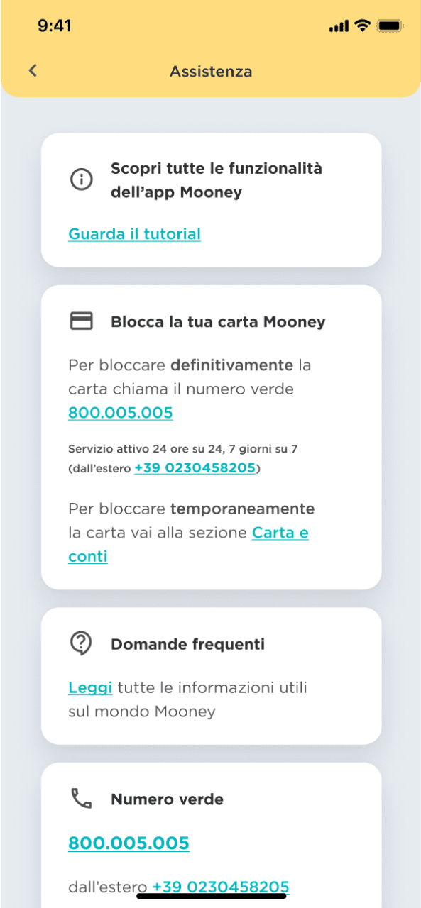
Mooney is the first Proximity Banking & Payments company in Italy which has inherited the
experience of SisalPay and Banca 5 (Intesa Sanpaolo Group).
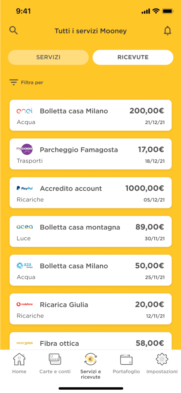
Thanks to its extensive network of over 45.000 points of sale throughout Italy that are fully integrated with the digital ecosystem, Mooney plays an important social role in providing consumers with a simple, quick and easy access to a wide range of payment solutions, namely bills, prepaid cards, telephone recharge cards as well as facilities such as cash withdrawals, wire transfers and payment orders, formerly possible only through banks.
THE CHALLENGE
Mooney decided to renovate its mobile app identity by choosing a fresher mood able to represent the clarity smartness and simplicity of the functionalities offered through their digital channels.
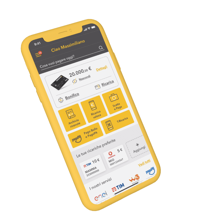
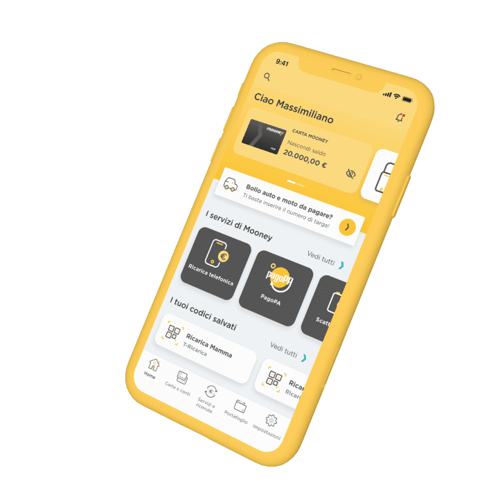
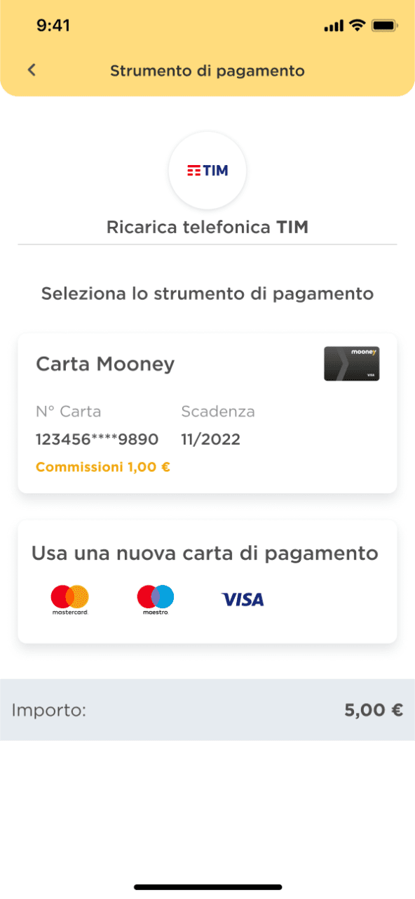
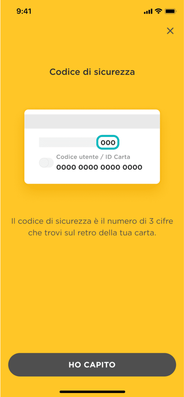
Collaborating with Mooney Design Studio, we redesigned the app interface, where customer has access to all personal and payment services, using up to 6 payment methods, including the Mooney prepaid card. The challenge was to create a virtual environment that was fresh and institutional at the same time, able to fit both existing flows and the latest services introduced.
Old homepage
New homepage
CREATIVE DIRECTION
Starting from the concept of the new brand identity and the app user experience, we created the UI design system of the new Mooney app.
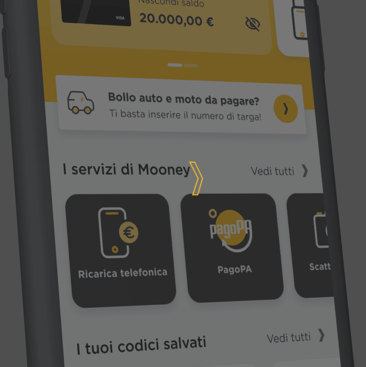
Our first task was to choose the newest features and assets introduced into the UX, giving them the right relevance in the UI and making them appealing for the customers. Afterwards, we developed the other components applying the same logic of attractiveness and functionality and considering each element not as a separate unit but as a whole within the page.
RESULT
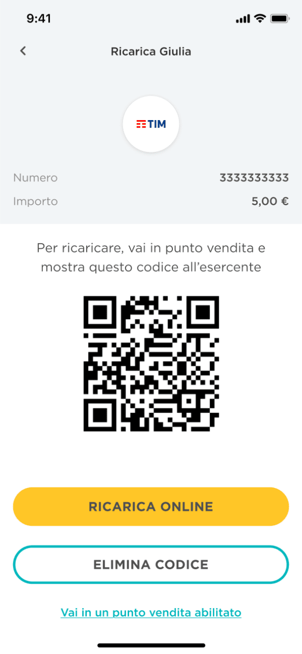
Through the new app, we shaped a human and smart experience that make customers feel like if someone is taking care of them step by step.
We placed modern animated illustrations in key points of the digital flows, such as the end of a transaction or tutorials to involve users during their daily usage. Our creative direction definitely contributed in achieving Mooney’s business goals in 2021.
Brandoh! is a digital storytelling platform created and developed by Reload S.r.l.
Brandoh! is designed for brands to deliver content innovatively. It serves as a creative playground for both companies and creatives to convey meaningful messages and reach their target audience.
THE CHALLENGE
Reload initially launched Brandoh! to create tailor-made narrative experiences for multiple brands like Timberland, Valentino, Barilla and many more through a meticulous consulting process. Starting from the specific communication goal, they select “elements” to compose ad hoc storyboards.
The goal was to evolve Brandoh! into an online no-code platform accessible to content creators, transforming it into a stage for everyone in the ever-evolving narrative of the digital age.
APPROACH
We were already responsible for the frontend platform design, which had continually evolved over the years, due to the integration of third-party services such as 3D object and space visualizers.
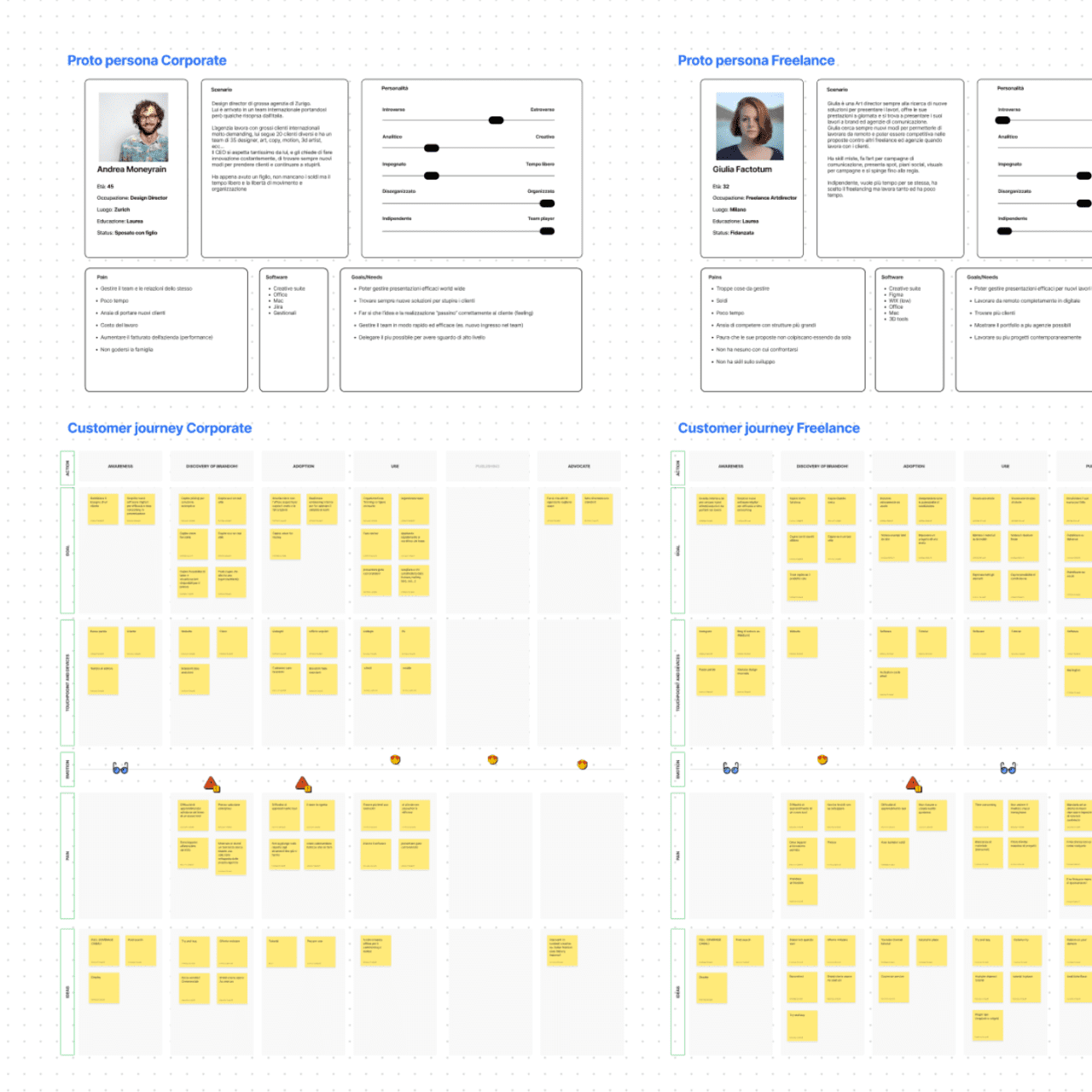
To tackle this new challenge, we conducted market research to identify new product opportunities that could arise from this new product evolution.
We then shifted our focus to the user experience, holding co-design workshops to create proto personas and user journeys.
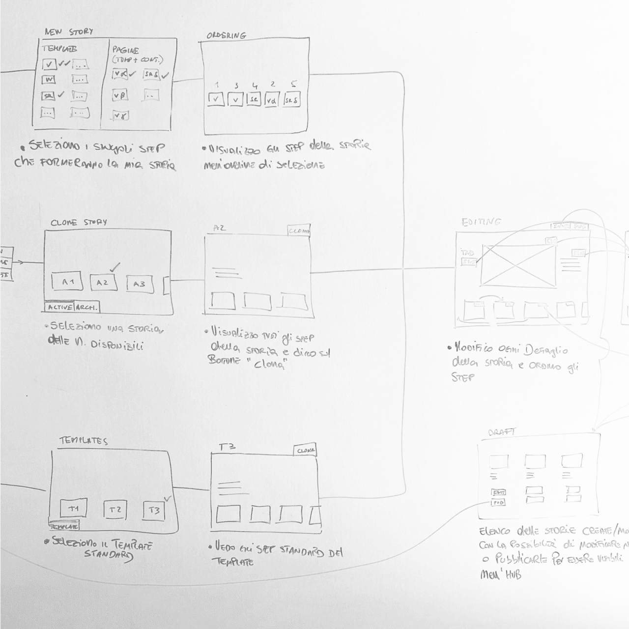
Having defined the taxonomy and main functionalities of the software, we then designed the complete UX for the CMS.
RESULT
We launched the Brandoh! beta with three plans (free, starter, and custom licenses) to quickly gather feedback from existing clients as well as first-time users.
The story-builder software facilitates team collaboration with user profiling, interactive story configuration, and publishing options. The platform is code-free, offers Single-Sign-On authentication, and tracks performance.